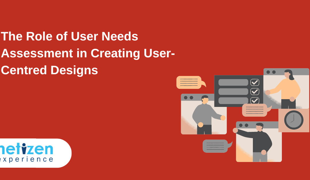
May 23, 2023 | UX Design |
Creating user-centred design is vital in UX/UI development because it ensures that the end product is intuitive, and meets the needs and expectations of the target audience.
In practice, a user-centred design approach revolves around iteratively gathering feedback and insights from users throughout the design process to inform design decisions.
And thus, increase customer satisfaction, loyalty, and engagement.
One critical component central to delivering effective user-centred design (UX design) is a user needs assessment.
In this article, we shall delve into user needs assessments and the role they play in gathering information about users’ needs, preferences, and pain points.
We shall also unpack how they help UX designers to inform design decisions and help devise designs that meet the user’s expectations and ultimately increase their satisfaction.
What is a user needs assessment?
User needs assessment is the process of gathering and analysing data to comprehend the end-user’s requirements, preferences, and pain points. Subsequently, this information is utilised to inform design decisions and produce user-centred designs that meet the user’s expectations.
In practice, a user requirements assessment can be conducted throughout the design process, from concept to launch. In fact, assessment of user requirements can take many forms, including surveys, focus groups, interviews, card sorting, and A/B testing. The choice of method depends on the project’s objectives, timeline, and budget.
For instance, a user needs assessment is particularly useful when redesigning an existing product or developing a new one. In such cases, user needs analysis helps identify the gaps in the current product, understand what the users want from the product, and design features that meet their needs.
What is user-centred design?
User-centred design is a design approach that places the preferences, needs, and pain points of the end-users (and their context) at the centre of the design process.
It involves gathering data on the above needs through a user needs assessment and using that data to inform design decisions, in the most effective and efficient way possible.
Fundamentally, the ultimate goal of user-centred design is to create a product that meets the user’s expectations, increases their satisfaction, and provides a positive user experience.
Benefits of conducting a user need assessment
- Increased user satisfaction: UX designers improve user satisfaction and outcomes by employing insights derived from a user needs assessment into how users interact with the product in order to create products best suited to them.
- Reduced development cost: Creating items that work for the users’ purposes lessens the necessity of making expensive UX alterations and modifications in future. Thus, reducing the overall cost of development in the long term.
- Increased market success: UX designers can maximise their market potential and differentiate themselves from other businesses by leveraging user needs assessment data to formulate goods and services that respond to users’ requirements.
- Improved user engagement: User needs assessments can enable UX designers to design products that better foster user engagement. Additionally, it can help encourage some users to become more involved in and committed to the product by letting them participate in the design process.
- Better alignment with business objectives: When UX designers comprehend user needs and preferences, they can create products that align with the broader business strategy and objectives.
- Reduced risk of product failure: By conducting user needs assessments, designers can identify potential issues early on and design products that are more likely to succeed in the market.
- Improved brand reputation: By creating products that are user-centred and meet user needs, companies can build a positive brand reputation and increase customer loyalty.
Methods of needs assessment
Here are some key methods typically employed to conduct a user needs assessment:
Surveys
Surveys are a common method of user needs assessment that involves asking a set of standardised questions to a large group of people. They can be conducted online, by mail, or in person and can be used to collect both quantitative and qualitative data on user needs, preferences, and behaviours.
Focus groups
Focus groups usually involve bringing together a small group of people to discuss a specific topic in depth. They are typically moderated by a trained facilitator and can be used to collect qualitative data on user needs, preferences, and behaviours.
Interviews
Interviews involve one-on-one conversations between a researcher and a user. They can be conducted in person or over the phone and can be used to collect qualitative data on user needs, preferences, and behaviours.
Card Sorting
Card sorting involves asking users to organise a set of cards (with each containing a piece of content or functionality) into groups that make sense to them. The results can provide insights into how users expect to find and navigate through information, which can inform the design.

Photo by Polina Zimmerman
A/B testing
A/B testing is essentially a method of comparing two different versions of a product or service to determine which one performs better. Users are randomly assigned to either Version A or Version B, and their behaviour is measured and analysed to determine which version is more effective at achieving the desired outcome.

How to conduct a user needs assessment to create user-centred designs?
To effectively conduct a user needs assessment to create user-centred designs, one can take the following steps:
Step 1: Identify the purpose and goals of the user needs assessment:
During this step, determine the objectives of the user needs assessment and the questions you intend to address.
Step 2: Identify the target user group:
Define the target user group, which could be current or potential users of the product or service.
Step 3: Choose the appropriate user needs assessment method:
During this step, ensure to choose the most appropriate user needs assessment method based on the project’s objectives, timeline, and budget.
Step 4: Recruit participants/Respondent recruitment:
Identify and recruit respondents who meet the criteria for the target user group and are willing to participate in the evaluation.
Step 5: Conduct the user needs assessment:
Administer the evaluation method, such as surveys, interviews, or focus groups, and collect data on user needs, preferences, and pain points.
Step 6: Analyse and interpret the data:
During this step, extensively analyse and interpret the user data collected during the user needs assessment to identify patterns, trends, and key insights.
Step 7: Develop user personas:
In this step, build user personas based on the data collected during the assessment, which represent typical users and their needs, goals, and behaviour.
Step 8: Use the findings to inform design decisions:
Apply the knowledge gained from the user needs assessment to inform design decisions and create a user-centred design that precisely meets the needs of the target users.
Best practices for effective user needs assessment to create user-centred designs.
Best practices for user needs assessment ensure that the design process is focused on meeting the needs of the target audience.
In essence, best practices help to establish a framework for the user-centred design process that is based on research, data, and user feedback, whilst taking into account the needs and preferences of the target audience.
Some of the best practices we recommend to achieve effective user need assessments when creating user-centred design are:
- Engage users as early as possible in the design process to ensure that their requirements are considered throughout the process.
- Avoid leading questions: Ask users neutral queries that do not elicit a specific response. This ensures that the responses are objective and precise.
- Select appropriate evaluation methods: Select the method or combination of methods that best fit the project’s objectives, timeline, and budget. Consider employing a combination of techniques to obtain a deeper understanding of user requirements.
- Recruit a sample of representative users: Ensure that the user group is representative of the intended user group and that the sample size is sufficient to yield insightful results.
- Use open-ended questions: Utilise open-ended queries to elicit detailed and sincere user feedback that can inform design decisions.
- Provide a relaxed and comfortable environment: Create an environment conducive to comfort and relaxation during user requirements assessment to encourage users’ candour and openness.
- Conduct ongoing assessments: Conduct ongoing user requirements assessments throughout the UX/UI design process to ensure that the design satisfies the changing needs of the intended audience.
- Collaborate with stakeholders: Include all relevant stakeholders, including designers, developers, marketers, and product managers, in the user requirements assessment process.
- Use data visualisation tools: Use data visualisation tools to help make sense of the data acquired during the assessment and to clearly and concisely present the findings to stakeholders.
- Validate findings: Validate the user needs assessment findings by verifying design decisions with users throughout the design process. This ensures that the final design meets the requirements of the intended audience.
By leveraging the above best practices, UX designers can ensure that they’re using proven methods and techniques to gather user feedback and analyse and interpret this feedback effectively.
Thus, ensuring that the design process is collaborative and inclusive for all stakeholders involved in the user-centred design process.
Read and explore more on UX Design insights.
Conclusion
In summary, user needs assessments play a critical role in creating user-centred designs. By iteratively engaging with users to gather their feedback, UX designers can create products that meet the needs of the target audience and can be adopted and deployed effectively.
As we also noted, this process may help to improve product usability, functionality, and overall user experience, leading to augmented customer satisfaction and loyalty.
Overall, conducting a user needs assessment is an essential step in creating user-centred designs that meet the needs and preferences of target users.
By religiously following the few steps outlined in this article, designers can gather valuable insights into user needs and preferences, which can inform design decisions and improve product satisfaction, market success, and brand reputation.
From card sorting to A/B testing, there are various methods to choose from depending on the project goals, timeline, and budget.
In conclusion, by investing in user needs assessment, designers can reduce the risk of product failure and gain a competitive edge in the market.
Reach out to us at Netizen Experience for user needs assessment for your next project!
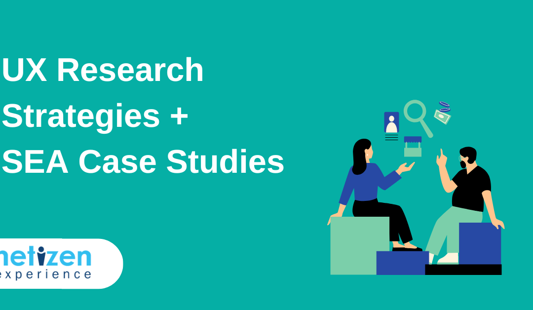
May 21, 2023 | UX Strategy & Planning |
In today’s digital age, user experience (UX) plays a pivotal role in shaping the success of products and services.
To create exceptional user experiences, businesses must gain deep insights into their target audience’s needs, preferences, and behaviours.
UX design is crucial to creating products that are user-centred, intuitive and enjoyable to use. As such, it’s important for businesses to understand their customer’s problems and expectations, and then tweak their products to optimise the user experience.
This is where UX research strategies come into play, allowing companies to uncover invaluable user insights that drive informed decisions.
The blog aims to emphasise the importance of UX research strategies with the help of two case studies from South East Asia (Neitzen’s clients).
What is UX research?
UX research, or user experience research, is a process of understanding user behaviour, and motivations in order to design and improve products, services, or systems so that they meet user needs and expectations.
This means the goal of UX research is to provide insights into how users interact with products, services, or systems and to identify opportunities for improvement.
UX research can take two forms, including qualitative research methods such as:
- Contextual inquiries
- User interviews
- Card sorting
- Usability testing
- Field studies/diary studies
- Focus groups
- User persona creation
- Tree testing
- Heuristic evaluation/UX audit
The second form involves, quantitative research methods, such as:
- A/B testing
- Surveys and questionnaires
- Digital analytics
- First click testing
- Website intercepts
All these methods are used, sometimes in tandem, to gather data and feedback from users throughout the design and development process. This can further be analysed to identify patterns and trends in user behaviour, needs, and motivations.
For more details on UX research and methods, read here.
The importance of UX research
User research is a systematic approach to understanding users, their behaviours, needs, and preferences.
By delving deep into it, businesses can gain valuable insights that drive the design and development of products and services that truly resonate with their target audience.
UX research ensures that user needs are at the forefront. This, in turn, leads to intuitive, user-friendly interfaces, enhanced satisfaction, increased customer loyalty, and, ultimately, business success!
Here are some key reasons highlighting the importance of UX research:
Understanding user needs
By conducting user interviews, surveys, and usability testing, UX researchers can uncover user pain points, preferences, and goals. This knowledge feeds the design process and ensures that the final product or service meets user expectations.
Designing user-centred experiences
By involving users in UX research early on and throughout the development cycle, designers can incorporate their feedback and insights to create user-centred experiences. This will help you create products and services that are more intuitive, easy to use, and relevant to the target audience.
Identifying usability issues
By observing how users interact with a product or service, UX researchers can pinpoint areas of confusion, usability issues and bottlenecks. This way, designers and developers can make iterative improvements and create a more seamless and enjoyable user experience.
Validating design decisions
UX research provides a data-driven approach to design decision-making. By testing design concepts, prototypes, or wireframes with real users, researchers can gather feedback and validate design decisions. This reduces the risk of making assumptions and ensures that design choices are grounded in user insights.
Enhancing conversion and engagement
A well-designed user experience can significantly impact conversion rates and user engagement. UX research helps in identifying barriers to conversion, optimising user flows, and improving user engagement so that researchers can make informed recommendations to enhance key interactions and drive desired user actions.
Mitigating risk and reducing costs
Investing in UX research early in the design process helps identify issues and nip them in the bud. This allows organisations to mitigate risks, reduce costly redesigns, and avoid negative user experiences that could harm their reputation and business outcomes.
UX Research Tools
To create exceptional user experiences, UX researchers rely on a variety of powerful tools to gather data, analyse interactions, and make informed design decisions. The insights they gain regarding user behaviour, preferences, and needs are a great asset in optimising their designs accordingly.
In general, these tools can be broadly sorted into the following categories:
- Active Research (Ex. Usability testing, specialised testing, surveys)
- Passive Insights (Ex. Analytics, A/B testing, automated feedback)
- Insights Management (Transcription, research repository, note-taking)
- Design (Wireframing, brainstorming, prototyping)
- Research Ops (Scheduling, recruiting, payment)
Check out our list of UX research tools and their benefits.
What is a UX research strategy?
Even the best team needs a plan that funnels their efforts into the right places.
A UX research strategy outlines the goals, methods, and approach for conducting user research and provides a framework for systematically gathering insights, including checkpoints, objectives and best practices.
Let’s look at a step-by-step plan for developing your own UX research strategy.
Step 1: Define research objectives
Clearly articulate the goals and objectives of your research. Involve any stakeholders and organisational leaders in the discussion so that you can identify what specific insights you aim to gain from the research, and how they align with the project or business goals.
Ensure that your objectives are specific, measurable, achievable, relevant, and time-bound (SMART).
Step 2: Conduct market research
Apart from finding out the target audience and market demand for your product, the most important element of UX research is cataloguing the field’s best practices. Not only will a well-defined set of principles keep your team’s progress consistent and on track, but it will also ensure that the data collected follows an approved ethical and methodological standard.
Step 3: Allocate resources
Consider the resources needed to execute your research strategy. Determine the required budget, form a research timeline, and start assembling a team for respondent recruitment, research activities, data analysis, and reporting. Ensure that you have the necessary tools and technology in place to support your research efforts effectively.
Step 4: Research, iterate, repeat
As you conduct research and gain new insights, iterate and refine your strategy accordingly. Incorporate feedback and learnings into future research efforts to continuously improve the effectiveness of your UX research strategy.
Netizen’s UX research case studies in SEA (South East Asia)
Case Study 1- Insurance company in SEA
An insurance company in SEA was seeking to digitise its product customer journey but faced several challenges with its mobile sales kit app. For example, policyholders and agents were unable to use the digital tools provided in that app with the ease and efficiency they’d anticipated.
As the company has recognised the need to engage with these stakeholders–including business managers, agents, and policyholders–in order to develop products that met their expectations, we were tasked to tackle these challenges.
After carrying out user research to engage with agent panels and understand their workflow, we gathered feedback to guide how the internal tools should be designed and tailored to their needs.
This approach enabled us to identify user pain points and areas for improvement in the agent experience, gaining insights to further improve the product app.
Not only that, we also conducted usability testing to consistently engage with policyholders while testing new concepts, prototypes, and service flow for the customer app.
Our user research strategy, including user testing, helped identify areas for improvement and ensured that the app is user-friendly and intuitive.
In conclusion, our approach to digital transformation for the insurance company involved a continuous process of engagement with the users and feedback gathering from all stakeholders.
By understanding the needs of agents and policyholders, we were able to create targeted UX research strategies and design digital tools that meet their needs and expectations to provide a positive user experience.
Case Study 2- Private Sector Bank in the SEA
A renowned private bank that relied on its website for banking services needed to compare the UX performance between the existing and new versions of its website’s design before launching to its large customer base of 10 million registered users.
As such, we were tasked to analyse the UX performance of the new design as well as to create UX research strategies to make any improvements that were needed.
One of the technical challenges for this project was that the new design prototype was only accessible via the bank clients’ network, making it impossible for us to test the prototype online.
To solve this issue, we shifted our user research approach and conducted it in person at clients’ offices instead. Our next UX strategy in order to better analyse UX performance, was to conduct usability testing to get insights on the new design’s usability for the customers compared to the existing website design.
Further, to further improve quality assurance and deliver a better experience for the users, we made sure to conduct usability testing on both desktop and mobile, since different platform users tend to have different user experiences.
Continuous usability tests were conducted over many weeks, and insights were fed to the design team for continuous design iteration and improvement.
Our systematic UX strategies and implementation helped manage the risk of launching a defective user interface, which could have caused major embarrassment for the bank and frustration for millions of users.
By continuously testing and iterating the design, this private bank was able to ensure that the new website design was user-friendly and met the needs of its customers before launching it to its large customer base.
Conclusion
UX research is a critical component in creating user-centred and intuitive products. By understanding user behaviour, needs, and motivations through qualitative and quantitative research methods, businesses can optimise the user experience and meet user expectations.
In the realm of user experience (UX) design, the use of effective research strategies is paramount to understanding user needs and preferences.
This blog explores the world of UX research strategies, specifically through our captivating case studies from South East Asian Countries. By delving into the proven UX methodologies, we uncover how UX research drives informed design decisions and transformed the way businesses create digital experiences.
Reach out to us at Netizen Experience for creating UX research strategies and planning for your next project!
May 16, 2023 | User Experience, UX Review |
The impressive capabilities of ChatGPT, as detailed in our previous article, does not stop at assisting with UX research. Many UX designers have also begun to make use of ChatGPT in their daily tasks. While some view ChatGPT as a powerful tool that can enhance the efficiency of UX design, others fear that it may pose a threat to human creativity and expertise. As the debate continues, it is important to explore the benefits and limitations of ChatGPT in UX design.
In this article, we will delve into the influence of ChatGPT on UX design, along with its drawbacks and the implications of incorporating AI tools into the design process.
ChatGPT for UX design
What can ChatGPT do in UX design? Following the previous scenario:
You are a UX professional in a tech company trying to create a new hotel booking application in Malaysia. Upon learning what ChatGPT can do, you are excited to incorporate ChatGPT in your workflow to see how it boosts productivity.
UX Design Ideation
1. Design Inspirations
ChatGPT can serve as a valuable source of inspiration for UX designers. It provides helpful references for successful designs or suggestions for improvements. Although the model cannot generate readily-usable designs, wireframes or prototypes, it can guide designers in the right direction. Specifically, ChatGPT can suggest sections to include in a page or essential features for an app.
For instance, when designing a hotel-booking app, designers can turn to ChatGPT for guidance and inspiration, asking for suitable app suggestions and design references, including recommendations for typography and logo design.
Prompt
“I’m creating an app for a hotel-booking app based in Malaysia. Can you give me suggestions of any hotel-booking websites with good usability?”
 7")
2. Create Design Systems
A design system is a crucial tool that helps designers maintain brand consistency and coherence within a team. It encompasses a wide range of guidelines, components, and assets, such as typography, color schemes, user interface elements, and interaction patterns.
When designing app components, designers may encounter situations where they need more detailed guidelines or design systems to draw from. In such cases, ChatGPT can be a valuable resource, providing specific answers relating to design systems that not only offer insights on best practices and principles, but also suggest color schemes, layouts, and other design elements that are relevant to the context and needs of the product.
Moreover, if the response generated by ChatGPT is too general or does not meet the designers’ needs, they can prompt for more specific adjustments to any design element. By leveraging ChatGPT’s capabilities, designers can save time and improve their design quality.
Prompt
“Are there any recommended design systems that I can follow while designing my hotel-booking app?”
 8")
3. Visualize User Flow
User flow comprises information of how a typical user navigates through a website or an app to complete a given task. This is important for UX designers to visualize how a product is used, hence creating a more intuitive and user-friendly design. Designers can consider using ChatGPT to help create a user flow to better visualize how a typical user would navigate an app.
By providing suitable prompts, ChatGPT can generate user flows on how a typical user navigates an app as well as suggest placement of features and content based on the context provided. This helps designers to streamline their design decisions and ensure their decisions align with the user flow, resulting in a better user experience.
Prompt
“Create a user flow for a hotel-booking app, outlining the steps a user takes to search and book a room.”
 9")
“What are the usual issues faced by users when using a hotel-booking app that I should take note of when designing a hotel-booking app?”
 10")
4. Generate Prompts for AI Image Generator
For anyone curious in trying out AI image generators such as DALL-E, Stable Diffusion and Midjourney, ChatGPT can be a valuable tool for generating prompts. By providing specific and detailed instructions on what kind of image you require, ChatGPT can generate a clear and concise prompt that can be easily understood by an AI image generator.
Be it the landing page, profile page or even icons for buttons for an app, ChatGPT can generate a prompt that captures the key features that can then be used to guide an image generator to create sample images that can inspire you.
Prompt
“Make a simple prompt for an AI image generator to generate the profile page of a hotel-booking app”
 11")
Limitations
ChatGPT can indeed offer valuable insights and recommendations for design ideation. However, the model’s suggestions rely on existing data and patterns, which can limit the potential for creative, innovative solutions. Despite its ability to generate ideas quickly, its suggestions may not always be unique or groundbreaking. Additionally, ChatGPT may not accurately comprehend the intent or context behind a designer’s request, leading to responses that do not align with the designer’s creative vision. As a result, designers may still need to supplement with their own creativity to achieve a truly unique and innovative design.
The model is also not able to generate directly usable designs. Being a text-based AI, it can only provide suggestions for prompts to be used on other platforms. While these prompts can be helpful for inspiring designers, images generated by AI image generators are often generic and lack the depth and complexity that designers require.
ChatGPT for UX Writing
1. Generate Copywriting
In addition to designing the layout of a platform, it is also important for designers to craft compelling UX copies that effectively convey the intended message and align with the overall brand strategy. With its advanced language-processing capabilities, ChatGPT can help create UX copies that are both engaging and informative, whether it is for writing product descriptions, blog posts or other types of content. By inputting the suitable prompts, the model can help you overcome writer’s block and generate fresh ideas that may not have been considered otherwise.
Additionally, you could also use ChatGPT to scan your writings and request for suggestions for improvement. Using ChatGPT to generate UX copies can save you time and effort, allowing you to focus on other aspects of your app design or development.
Prompt
“Give me 5 suggestions of a welcome text description for a landing page of a hotel-booking app.”
 12")
“Help me scan this copywriting and give suggestions to improve it:
Looking for your next adventure? Our hotel booking app has got you covered with top-rated hotels and resorts in Malaysia.”
 13")
Limitations
However, as advanced technology as ChatGPT, its accuracy in understanding and generating emotional content may be limited. As an AI model, ChatGPT lacks the ability to truly empathize with human emotions and may not be able to capture the subtle nuances of emotional language that a human copywriter would. In addition, ChatGPT’s reliance on past data means that it may not be able to respond appropriately to new or unique emotional contexts.
While ChatGPT can be a useful tool in generating copywriting, it is important to use it with caution and supplement its output with human input to ensure that the emotional content is accurate and resonates with the intended audience.
Design Review
1. Review Design Ideas
ChatGPT can also be an incredibly valuable tool for UX designers when they are formulating ideas or reviewing a finished product. It offers suggestions, feedback, and asks relevant questions that help designers refine and improve their design ideas. With ChatGPT, designers can easily test different design elements, gain insights to common usability issues, and receive helpful suggestions for improving their designs.
For instance, you can provide the URL to a website or even a prototype and request ChatGPT to review and provide critiques related to design flaws. This helps you steer clear of any major usability issues and allow iterations during the design process. Interestingly, you can even prompt ChatGPT to voice their critiques in the style of a certain person or character.
Prompt
“Imagine yourself as a UX specialist. Give critiques on the design of this app: MakeMyTrip.”
 14")
Limitations
Although ChatGPT is a powerful tool for reviewing UX design products and ideas, it may not be able to fully grasp the artistic aspects of a design. Visual elements such as color, typography, and layout play a crucial role in how design is perceived by users. It is important to note that while the model can provide high-level feedback on these visual elements, a human designer’s understanding of these elements may still be necessary to provide more comprehensive and detailed feedback that can assist designers in refining and improving their designs. Despite its advanced capabilities, ChatGPT’s feedback should be considered as an additional tool for designers rather than a substitute for human expertise.
The Big Picture: Nothing Beats Human Touch
All things considered, ChatGPT can be an invaluable tool in enhancing the UX design workflow. However, similar to its limited capabilities to understand emotions and filter out biased data, the model also has its limitations when it comes to the design process.
1. Design recommendations lack specificity
ChatGPT’s responses are often broad and generic, which can limit its usefulness to the design workflow. UX designers often require precise and specific guidance on design elements such as placement and color codes, which may be beyond the scope of ChatGPT’s capabilities. Besides, the model may not take into account important design factors such as branding guidelines, accessibility requirements, or user testing results, all of which are crucial elements when designing user-friendly products.
2. Incapable of creative thoughts
As an AI model, ChatGPT relies on analyzing logic and patterns from the data in its database. While it can produce responses that seem intriguing, it lacks the capacity to generate fresh and innovative ideas. In essence, ChatGPT analyzes “how things were done,” but does not explore alternative approaches to problem-solving. This limitation hinders its effectiveness in product design, where creativity is often necessary to deliver unique and engaging user experiences.
Final thoughts
Once again, will ChatGPT fully replace human UX researchers and designers?
The answer is NO.
Although ChatGPT is an effective tool, the model is by no means a replacement for human researchers and designers who possess a deep understanding of human behaviors and can provide nuanced insights machines cannot.
Nevertheless, this does not mean that we should stop using ChatGPT prompts for UX design altogether. Instead, integrating AI tools into UX workflows, researchers and designers alike can create better user experiences, which in turn can enhance business value and user satisfaction.
May 16, 2023 | User Experience, UX Review |
User experience (UX) research is an essential part of creating products that are intuitive, user-friendly, and meet the needs of target users. To this end, UX researchers strive to understand user behaviors and needs by conducting research through various methods such as surveys, user testing, and data analysis. UX designers, on the other hand, incorporate research findings into the design processes to create products that satisfy the target users’ needs.
However, the release of ChatGPT has impacted the UX research and design landscape by automating and boosting productivity in UX-related tasks. As a result, this has sparked the debate of whether UX researchers and designers will be replaced by AI tools such as ChatGPT.
This review will be divided into two parts: UX research and UX design. In this article, we will discuss how ChatGPT revolutionizes the UX research landscape, where it falls short, as well as the implications of AI tools in the field of UX.
ChatGPT for UX research
To better understand how ChatGPT helps UX researchers at work, let’s assume the following scenario:
You are a UX professional in a tech company trying to create a new hotel booking application in Malaysia. Upon learning what ChatGPT can do, you are excited to incorporate ChatGPT in your workflow to see how it boosts productivity.
Ideation
1. Competitor Analysis/Benchmarking
Competitor analysis involves studying the user experience of competing products and is a crucial component of UX research. Both researchers and designers benefit from this process by studying the task flows, features, or app architectures of other similar apps, obtaining valuable insights pertaining to product strengths and shortfalls. This helps identify UX trends, design gaps and opportunities, as well as inform better design decisions.
As an AI language model, ChatGPT is capable of boosting this lengthy process by generating a summary of the competitive landscape within seconds. The model does this by analyzing its training data to identify common user feedbacks, pain points, and areas for improvement. All that is needed is a prompt to conduct the analysis, and ChatGPT can do the rest.
Prompt
“I want to create a hotel-booking app in Malaysia. Conduct a UX competitive analysis using Agoda’s app.”
 15")
2. Suggest User Profiles for Research
Selecting the right users for UX research ensures the insights obtained represent the target audience of a product. This enables the development of user-centered designs and products that meet target users’ needs and expectations.
ChatGPT can be helpful in this process to identify the potential user groups of a product by analyzing its training data about user preferences, behaviors, and demographics. Additionally, ChatGPT has the capability to offer recommendations on how to break down user groups when specific requirements need to be met and multiple user groups are involved. These help UX researchers to better target and understand the selected user groups of a new product, enabling them to conduct more effective research.
Prompt
“Imagine yourself as a UX specialist. I want to conduct a user research on a new hotel booking app in Malaysia. What kind of users should I recruit?”
 16")
3. Generate Product Use Cases
Understanding the target users’ behaviors and motivations is crucial to design user-centered products. Identifying the user personas and journeys reveal valuable information about users’ usual concerns, needs, and motivations when using a particular product. This also fosters a shared understanding of the user base and enables more effective communication among researchers, designers, and cross-functional teams.
ChatGPT’s extensive database empowers it to generate realistic user scenarios and provide insights into how users may interact with a product or its features. For instance, UX researchers can leverage ChatGPT to create user personas and analyze user journeys and pain points in competing products. This can be particularly valuable in the research preparation phase, as it helps identify research directions and generate ideas.
Prompt
“Create 2 personas of people who use hotel-booking apps in Malaysia.”
 17")
“What would be the key information Sarah (Persona 1) needs in each stage of the user journey? List down in point form.”
 18")
4. Suggest Research Methodologies
Due to the myriad of available methods that address different problems, choosing the right research approach can be daunting even for experienced UX researchers. Selecting the wrong research method can lead to wasted resources and expenses. What’s worse – using the wrong approach may yield biased findings, leading to flawed design decisions that negatively impact user experience.
This is where ChatGPT comes in handy – it is capable of identifying the ideal research methodology based on the objectives defined. This provides valuable guidance for UX researchers in choosing the most appropriate approach. For instance, you can define the objectives of your research and request ChatGPT to suggest an ideal research methodology that answers the objective.
Prompt
“My research objective will be to understand the users’ current experiences using other hotel booking apps, and also generate ideas on what kind of information is needed in my new app. What kind of user research method should I go for? List only the best one.”
 19")
Limitations
While ChatGPT can provide great assistance for UX research, its data may be unreliable due to biased and unvalidated information within its database. Additionally, the suggested research method and user group may not be the only solution to the research objectives.
Therefore, it is important for UX researchers to fact-check ChatGPT-generated information and not solely rely on them during the research planning phase. Project or product requirements must also be considered when selecting target user groups and research methods. While ChatGPT can be used as a reference, talking to real users remains a necessary part of the research to obtain relevant feedback and make better design decisions.
Research
1. Generate Interview Questions
ChatGPT’s capabilities are not limited to assisting with research planning and it is surprisingly useful during research execution too. ChatGPT helps brainstorm and generate interview questions for the researchers. This can be done by providing ChatGPT with some prompts along with the objectives for the interview questions, easy as that!
Back to our scenario of creating a hotel-booking app in Malaysia. During the preliminary rounds of research, you might be interested in users’ current experiences, pain points, and information needs while booking a room using hotel-booking apps. ChatGPT can assist by suggesting potential questions and even help with structuring the question flow.
Prompt
“I would like to draft some questions for a user interview session. The questions should start with generic questions like their current experiences using hotel-booking apps, then narrow down to specific questions about their pain points and content requirements. Draft in total 10 questions.”
 20")
2. Translate Test Scripts
As UX researchers conduct studies in countries that speak different languages, translation becomes an inevitable aspect of research. Properly translated test scripts (such as interview questions) are essential to help local users understand the questions asked and provide better feedback.
Translation tasks can be daunting as the traditional translation process can take hours, if not days to complete. However, with ChatGPT’s instantaneous translation capabilities, the process can be completed in seconds. This not only saves time and resources but also ensures that research questions are accurately translated, thus enabling researchers to obtain accurate and meaningful data.
Prompts
“Help me translate the questions above to Chinese.”
 21")
3. Suggest Information Architecture
Information architecture helps organize and structure information on a website or app in a logical manner that enables users to easily find the information they need. This reduces the chance of users becoming frustrated and abandoning their tasks, resulting in bad user experience.
When designing a new app or incorporating new information into existing websites or apps, ChatGPT has the capability to suggest the optimal structure of how information should be arranged. This is made possible by its vast database of patterns and information structures collected from numerous sources. By utilizing ChatGPT’s suggestions, UX researchers can further validate these structures with methods like card sorting or tree tests to ensure the best possible user experience.
Prompt
“I want to create a hotel-booking app for local Malaysians. Assume yourself as one and tell me what is the ideal information architecture for the following information: (About Us, promotions, search bar for hotel booking, customer reviews, profile settings, terms and conditions, chat support, information for specific hotels, hotel pricing)
Arrange them into at least 2 levels of information, where Level 1 are information users must see upfront, and level 2 refers to information users will see after clicking into certain sections or buttons.”
 22")
Limitations
ChatGPT suggests interview questions and information architecture structures based on common patterns observed from its database rather than analyzing the “best” solution for each inquiry. Therefore, UX researchers should only use them as a reference and not rely on them completely.
Besides, the model may not capture the cultural nuance and understanding that a human translator can bring to the table. As a result, the translations produced by ChatGPT may not have the necessary cultural sensitivity required for effective communication in some situations.
Reporting
Summarize Data and Create Stories
Research findings become nothing more than a bunch of meaningless data if they are not presented in ways that resonate with the target audience. Storytelling is a necessary skill to UX researchers as it allows the audience to empathize with the users, thereby communicating research findings to team members and stakeholders effectively.
ChatGPT is capable of summarizing lengthy texts into easily comprehensible points and creating user stories that cater to various audiences based on the tone and context set. With this, UX researchers can now seamlessly craft user stories that strike a balance between quantitative and qualitative aspects.
For example, you would like to share your findings with cross-functional teams and stakeholders after a research project. To make it easier for the audience to understand, you can summarize the details into a short paragraph instead of a lengthy report by requesting a quick summary from ChatGPT using simple prompts as shown below.
Prompt
“Summarize the findings above to 1 paragraph.”
Once you have extracted the key information, you can also prompt ChatGPT to create stories that suit different audiences based on different requirements.
 23")
Prompt
“Create a story out of this data and tell it to a group of audience who are insensitive to numbers.”
 24")
“Now tell the same story to a group of stakeholders. Numerical data is fine.”
 25")
Limitations
ChatGPT is capable of condensing lengthy texts into summarized points and creating stories out of basic data. However, unlike human researchers, it falls short in considering contextual factors of the data, which are important for precise analyses.
The model focuses on the literal meaning of the content and does not have the ability to accurately capture contextual cues and information (such as users’ prior experiences and emotions). This may result in inaccurate conclusions of users’ feedback.
The Big Picture: UX Researchers Remain Unrivaled
Without a doubt, ChatGPT is a remarkable productivity tool even in the field of User Experience where human interaction is paramount. UX researchers can leverage it to boost productivity, streamline workflows and generate useful research insights for designing user-centric products. Various ChatGPT prompts for user research can help support the process.
However, while ChatGPT serves as a promising tool for UX researchers, here are some limitations of the model that we must not overlook.
1. Lacks understanding of human emotions and contexts
One major limitation of ChatGPT is its lack of sensitivity to human emotions and contexts. While the model is claimed to be well-versed in analyzing user sentiments from text-based input, it lacks accuracy when it comes to ambiguous situations such as when users provide mixed or subtle feedback. This is because the model was not trained to understand different contextual and cultural knowledge. As a result, it can only offer generic responses instead of context-specific answers, which can pose a challenge in the field of UX where customized experiences are vital to enhance user experience.
2. Uncontrolled sources and biased suggestions
Besides, another limitation of ChatGPT lies in its limited knowledge and potential to generate biased responses. The model’s data only goes up to year 2021, which prevents it from providing responses that incorporate the latest developments and changes in specific fields. Besides, it is also incapable of deliberately filtering biased data, resulting in the possibility of generating biased responses.
Our Verdict?
ChatGPT as it is currently, has noteworthy flaws and shortcomings which stand in stark contrast to the contributions UX researchers can bring to table.
In our next article, we will explore the role of ChatGPT in UX design, and the challenges UX designers may face with the rise of AI tools.

Mar 9, 2023 | User Research |
Sometimes, cross-functional UX teams are required to analyse substantial amounts of research data and synthesise their findings to achieve the desired user experience outcome. One tool that helps facilitate this process is affinity mapping.
This article will delve into the basics of how to create an affinity map from scratch and exploit it to enhance user experience.
What is an affinity map?
Also known as affinity diagramming, or collaborative sorting, affinity mapping is a synthesis tool employed to quickly surface common themes in UX research findings, and visually present them in a way that almost anyone can interpret.
For all intents and purposes, an affinity diagram can be simply referred to as a visualisation of the relationships between concepts. It helps to identify patterns in UX data, and can be used to make sense of large amounts of information.
Overall, the advantage of using an affinity map over other types of UX research is that it allows one to see how two user groups and categories are related and how they differ from one another.
For context, imagine two groups where Group A consists of users who like tea, whereas Group B contains users who enjoy coffee.
By creating an affinity map for these two groups, you’ll be able to see that there’s likely some common ground between them—in other words, where both groups have similar interests.
But what about differences?
Let’s say one group drinks five cups per day while another group drinks only three cups per week. This difference might not seem so significant at first glance, but when viewed through an affinity map lens, the differences become clearer.
What is the purpose of an affinity map?
Affinity mapping aims to organise information like field notes or surveys into groups of themes based on relationships and commonalities during UX ideation sessions.
As such, the core purpose of an affinity map is to first streamline data collected through user interviews, surveys, and other research methods into one centralised location. This is where one can easily find information as needed when creating prototypes or building out new features within a product roadmap.
So, utilising affinity maps, UX research team can create a visual representation of their UX research findings. They do so by mapping users’ preferences for features, functions, and interactions with a product. This will give them valuable insight into how people are using their apps or websites and what they like about the solution compared to other products.
When to use affinity mapping?
Affinity diagrams help multiple UX teams across various disciplines to iteratively analyse substantial qualitative data and plot a meaningful path forward. In fact, affinity maps help make large research data more manageable and digestible, and thus, more actionable.
Bottom line, affinity mapping can be used to turn user research into actionable insights that drive product decisions. However, they shouldn’t be used as a brainstorming tool but instead as a way to reconcile and act on the ideas derived from the brainstorming exercises.
So, affinity mapping should be used when:
- You are solving a complex problem.
- After your brainstorming session.
- You have many ideas or substantial research data to work with.
How to create an affinity diagram?
The most effective way to create an affinity diagram is by collaborating with all members of your UX design team. In practice, the diagram structures are relatively straightforward to facilitate the easy breakdown of sophisticated information.
This allows any team member to understand the disparate elements of the concept. It also enables UX teams to streamline their processes, reach consensus within a group and create new and innovative solutions.
Here are the main steps involved in the creation of an affinity diagram:
Idea generation
The affinity diagramming process starts with the generation of ideas one would desire their findings to revolve around. In practice, these ideas shape the direction of the team’s questions and notes. However, this should happen after the team has brainstormed the main product ideas.
Make notes
In the next step, teammates create sticky notes detailing the problems observed from their research or the questions they are seeking to answer.
Find patterns and themes
After having a number of sticky notes to work with, they are organised into common themes, groups or categories. The next steps is to continually iterate this process whilst evaluating each sticky note to add it to an existing category or create an entirely new one.
Ensure to name these groupings by their key identifying factors, but remember that you may need to make slight adjustments as you proceed.
Subsequently, you can choose to input this information into a spreadsheet, or a tool like Miro, Mural or FigJam to visualise everything at once, then move to the next step.
Explore findings from groups
This step involves exploiting your affinity diagrams to create action items and timelines that drive you to solve the problem at hand. You do this through exploration by identifying which groups and categories are related to one another—or not.
Try using arrows to visualise these connections to indicate potential relationships between themes.
In essence, the goal of the exercise isn’t just to find correlations between multiple UX variables. It is also to analyse patterns across multiple UX variables so that the UX research team can make better decisions about how those variables affect each other and what they want each variable to represent.
After identifying these groups, you can introduce some additional filters and organisation tactics, such as:
- Prioritisation: Here, UX teams can prioritise the groups based on the project goal.
- Hierarchy: If there is a clear hierarchy between stickers, UX teams can group them based on the level of idea.
The fundamental premise of the above steps is to help UX teams derive major insights, understand user needs, pain points and identify gaps in UX data. These insights can be translated into empathy maps, personas and problem statements to aid the design process.
Generally, UX research team should see their data come to life as they iterate through these steps and get a better understanding of the scope of the problem.
How to use affinity mapping to analyse UX research?
Affinity diagrams essentially provide an excellent way for any UX team, especially product teams, to organise and synthesise their ideas. They help in turning qualitative user research—from thematic analysis to ethnographic research— to derive actionable insights that drive UX product decisions.
However, affinity mapping isn’t suited for quantitative data or research from sources like focus groups. This is because focus group participants tend to render disparate perspectives concurrently, eliminating the affinity mapping requirement.
That being said, affinity mapping is well suited where UX research has lots of contexts and is required to consider various experiences. For example, in-depth interviews (IDIs).
The outcome of effective affinity mapping can then be exploited to:
- Build personas that clearly represent one’s target audience.
- Inform the creation of empathy maps.
- Synthesise insights to create a problem statement for one’s design process.
- Provide a stronger foundation for ideation.
Affinity mapping UX example
UX teams can organise their ideas by colour-coding, using different coloured sticky notes to organise ideas. They can choose different colours to represent ideas, customer feedback or even label each cluster with a different colour. Sub-categories can also be a different colour from the main categories.
Subsequently, teammates can reorganise the sticky notes into new groups, while retaining the colour from the original organisation.

Affinity mapping vs card sorting
Both affinity mapping and card sorting are tools employed during information architecture organisation. Card sorting is a usability technique in which participants are asked to categorise cards based on their assigned labels (e.g., “categories” or “functions”).
On the other side of the spectrum, affinity mapping analyses how users interact with products and how they think about those products through their past experiences and current expectations.
Despite sharing similarities, affinity mapping is more free-flowing and less structured than card sorting. In fact, card sorting is more structured to help UX designers better understand what content types might work together on a specific page or feature.
Furthermore, card sorting is a better tool for understanding how users categorise information, while affinity mapping is better for understanding how users think about things.
What is the difference between affinity mapping and empathy mapping?
You may have heard the term affinity mapping and empathy mapping used interchangeably. However, there is a clear distinction between these two techniques.
Affinity mapping is a technique for organising and visualising the data collected from user research. It helps you to understand how your users relate to each other by identifying themes and patterns across all users’ behaviours. Affinity maps encourage different ways of thinking for UX teams to break ingrained assumptions.
On the other hand, empathy maps are considered a temporary container for the insights gathered during user research. For example, some UX researchers would save time by writing insights from user interviews directly onto an empathy map. Thereafter, the UX researcher would start the affinity mapping activity to organise the information they have on the empathy map.
Conclusion
In summary, affinity maps are useful for turning user research into actionable insights. Affinity maps are typically used by product teams to synthesise their findings from user interviews in order to identify pain points related to the design elements that were discussed during UX research interviews.
If you’re new to UX research or haven’t done much of it before, affinity mapping can also help you get started with this type of work.
In fact, it’s important to note that affinity maps aren’t just for UX researchers—anybody can use them! For example, designers might map out which elements they think are most important when designing an app.
On the other hand, marketers might map out how users interact with certain sections within an e-commerce site during shopping trips online before making any changes based on this information.
In summary, affinity maps work:
- When you want to group ideas together. Especially, as a great way of getting an overview of the pain points that affect your users and their needs.
- When you have too many ideas to organise. Affinity mapping is a quick way to see where they overlap and where they’re not connected at all.
- If you have a substantial amount of data (or if your team is just having trouble prioritising). Affinity mapping can help you find commonalities between different types of information—and help prioritise which pieces are most important for further research or development.
At NetizenExperience, we’ve helped create affinity maps for various UX research projects. Reach out for a discussion on how they can be useful for your UX design project.