

User experience—online or off—relies on one guiding star: consistency. Consistent user experience is one of the most widely recognized, yet also one of the most fragile, design principles.When you visit an app or website for the first time, a consistent interface feels familiar. It lets you transfer what you already know and focus on your goal rather than on figuring out how things work.
Why Consistency in Design Matters
When someone opens a website or app for the first time, everything feels new. Consistency makes that new experience less intimidating. Familiar layouts, buttons, and words give users a sense of comfort—they can quickly understand how things work without guessing.
When designs follow the same patterns, people can use what they already know. Instead of spending time figuring out where things are or what buttons do, they can focus on getting things done.This familiarity also builds trust. If the design keeps changing or similar actions look and behave differently, users get confused. Confusion slows them down, frustrates them, and often makes them give up.In short, consistency in design:
- Feels familiar and easy to understand
- Reduces the time needed to learn something new
- Lets users focus on their goals instead of figuring out how to use the product
- Builds trust and confidence
- Prevents confusion and frustration that lead to users giving up
Types of Consistency
Consistency shows up in more than just how a product looks. It also affects how it works and how familiar it feels across different parts of an experience. There are four main types of consistency in design:
- Visual consistency makes things look familiar
- Functional consistency makes things behave predictably
- Internal consistency makes the experience seamless within one product
- External consistency makes it easy to switch between related products
Visual Consistency
Visual consistency is about making sure that all visual elements—such as fonts, colours, buttons, icons, and labels—follow the same style.When this is done well, users can often recognize a brand’s website or app even without seeing the logo which is how you can establish brand identity. Take this website as an example, the logo and other branding has been removed but any guesses what this website is?
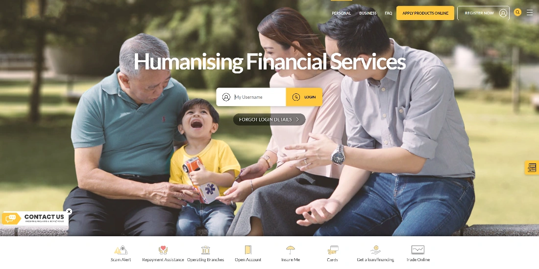
It’s Maybank! It’s easy to recognize because of its distinctive yellow colour, clean layout, and the consistent way these elements are used across their website.
Functional Consistency
This type of consistency focuses on how things work. When similar actions always behave the same way, users can predict what will happen. This predictability builds confidence.
A simple example is the “Back” button; it should always take you to the previous page. If it works differently in different parts of the same app, users become uncertain and frustrated.
Internal Consistency
Internal consistency means that every page or feature in the same product follows the same structure, patterns, and behaviors. For instance, you can reliably expect the same navigation menu to appear on every page of a website you’re browsing. This makes it easier for people to learn how your app works. When you add new features later, users can adapt quickly because the new parts feel like a natural extension of what they already know.
External Consistency
External consistency goes a step further: it’s about keeping similar patterns across different but related products or platforms. When users are familiar with one product, they can transfer their knowledge to another without starting over.
A good example is Adobe’s user interface: if the user is familiar with Adobe Photoshop’s toolbars and menu layouts, it is easier for them to reuse the same knowledge to use Adobe InDesign because of the consistent user experience.
How To Have A Consistent User Experience
Having a consistent user experience involves being able to replicate the same action or element whilst supporting the user in achieving their task. Here are four ways to make your user experience more consistent:
- Maintain visual consistency: Use the same fonts, colours, spacing, and layouts everywhere.
- Speak with one voice: Decide on a tone and style of language and apply it across your product.
- Follow familiar patterns: Use standard layouts and common UI elements so users don’t have to guess.
Visual Consistency
Typography, space, size, positions, grid, colours: define these elements in one central design guideline and utilize them accordingly across the system.
By following these guidelines everywhere, your product looks like a single, cohesive experience. It also helps create visual hierarchy: important buttons or links are bigger and stand out; secondary actions are more subtle.When users see the same colours, buttons, and layouts across your app or site, they don’t need to relearn things every time. It reduces confusion and makes their journey smoother.
Tone & Voice
Think of your product as the spokesperson for your company.
Does it sound friendly? Helpful? Formal? Choose a tone and stick to it.
For example, if you want a friendly, light-hearted tone, use that style even in error messages. When users get one consistent voice, it feels like they are interacting with the same “person” every time. Multiple voices can feel jarring and unprofessional.
Familiar Patterns
Some patterns are so common that users expect them without thinking:
- The search bar is in the top centre.
- A login button is in the top right.
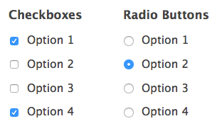
- Radio buttons mean “choose one option,” while checkboxes mean “choose more than one.”
By sticking to these established patterns, you reduce the learning curve. Take the design convention of radio buttons, for instance, is used when only one option is allowed, whereas checkboxes are used when more than one option is allowed.
Take advantage of these existing design conventions, and familiar patterns by incorporating them into the design. This will help to smoothen the user journey with familiar elements instead of confusing the user.
Another example is the well-established layout convention of an e-commerce website. Cognitively, users know that the logo is on the top left, the search bar is on the middle, and the log-in button is on the top right.
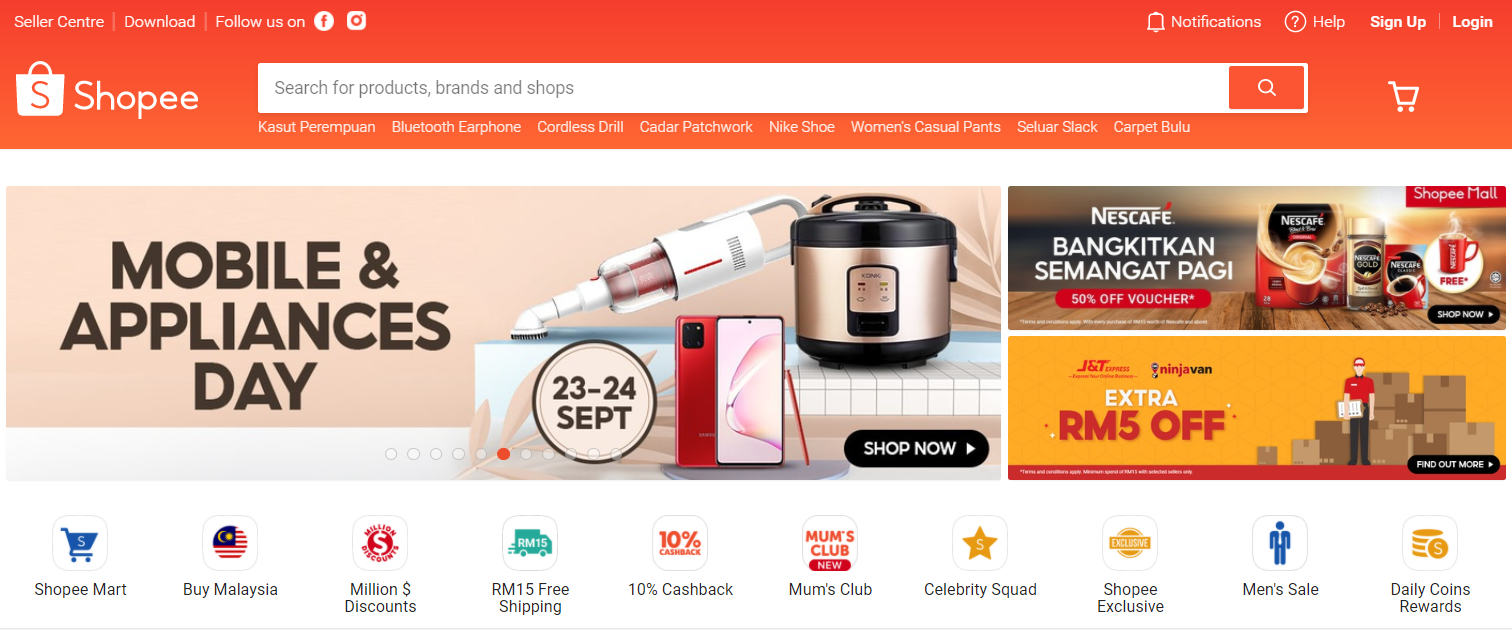
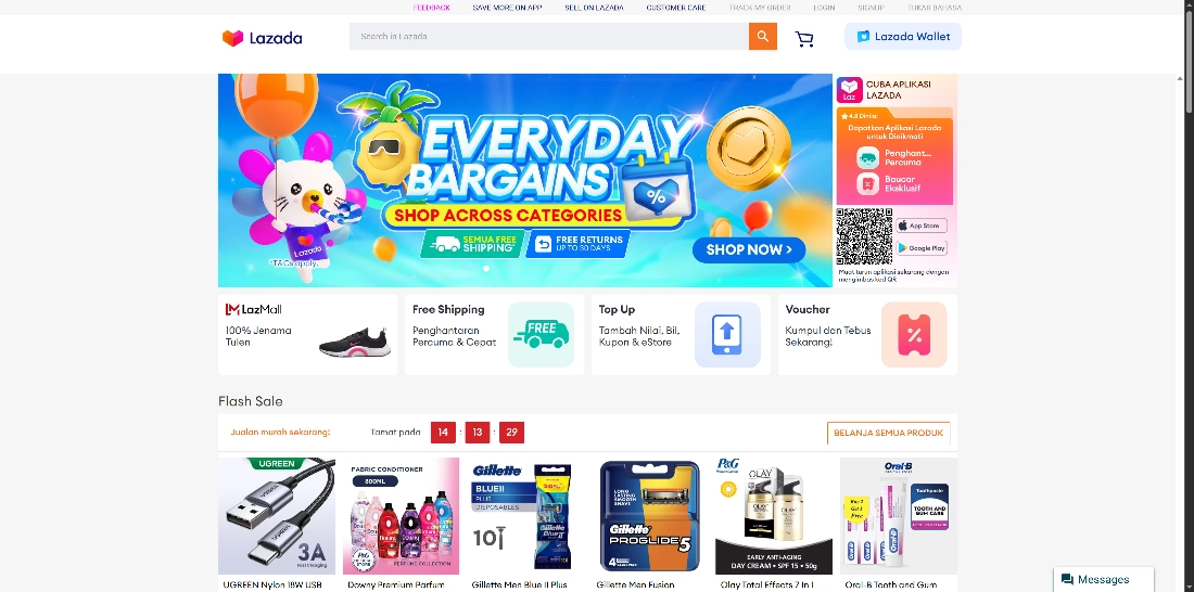
The consistency in layout helps the users feel like they know what they are doing instead of feeling disoriented, even when they are browsing a new site.
Bending Consistency
Some people think that consistency makes design dull or stops innovation. In reality, it’s the opposite. Consistency gives you a strong base. When users know what to expect, creative touches stand out in a good way instead of confusing them.
Consistency also saves time. With clear guidelines, teams don’t have to spend hours deciding how a button should look or where a menu should go. This frees up energy to focus on new ideas that make the experience better. This doesn’t mean everything must always look or work the same. There are times when bending the rules can improve your product—but it should be done with care.
But before you make changes, understand your users. Any adjustment should come from user research: what they need, what confuses them, and what helps them achieve their goals. When you make small, thoughtful changes based on user insights, your product keeps evolving. It grows in a way that feels fresh but still familiar.
In short:
- Consistency provides a solid base that allows creativity to shine.
- Clear guidelines save time and reduce unnecessary debate.
- Bend the rules only when you have a good reason, backed by user research.
Making small changes will continually evolve your business into a better version, all whilst keeping it consistent. How else can you improve your user experience? Check out this article for 12 Principles To Follow For Better User Experience (UX)
Final Thoughts
Consistency makes it easier to see your product the way your users do. When your design matches their expectations, everything feels natural: they can focus on their goals instead of figuring out how things work.
The best way to understand those expectations is through user research—talking to users, running usability tests, or creating user personas. These insights show you where to stay consistent and where a small change could make things better.
If you’d like to learn more about creating a consistent user experience or how research can guide your design decisions, get in touch with us at support@netizenexperience.com or visit www.netizenexperience.com.


