

You open an app in the morning to check your bills. Instead, you find yourself navigating a maze of promos, loans, and shopping tabs.
Welcome to the double‑edged sword of the super app; more convenience, more complexity.
What begins as a convenience promise can quickly turn into a cluttered, high-friction experience if design and architecture are not aligned. In Southeast Asia, platforms like Grab, DBS PayLah!, and GoTo are showing that scale does not have to mean sprawl. Read on to see how modular app architecture, clearer UX boundaries, and linked services can deliver “more features, less frustration” without overwhelming the user.
Note: Where platforms don’t name “discoverability” explicitly, we infer it from their published goals (faster builds, fewer regressions, cleaner interfaces) as UX‑driven efforts to reduce friction
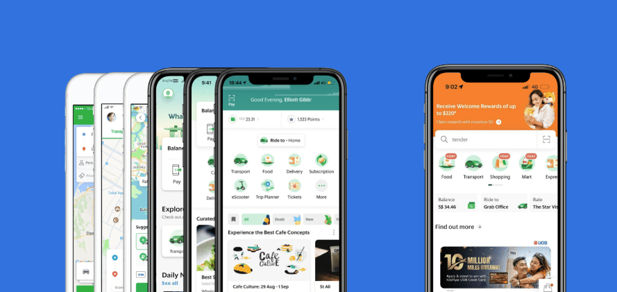
1. Grab: Breaking Down the Digital Monolith
The Monolith Problem
Over time, Grab’s single codebase came to include rides, delivery, payments, insurance, micro‑loans, even groceries. They have come to realize that every release meant rebuilding and retesting hundreds of intertwined features; delaying updates, risking regressions, and measuring in seconds of extra startup time felt painful to users.
What Grab Did: Modular App Architecture
- Developer Benefit: The team refactored into over 1,000 independent modules, forming a modular app architecture with core libraries for networking/UI and separate feature libraries (rides, food, wallet, etc.). Now build tools only recompile the modules that changed, cutting build times by as much as 60%.

- Trade‑Off: Splitting the monolith isn’t free. It introduced extra configuration, longer initial migration, and heavier IDE workloads. Grab engineers admit this was “not an easy or small task,” but ultimately worthwhile.
- User Benefit: Although every module still ships with the app, behind the scenes this modularity enabled performance optimizations; caching service tiles, lazy‑loading certain assets, and reducing cold‑start latency by around 4 seconds. The result: faster, more predictable launch times and fewer “spinning wheel” moments.
Central Design Token
- To tame visual inconsistency, Grab’s design team created a central token library—standard colors, typography, spacing, and button styles. Every new feature must draw from this set, preserving a cohesive look as services expand.
Test-and-Learn A/B Culture
- Major UX changes now go through continuous testing. Before a wide rollout, Grab pilots tweaks (e.g. relocating an “Order Again” button) with a small cohort, measuring engagement and satisfaction. Only winners make it into production; minimizing the risk of unwelcome surprises.
The Outcome:
Grab went from an overloaded super-app to a platform built on modular app architecture that feels light, responsive, and seamless; making life easier for both daily users and the teams who build it.
2. DBS PayLah!: Ecosystem Without the Overload
Feature Sprawl & Technical Debt
Originally a simple P2P wallet, PayLah! became cluttered and slow. UX analyses (independent of DBS) observed that the 2018 PayLah! app was “cluttered with a surplus of underutilized features” and that peer-to-peer transfers still “felt sluggish”. Users noted a confusing home screen and extra confirmation steps. Thus the article is correct that adding too many services risked confusing users.
What DBS Did: API‑First & Microservices
- API Platform: DBS launched one of Asia’s largest banking‑API hubs, exposing over 150 endpoints; everything from wallet top‑ups to reward redemptions. Partners plug in via APIs, removing the need to embed mini‑apps directly into PayLah!’s code.
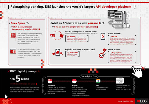
- Domain‑Driven Refactoring: Behind the scenes, PayLah! was decomposed into microservices (payments, accounts, promotions), creating a modular app architecture where each component is independently deployable. Release cycles shrank from quarters to weeks, and a single service outage no longer dominoes across the platform.
The Outcome:
PayLah! keeps growing without losing clarity. Users experience a wallet that adapts to their habits, and DBS teams scale the business without scaling “super-app stress.”
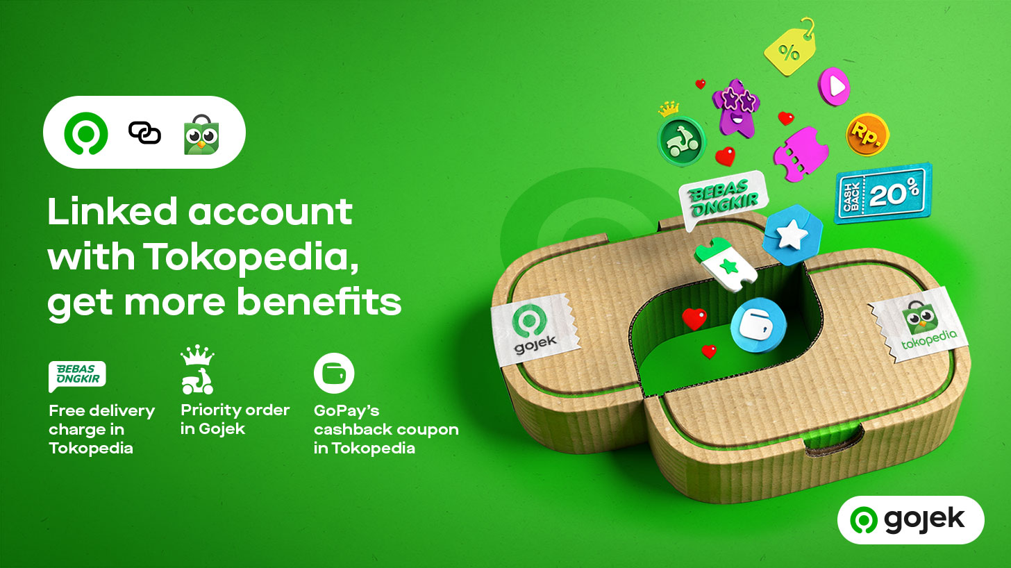
3. GoTo: The Power of “Split But Linked”
The Merger Dilemma
After Gojek and Tokopedia united under GoTo, engineers and regulators alike questioned: merge into a single super‑app or keep two? A unified app risked monolithic complexity and ran afoul of Indonesia’s antitrust concerns.
What GoTo Did: Account Linking, Not App Merging
- Separate Apps, Shared Wallet: Users link their Gojek and Tokopedia accounts to share GoPay balances and loyalty points without cramming ride‑hailing and shopping flows into one overloaded interface.
Accessibility and Micro-Interactions
- Both apps now support high‑contrast, dyslexia‑friendly, and color‑blind modes, built from shared UI components. Gestures and micro‑animations are standardized, so features introduced in one app immediately feel familiar in the other.
The Outcome:
GoTo’s “split but linked” approach means more people are finding what they need, fast: Millions of extra users are riding and shopping each month, and the total value of transactions has jumped by almost a third. By keeping apps focused but connected, GoTo hasn’t just made life easier for its users. The numbers show it.
Core Lesson: Why Modular Architecture Makes Super Apps Work
Think of super apps like LEGO sets: you can build big, but only if every piece is well-designed and fits cleanly with the others. Grab, DBS PayLah!, and GoTo show that success comes not just from doing more, but from building smarter—so both users and company teams win.
Break: Make Features Modular
- What it means: Each service lives in its own “block.” Features load only when needed.
- For users: The app is quicker, less overwhelming; no extra loading for things you don’t use.
- For teams: Fixes or launches happen fast, with far less risk of breaking other features.
Build: Standardize Design and Process
- What it means: Every feature or partner uses the same design language and rules.
- For users: Even as new options appear, everything looks and feels familiar.
- For teams: No time lost reinventing basics; launches and support are smoother.
Connect: Link Value, Not Clutter
- What it means: Core app connects to partners and extra features using APIs, so new things appear only when relevant.
- For users: You get shortcuts and suggestions that genuinely help, not a flood of unwanted menus.
- For teams: Teams can swap partners or improve sections quickly, keeping the core stable.
In practice:
- Users enjoy an app that feels lighter, clearer, and more personal, even as features grow.
- Teams experiment, fix, and scale with less stress and more success.
The Takeaway:
Build super apps like modular, connected LEGO—everyone gets more power, but no one is stuck with extra weight.
Ready to see how SEA’s super apps build trust into every tap? Continue on to Part 2!


