

Tech in Asia, one of leading online news sites that covers technology and startup news in Asia recently launched their mobile app on iOS platform. As most of our team in Netizen Testing are frequent readers of the site, we’re extremely excited about the launch.
Tech in Asia launching their new iOS app
We decided to run a quick usability testing on the TechinAsia(TiA) app in conjunction with our upcoming research initiative: Mobile Apps and Media / Entertainment Industry. We tested the app with only 3 users: 1 TiA readers and 2 non-TiA readers with tech/startup interest.
The initial plan was to test with at least 5 users, but we found that we were able to gain valuable insights even with the pilot test, and the first few tests, so we stopped the test. Low number of users is always sufficient to identify most usability issues when it is an app or site that has not gone through validation and iteration.
Although content is essential for a news app or site, we have no doubt on the quality of content produced by Tech in Asia. At least, evaluation for the article content quality should not be necessarily considered for this round of testing. By the way, all users liked the article contents during the test. We understood that it is an early version of the app, so we only summarized the findings into two sections: things that work and things that need improvement.
Things that work:
Nothing much.. but with great first impression
Yes, currently there is nothing much that the app can do. Still, users found the design looks clean and professional. Navigation is considerably smooth too. Most importantly, they are able to read the words clearly.
Users loved the fact that pictures in the article can be zoomed. Some news sites show only static pictures that can’t be zoomed or can’t be viewed in photo gallery mode. It can be very frustrating.
This video (below) somehow summarized overall experience of first time users.
https://youtu.be/OyrN_yQHySo
Things that need improvement:
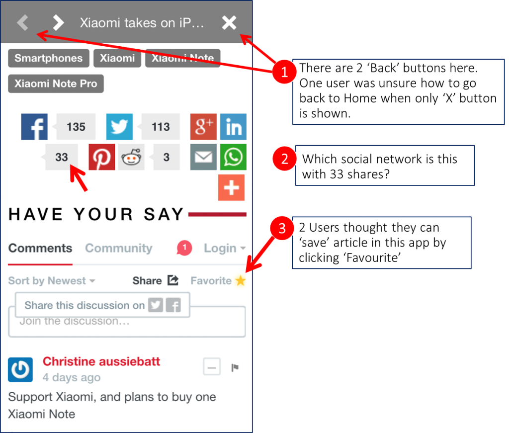
In-App browser: Sorry, this favourite doesn’t ‘favourite’.
https://youtu.be/uAmZuF0sZWU
As shown in the video, a user clicked on the ’Favorite’ button and then the user instinctively proceeded to ‘My Stream’ to look for his ‘Favorite’ articles. He expected ‘My Stream’ to be a place to save their articles. Later on, he found a way to ‘save’ it for future reference by utilizing the email sharing button.
“Too many stuff here; I expect to see the article immediately. How about moving advertisement, author picture, or social media sharing to the bottom?”, a user suggested.
Tips for users: Avoid inserting sensitive information in in-app browser.
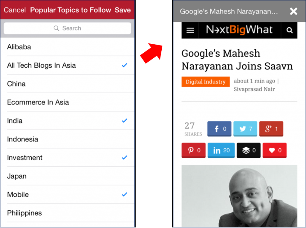
The clash of the stream: Topics, Favourites, or what?
Initially, I thought ‘My Stream’ was a good name, but it turned out it was not the case. ‘Thanks’ to the user guide, I expected ‘My Stream’ to be a place to store or follow topics (articles from TechInAsia).
Users misunderstood ‘My Stream’ as a ‘place to store articles’. As such, one user utilized the ‘My Stream’ function, yet did not realize that was not the right place for him to find ‘topics to follow’.
A user was trying to save an article related to ‘Ministry of Defence’; she clicked on ‘My Stream’, selected ‘Singapore’ to follow. She saw the article and commented that she would be able to read that particular article from there in the future.
At the end of a test, one user finally opined that ‘My Stream’ is actually an alternative to search for specific topic, because there is no way to perform search on ‘Home’. He insisted that he should be able to view his ‘Favorite’ posts somewhere in this app. Other user was also confused with the disguised ‘Favorite’ button by thinking that he could ‘Favorite’ an article and view it later.
In terms of topic categorization, a user also suggested that the arrangement of topics list (My Stream) should be segmented into different categories such as ‘Countries’ instead of listing everything in one place based on alphabetical order. Another user also questioned “hmm, Singapore, Thailand, Indonesia, where’s Malaysia?”
NO-tification
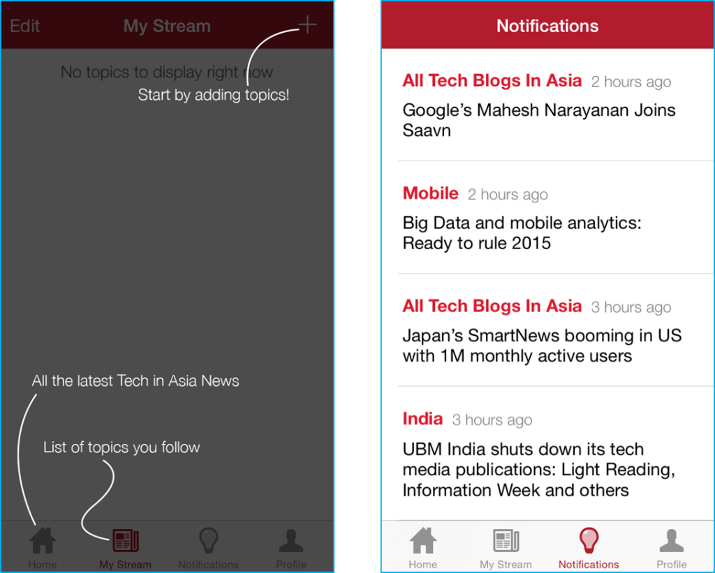
All users were unsure about the use of ‘Notification’, they soon found out that it was a place that displayed all articled based on the selected topics from ‘My Stream’.
Verdict:
The app has comfortable reading experience, not much problem with browsing and reading. However, the functionality of an in-app browser is definitely not on par with Chrome or default mobile browser. So, improvement on article reading experience is expected. The idea of ‘My Stream’ can be misleading especially to people who wish to save articles for future review.
Talking about a common question – “do we really need an app?”; upon completing the test, users were asked on whether they will consider using the app again. Most responded that they will use it. However when we probed them further on whether they use other news site app – “No, I don’t see the need of using a news app, I would prefer to browse the sites which works very fine for me.” , a TiA reader responded. Aha!
Another user (non-TiA reader) also commented that he would consider using the app in the future, however, he disliked the fact that he couldn’t save article to read later, which is a common function that most mobile browsers are already providing. Think Facebook in-app browser.
News apps that the users have used before include: Pulse, Today News and Times of India.
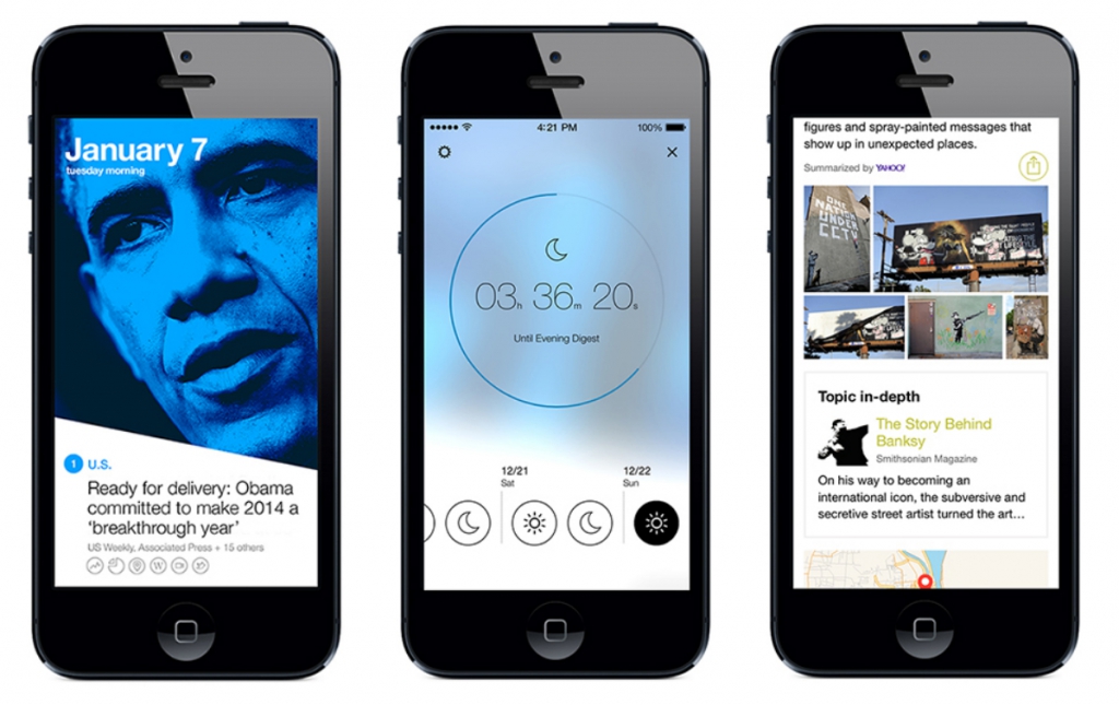
Need a great news app example? meet Yahoo! News Digest – Apple Design Award winner
I’m not entailing that TechInAsia or any other site should follow the design of Yahoo! News Digest app. Every business is unique, both TechinAsia and Yahoo News Digest apps have different interest, but there is something that we can learn from a great app design. It has been my interest to ‘test on new stuff’ ever since I started testing (or trying out new) mobile apps of Nokia Symbian smartphones since secondary school, and introducing great ones to friends. I would personally envision Techinasia to be a Flipboard like app without the flipping part (yes).
I’ve tried out a number of news apps of reputable sites on phone/tablet and even desktop. Most news apps did not maintain a spot in my phone for more than a day mainly due to lack of differentiation. I can always visit their mobile site and the sites usually serve me well. I hate Forbes mobile site very much, but I still visit it because they have great contents that I’m interested in.
There is only 1 app that managed to survive on the home screen of my phone: Yahoo News Digest. I recently just removed Flipboard from my phone due to personal productivity management; it stayed on my Surface device though. Below I will be sharing my opinions on why Yahoo News Digest deserves an unchallenged space on my phone and crowned Apple Design Award.
“App is different from site” – so easy to say yet hard to implement. There are generally 3 things that the Yahoo team did superbly well in crafting their app’s UX. From there you can also see the points why Merissa Mayer ‘shopped’ Summly and grabbed its founder to join Yahoo.
1. Content:
- ‘10 must -know news of the day’, delivered twice a day!
- Wanna ‘Read More’? Granted! Even if you’re not interested in all the top 10 curated news.
- Every single thing that you need to know about the article, there for you! Videos, Numbers, Facts, Pictures, Tweets, Quotes, Wikis, Maps, References.
2. Context:
- Swipe left/right to read other articles.
- Clicking on the number directs you to article.
- Pretty intuitive, pretty accessible, pretty pretty.
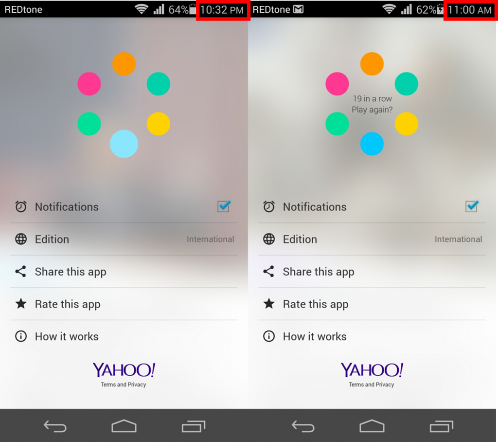
3. Special: News Gamification?
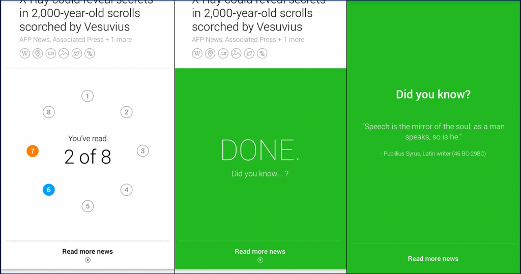
i. #AchievementUnlocked: Read all curated news to ‘unlock’ knowledge.
Background screen changes over time.
ii. And literally.. a game..
I once played their game and unintentionally promoted the app to a friend. He heard the sounds came out when I tapped on the circles and asked me about the app. The same happened when I was writing this article, I played with the circles and generated some sounds, “Hey! What’s that?!” the whole team responded.
Sum up:
Hidden but smart discoverability. Content is King, Context is Queen; Yahoo! News Digest, the user-friendly prince.
Personal note: I might be intriguingly hooked with the Yahoo News app because of my daily habits of reading Yahoo news ever since I was a kid; it was the first website that I visited in life! I did not browse their desktop site regularly anymore, even before this app is introduced. The reason can be a combination of increasing competition and the changes of site design (especially the latest layout).
NOTE: Netizen Testing was also the finalist in the Startup Arena Singapore 2013, an event by Tech in Asia.

Disclaimer: We do not publish works that we’ve conducted for our clients or with our partners unless permitted. Other than conducting research for clients, we keep ourselves updated with the latest online behaviour by regularly studying different industries like education, telecommunication, travel, e-commerce.


