


Remember back in the early 2000s when watching TV was completely mindless? You just picked up the remote, hit the power button, and flipped through channels until something caught your eye. There were no passwords to remember, no profiles to choose, and no loading screens. It just worked.
Today, that simple experience has evolved significantly, and as a UX researcher, I see the complex reality of this in user interviews. If you want to watch a movie, you have to remember which of your various apps actually hosts it. Every platform features its own subscription model, interface logic, and authentication requirements.
With so many platforms to keep track of, users frequently share that they’ve entered a cycle of subscribing and cancelling so many times that it is difficult to keep track of what they currently manage. This is partly because content trends can feel quite similar across platforms, which occasionally strips services of a distinct visual or thematic identity.
When users do log in, they often encounter a well-known design challenge: choice paralysis. The modern streaming landscape presents a unique paradox where audiences are frequently overwhelmed by the sheer volume of available content.
In fact, it has become a relatable cultural trope that by the time someone finally selects something to watch, they have already finished eating their dinner in front of a silent screen. What presents as a lighthearted frustration is actually a significant UX opportunity; navigating these ecosystems has simply begun to require too much deliberate effort.
This represents a profound shift in the streaming industry. In 2026, the most valuable feature a platform can offer is no longer just exclusive content, but effortlessness. The services leading the market today are those that require the least amount of cognitive energy to navigate. Instead of judging a platform solely by its catalog, users increasingly measure value by:
- Content accessibility: How quickly content becomes accessible.
- Interface design: How naturally it fits into their daily routines.
- Streamlined playback: How little interruption exists before playback begins.
Why Streaming Still Feels Like TV
For years, platforms competed fiercely through expanding content libraries, original productions, and premium sports rights under the assumption that more content automatically created stronger user retention.
But today's reality is a dynamic environment where native, on-demand pioneers like Netflix operate alongside established legacy players who originally championed the traditional cable, broadcast, and satellite TV industries.
As illustrated in the timeline below, this decades-long evolution from a "TV-First Era" to the modern "Streaming Wars" means these competitors are entering the battlefield from entirely different technological starting points.
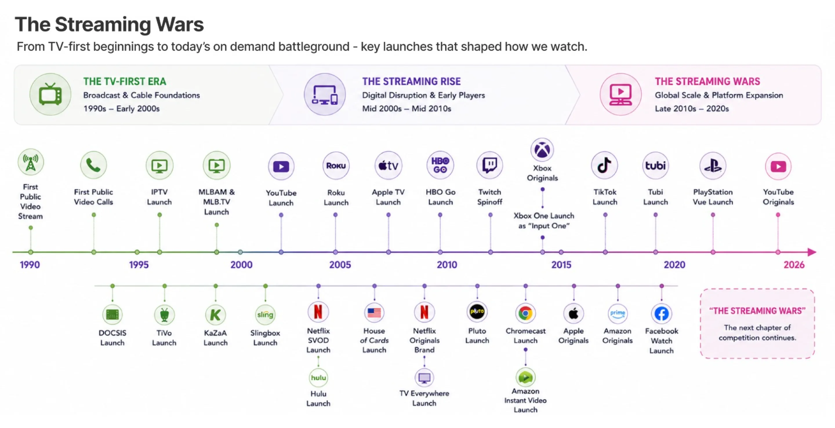
For these established broadcasters, the transition introduces unique structural challenges because their platforms were originally built around linear, scheduled viewing models rather than native on-demand behavior.
According to the Nielsen State of Play Report, as audiences shifted toward streaming, traditional networks adapted their TV-first infrastructure into digital services. These legacy systems were optimized for scheduled programming and channel-first navigation.
However, user expectations have evolved rapidly. Today’s viewers look for instant playback, cross-device continuity, and highly personalized discovery. This creates a natural tension between legacy infrastructure and modern on-demand expectations, which can manifest as multi-step authentications or complex content ownership paths.
The 3 Strategic Archetypes of Legacy Streaming
To solve this and meet the frictionless standard expected by modern viewers, traditional media players have adapted into three distinct strategic streaming archetypes. Each model approaches the core challenge of making viewing feel effortless from a different operational starting point.
1. The Ecosystem Leader or The "Everywhere" Utility
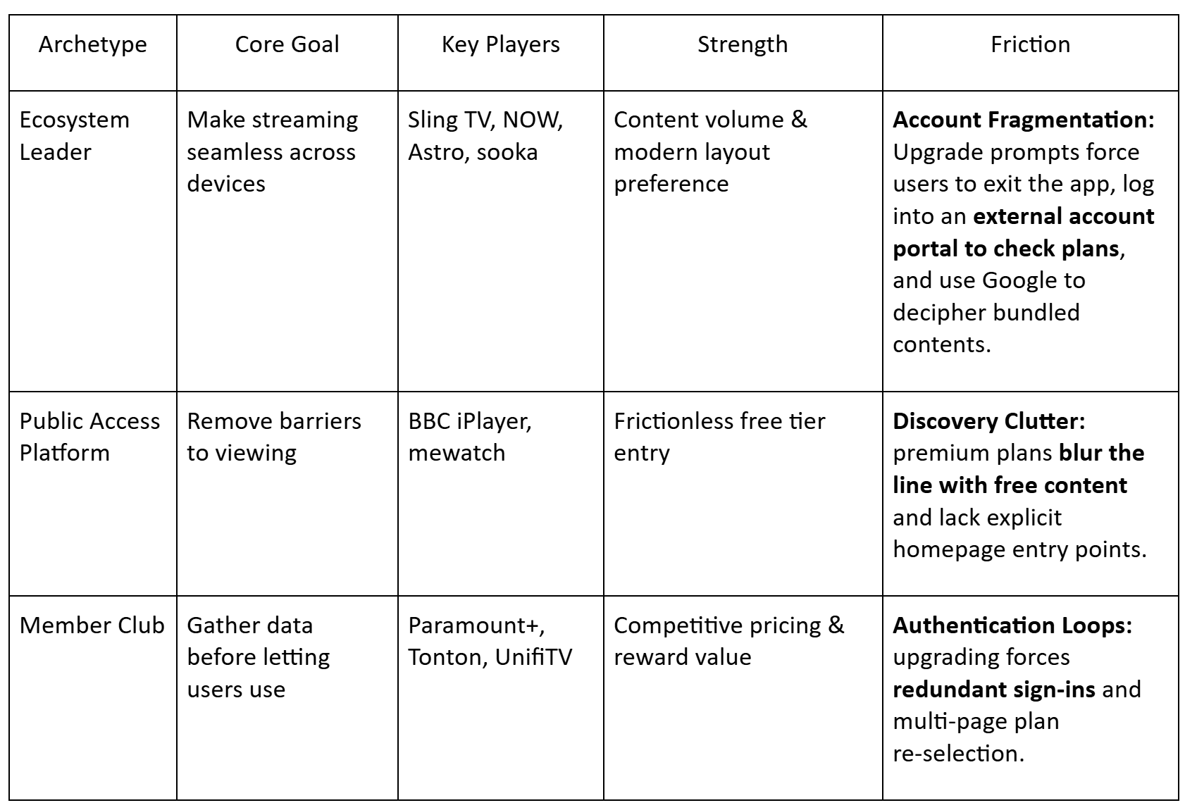
Adopted by platforms like Sling TV (United States), NOW - formerly NOW TV (United Kingdom/Europe), Astro (Malaysia), and sooka (Malaysia), this archetype represents traditional pay-TV and cable ecosystems that have successfully transitioned into the digital age.
Because they originated as multi-channel providers, their core objective is to act as a unified utility that follows the user across every screen. This aligns directly with the Deloitte Media and Entertainment Industry Outlook, which notes that traditional media is shifting from being a basic service provider to an “orchestrator of experience.” To achieve this, they prioritize cross-device continuity and advanced voice or AI navigation.
2. The Public Access Platform
Utilized by national broadcasters like BBC iPlayer (United Kingdom) and mewatch (Singapore), these are traditional, free-to-air local TV stations turned into modern streaming apps. Rooted in public or broad-reach broadcasting, their operational goal is to maximize accessibility and connect audiences with content as efficiently as possible.
To achieve this, they prioritize open discovery, immediate viewing, and minimal login barriers, beautifully recreating the old-school simplicity of casual channel surfing.
3. The Member Club (The Data-First Fortress)
Seen on platforms like Paramount+ (United States), Tonton (Malaysia) and UnifiTV (Malaysia), these are established media studios leveraging deeply on personal user relationships. Competing in a data-driven market, their goal is to encourage user registration so they can build robust, personalized profiles and understand viewing habits.
To achieve this, they prioritize sophisticated behavioral personalization, tailored recommendation systems, and member-exclusive environments.
The Shared Challenge: Balancing UX with Corporate Metrics
Ultimately, despite their different origins, all three archetypes face a similar strategic challenge: their interfaces must carefully balance internal business objectives such as user engagement, revenue, promoting tier upgrades, or maximizing data collection with the user's primary goal of effortless relaxation.
When corporate goals and user-centric design fall out of alignment, it creates specific points of friction within each model:
- For Ecosystem Leaders: The Package Boundary Guessing Game
- For platforms like Sling TV or Astro, users are highly satisfied with the massive content range and robust search mechanics. However, because they bundle a vast array of live channels and video-on-demand (VOD) assets, the primary UX friction lies in poorly signposted subscription boundaries during active browsing.
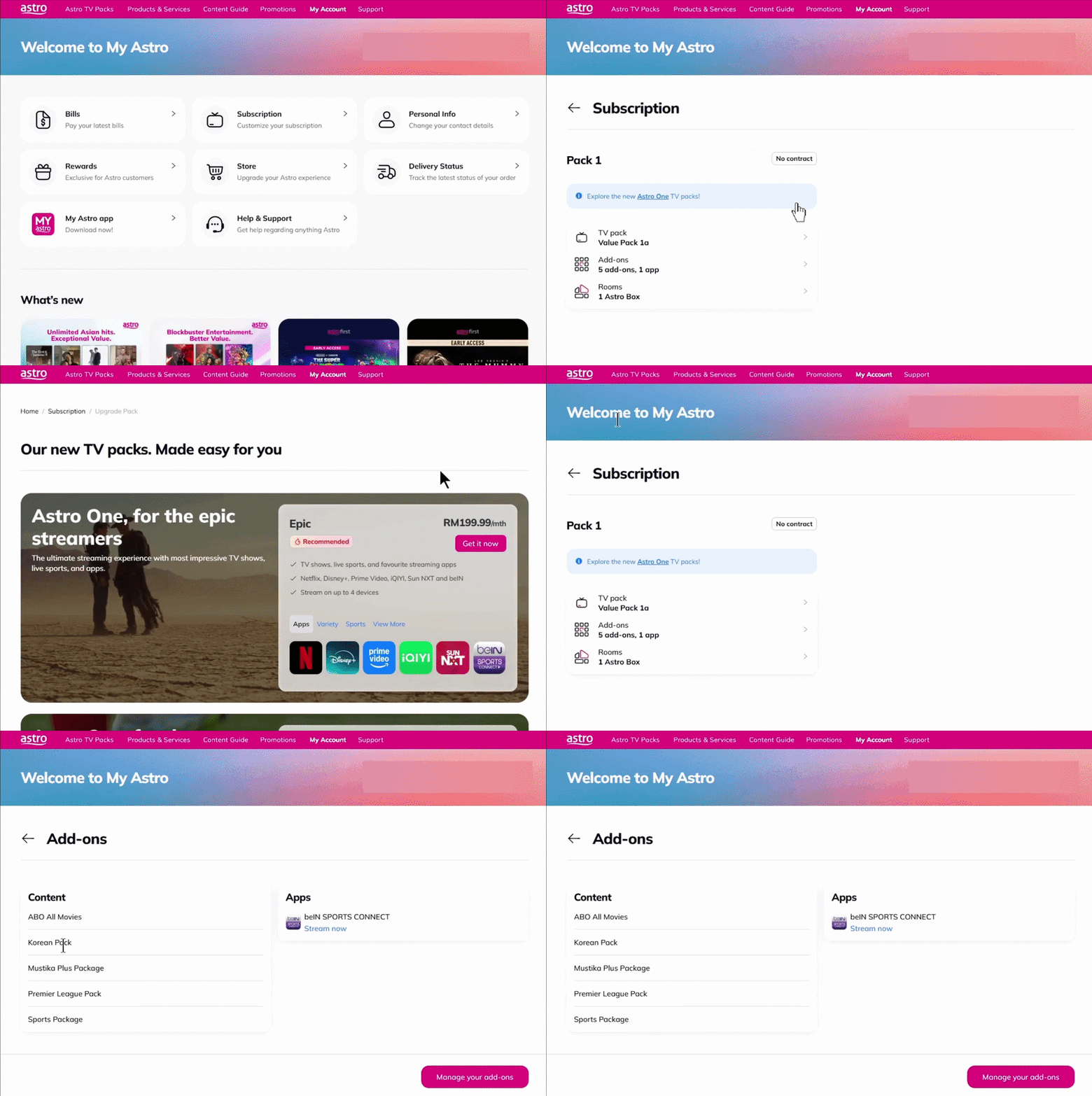
- This friction plays out as a confusing hurdle during a user's evening routine. You click a movie poster, only to be met with an unexpected upgrade prompt. Because streaming apps are optimized for playback, they rarely display account granularities natively within the viewing window. This forces you to leave your stream and log into an external account portal just to verify your active plans. Even then, if a package name is cryptic, you often have to run a quick external search just to decipher which specific channels or contents are actually bundled under it.
By the time you untangle whether a show is immediately accessible, your evening's momentum is disrupted. An interface that forces you to constantly negotiate your own subscription boundaries simply requires too much deliberate effort.
- For Public Access Platforms: The Discovery vs. Monetization Clutter
- For platforms like mewatch, the UX breakdown happens directly on the homepage layout long before a user even tries to select a show. When free-to-air content is visually blended into the same rows as premium add-on bundles and SVOD (Subscription Video on Demand) thumbnails without clear, distinct separation, it creates an irritating post-decision roadblock.
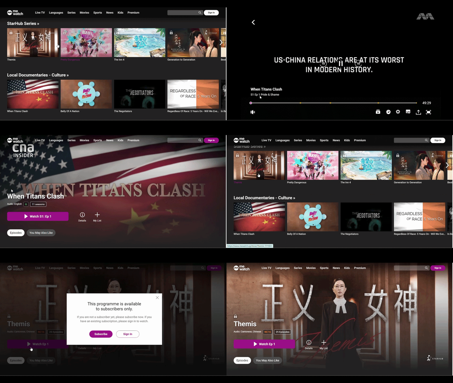
- Here, the breakdown happens before you even choose a show. You open the app, but the homepage completely blurs the line between free content and premium add-on bundles. The entry points for actual subscription details are so thoroughly hidden that you’re left guessing which titles are genuinely open-access.
On a Smart TV, this clutter forces you into a jarring detour: leaving the app entirely to search for basic pricing data on an external browser. The platform turns what should be a casual surf into an unnecessary cognitive chore.
- For Member Clubs: Fragmented Journeys and Redundant Logins
- When platforms implement mandatory account creation, frequent one-time password (OTP) prompts, or session expirations on connected TVs, it adds steps to the evening routine.
- For an archetype built on data, the checkout experience feels remarkably hostile. Even if you are already logged in, initiating an upgrade forces you into a repetitive authentication loop, demanding a second sign-in on a separate screen.
What follows is a redundant multi-page maze: you choose a package, only to be forced to re-select that exact same package on the very next listing page. Paired with a confusing, piecemeal price breakdown instead of a single total , users simply drop off before ever reaching the payment gateway.
When these business objectives overlap too heavily on the user interface, they create a cumulative cognitive load. Individually, a single promotional banner or login prompt might seem minor on a product roadmap. Together, however, they create a subtle mental burden that quickly turns into a major retention risk in a highly competitive market filled with frictionless alternatives.
This is why UX has transitioned from a design function into a core business strategy. The strongest platforms preserve momentum by actively reducing decision fatigue and authentication friction. Every single interruption represents a potential pivot point for the user.
The streaming platforms winning in 2026 are moving beyond functioning as standalone apps; they are becoming essential entertainment infrastructure. While compelling content will always drive initial user acquisition, an effortless, low-friction experience is what secures long-term retention. In a market entirely overwhelmed by choice, the platform that makes the viewing journey the simplest inevitably becomes the hardest for the user to leave.
In Part 2 of this series, I'll dive into exactly how platforms can solve these UX challenges and turn ease-of-use into their ultimate retention tool.


