
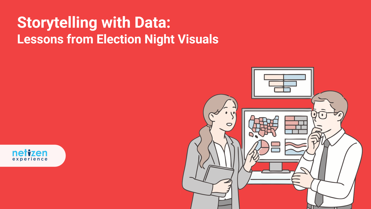
We live in a world drowning in data, and the ability to turn that chaos into clarity has never been more valuable. Yet, let’s face it, storytelling with data—translating raw numbers into something people instantly grasp (and care about)—is one of the hardest parts of the job.
When the pressure is on and millions are watching, who actually pulls it off? Enter: U.S. election night coverage, a masterclass in real-time, high-stakes data storytelling.
Every four years, newsrooms are tasked to present huge amounts of real-time data to millions of viewers. Their data has to move fast, stay accurate, and make sure the story is crystal clear. So what if we applied that same thinking to our data-driven reports?
In this guide, we’ll walk you through six visual techniques commonly used in election reporting and show how you can borrow each one to make your insights more engaging and impactful.
1. Cartogram: Reshape Geography to Show What Matters
Let’s kick things off with the cartogram! This is a technique used in storytelling with data, where the regional maps are resized based on a data point (like population or number of users) rather than actual land area. This is a particular favorite during election season as it’s an easy way to highlight electoral college votes.
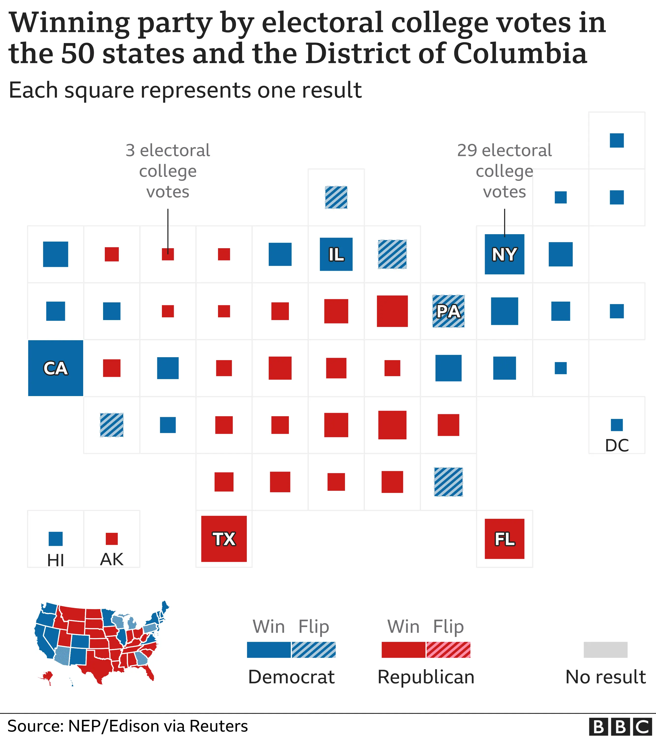
Shifting to reporting user findings, cartograms can help you draw attention to where user volume or success rates really concentrate, without overwhelming your audience.
✅ Use it when:
- You want to show data magnitude more than physical geography
- You need to visualize performance across steps or regions
Example 1: Demographic Data by Region
Want a high-level view of where your users are located? Use a cartogram to highlight user persona distribution across regions! This way, you’ll get a big picture view of users’ breakdown by location.
Here’s how that looks like based on the regions we have in Malaysia’s Klang Valley:
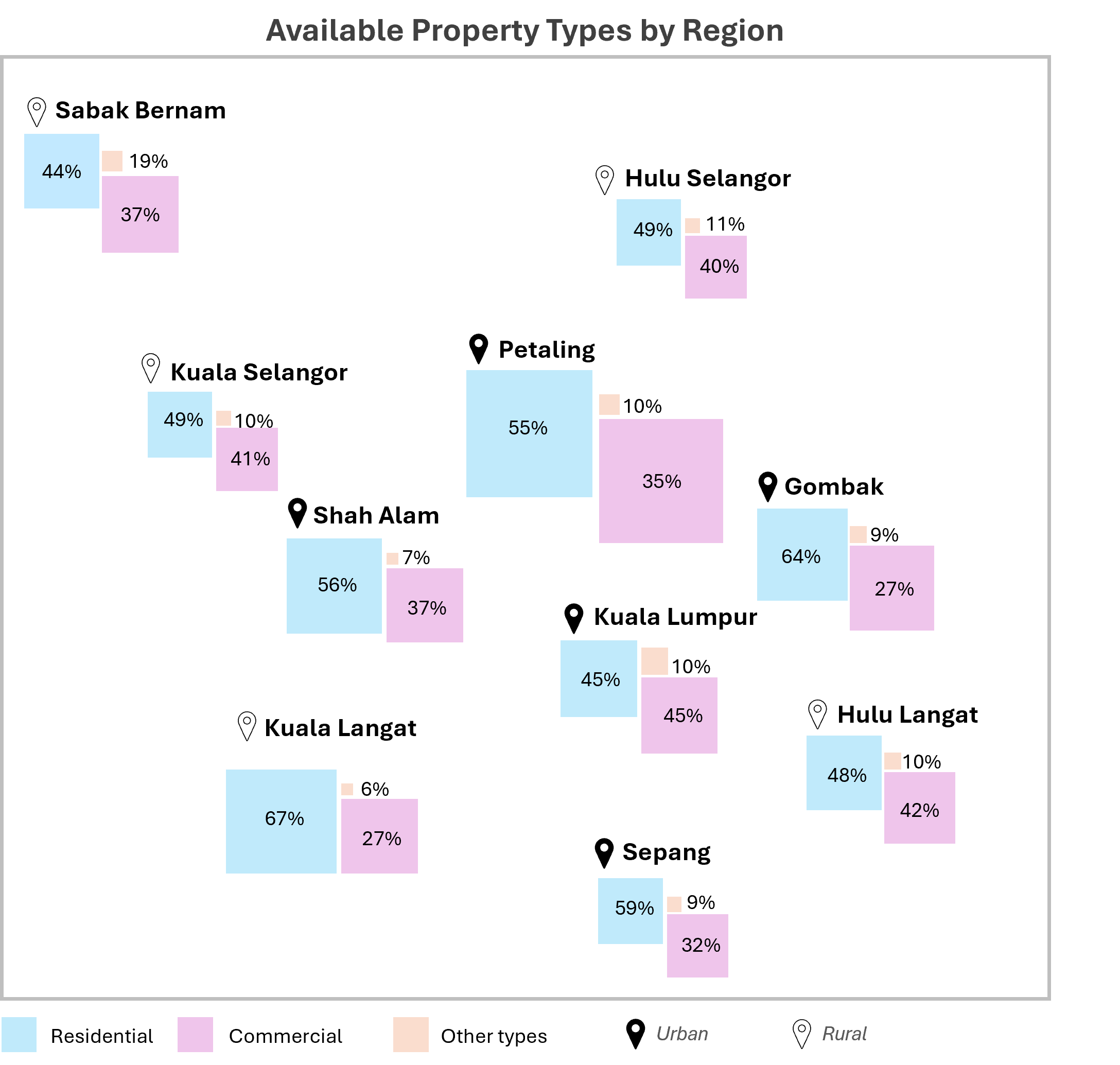
Important Indicators:
- Tile size = number of users
- Tile color = persona type (e.g., blue for residential, purple for commercial)
This gives you an immediate sense of scale as to where user groups are concentrated without worrying about actual map shapes.
But if you need to keep real-world geography intact, don’t worry—we’ll cover that later on in this article!
Example 2: Task Success Rate Across a Journey
Other than geographical data, we can also use cartograms to visualize success rates along a task flow. This approach draws immediate attention to tasks with high or low performance, as you can instantly see where users are succeeding, or getting stuck.
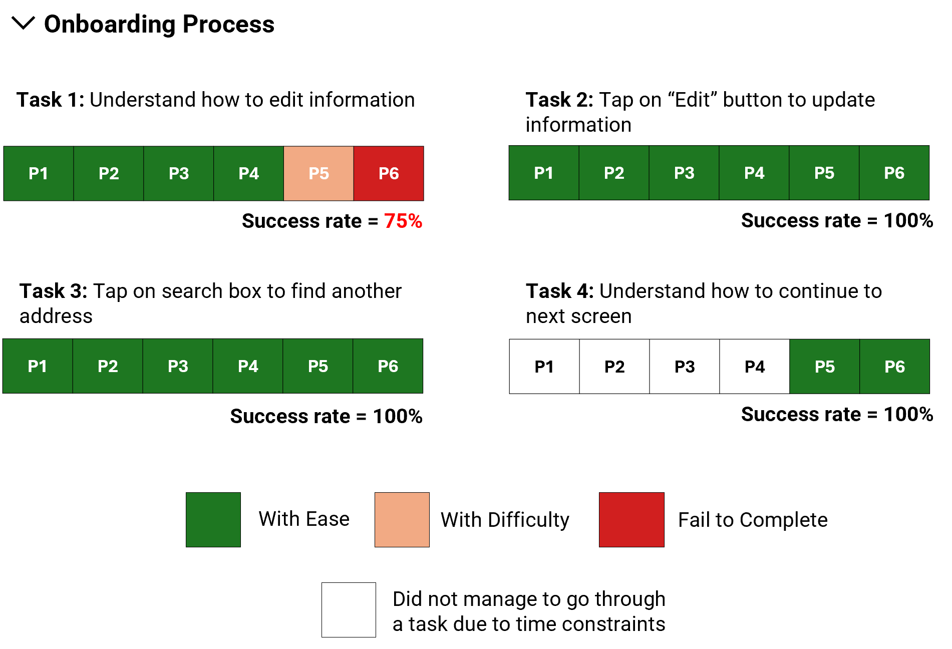
Important Indicators:
- Each tile = one user
- Rows = tasks, sequenced by journey step
- Tile color = outcome (e.g., red for failure, green for success)
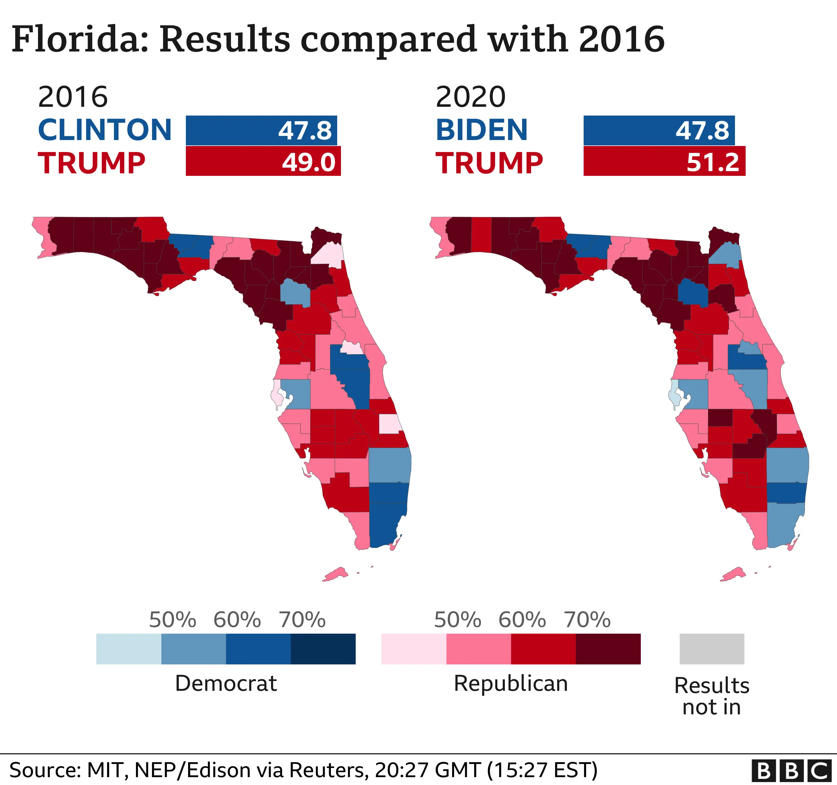
2. Geographical Maps: When Location Tells the Story
If you have ever navigated locally or overseas, you’d be familiar with geographical maps. Unlike cartograms, geographical maps keep region shapes intact. That makes them ideal when spatial relationships (like proximity or clusters) matter in your analysis.
Election maps often use shading or overlays to show voting margins.
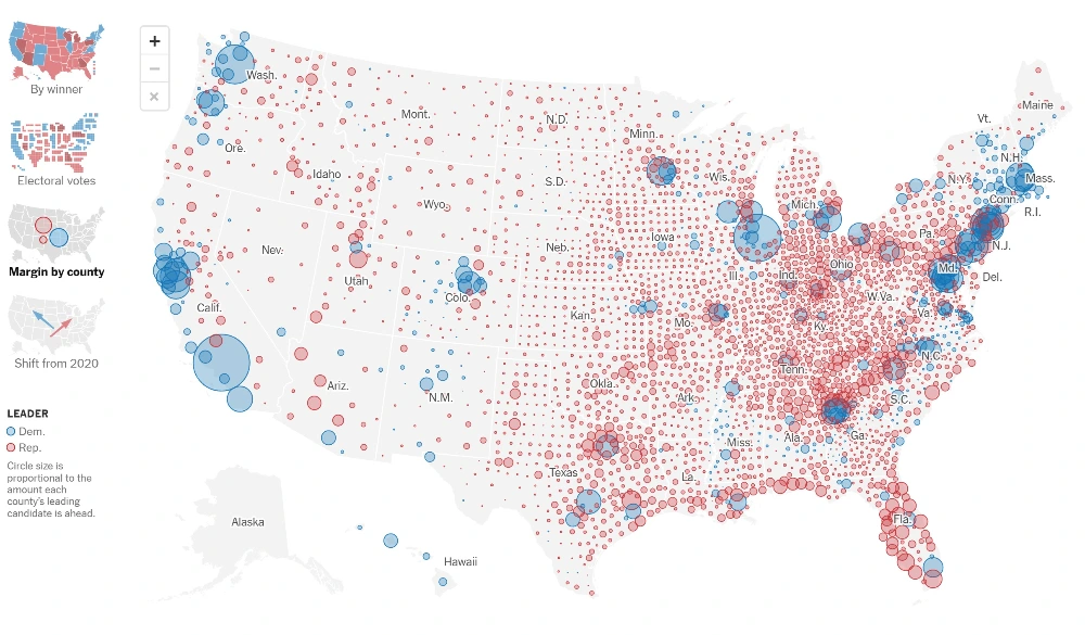
For presenting user insights, you can do the same to show where engagement or satisfaction changes based on actual location.
✅ Use it when:
- You want to keep geography accurate
- You’re showing trends that are spatially relevant
Example: User Personas Breakdown by Region
Remember how we talked about mapping user personas with a cartogram? Well, if you want to preserve the real world map layout instead, especially when proximity or region shape matters, a geographical map is your go-to!
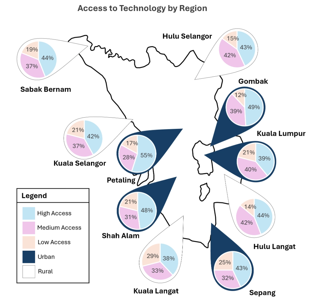
Highlights:
- Data was mapped geographically to preserve location accuracy
- Utilize pie charts showing both data volume (pie size) and category breakdown (pie color) across regions. Note that to use the pie chart, make sure that all your numbers add up to 100%!
3. Heatmaps: Make Activity Pop Off the Page
You’ve probably seen heatmaps during elections showing party strongholds. In case you’re not familiar, a heatmap is a color-coded visual where darker shades indicate higher levels of activity in specific areas, making it quick to identify trends or behaviours.
The idea of a heatmap is simple: darker = more activity. It’s a classic example of storytelling with data, making it easier to spot patterns at a glance.
In any web performance report, they’re a go-to for visualizing engagement and identifying problem areas.
✅ Use it when:
- You’re analyzing user interaction on interfaces
- You want to pinpoint hotspots or drop-off zones
Example: User Engagement Rate on a Webpage
Heatmaps are not new to most researchers and analysts. We use it to show where–in a webpage layout–users are clicking or ignoring. This way, it’s much easier to identify specific screen elements that users may have issues with.
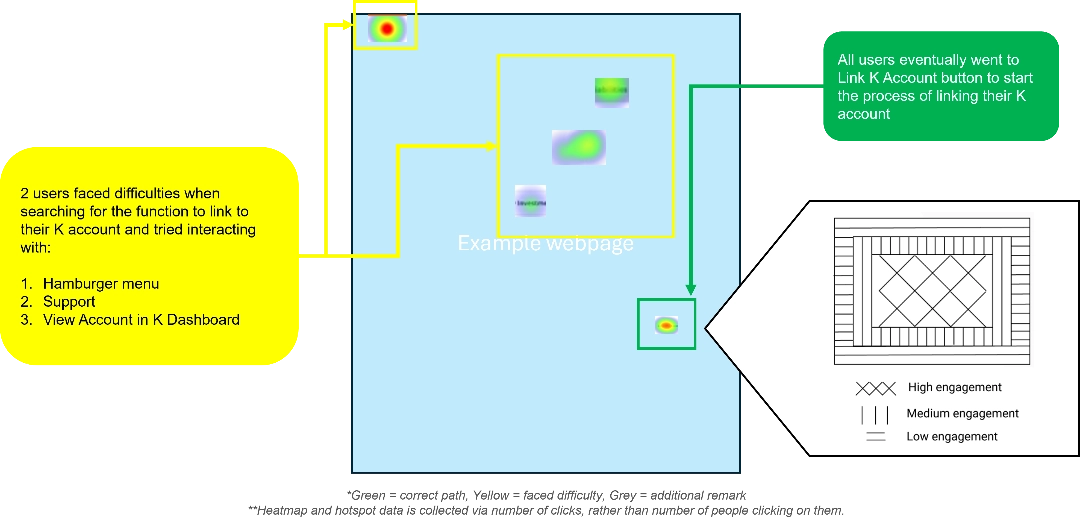
Important Indicators:
- Color intensity for click volume
- Improve accessibility by including optional patterns or textures in addition to color. This way, anyone with color blindness can still interpret the data accurately!
4. Segmented & Stacked Bar Charts: Show Proportions with Precision
We’re all familiar with the basic bar charts (I hope!). It’s simple and gets the data across well but when the data gets complicated, that’s when segmented and stacked bar charts take the spotlight! Let’s first have a look at the segmented bar chart.
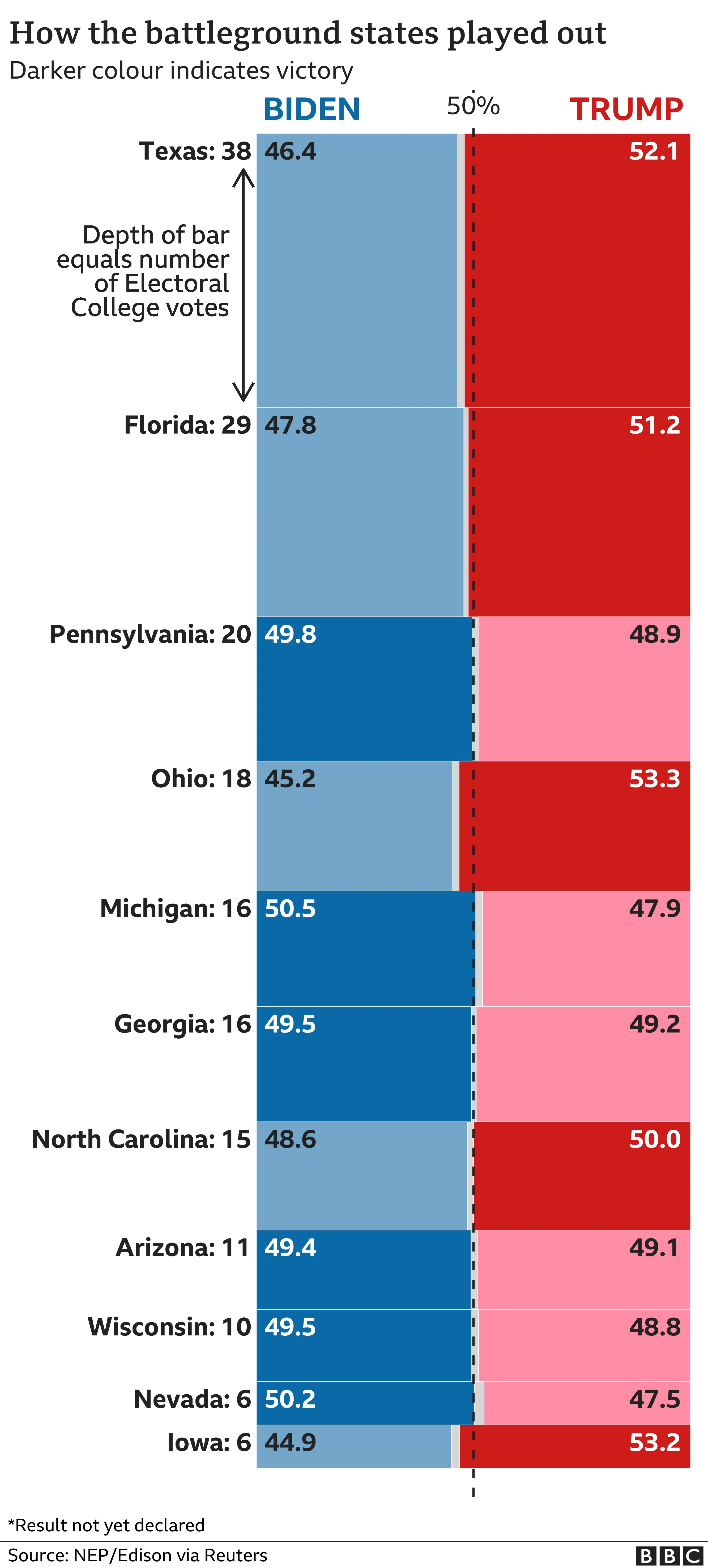
Unlike regular bar charts, its bar length stays the same. Instead, what changes is how the segments are distributed. In some cases, you can even adjust the bar depth to highlight data weight!
Election coverage often uses segmented bars to highlight battlegrounds or voter splits, so in seeing it from a general reporting point of view, it is especially handy when comparing completion status, user preferences, or breaking down categories within the same total.
Example: Segmented Bar Chart for Task Completion
One such example is using the segmented bar chart for task completion rate by showing the proportion of user completion status. In a snap, you can instantly identify how many users completed a task, abandoned it or encountered errors.
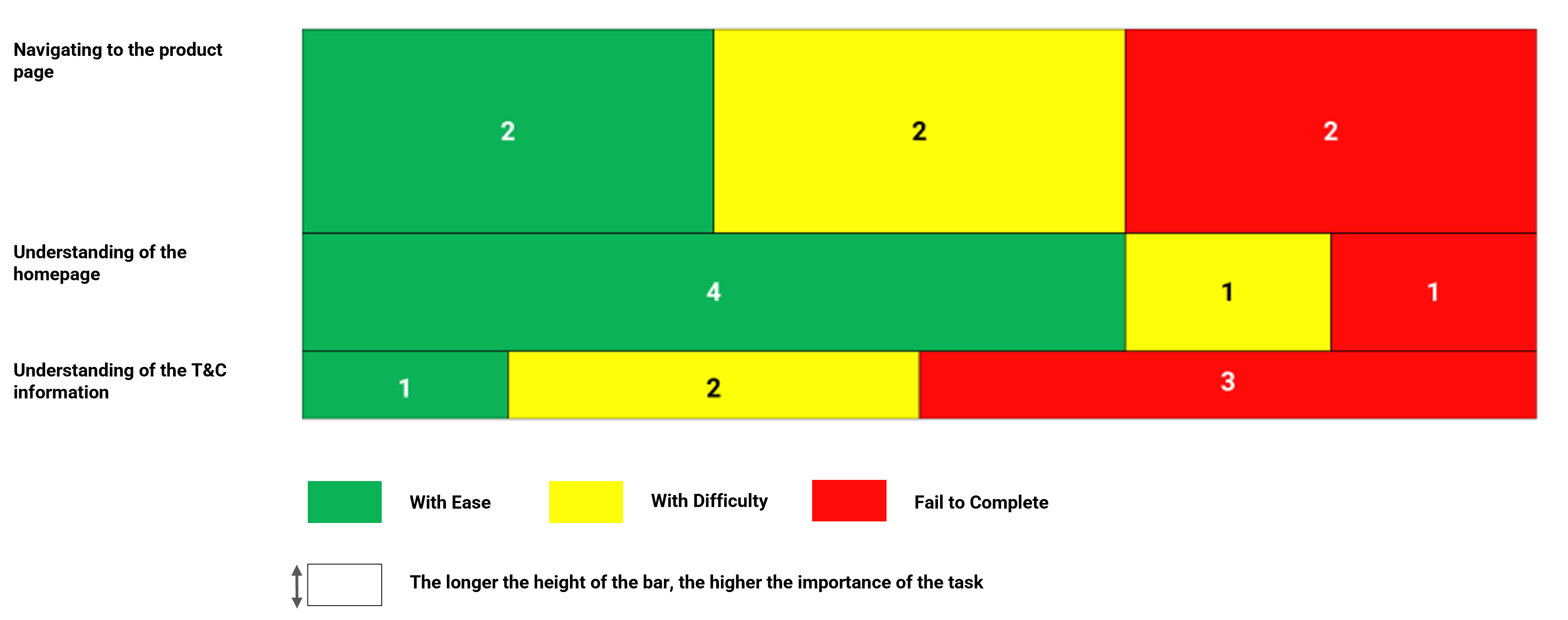
Important Indicators:
- One bar = 100% of users for a task
- Segments = outcomes (e.g., green for “completed easily,” yellow for “with difficulty,” red for “didn’t complete”)
- Thicker bars = more important tasks
Another variation of the bar chart is the diverging stacked bar charts.
This is a great way to compare different options and see what’s more popular. In the context of the election, news outlets use it to showcase the margin of victory between the two parties across states.
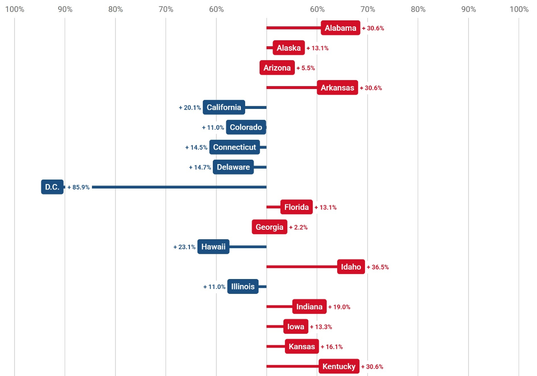
You can clearly see which state leans to which party as the bar clearly spreads to one side or the other. This makes it super easy to see which party stands out and by how much.
For presenting research results, we can use this chart to showcase results from A/B testing, survey results or customer opinions.
Example: Diverging Stacked Bar Chart for A/B Testing
Making positive and negative feedback go in opposite directions provides a quick snapshot of what people prefer.
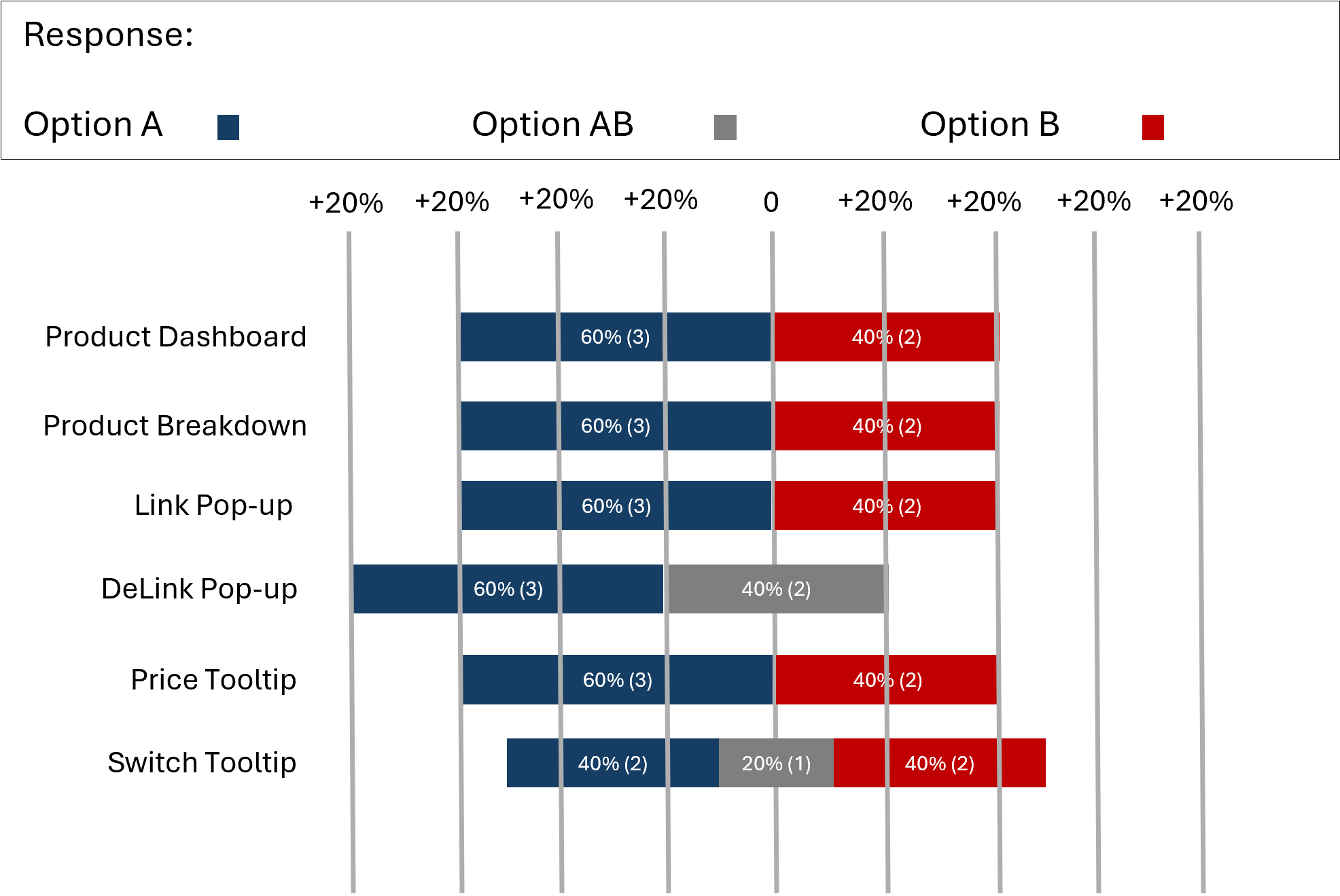
Important Indicators:
- Each bar represents all responses for one A/B test.
- Positive (e.g., “Prefer A”) extending right, negative (“Prefer B”) extending left while neutral responses remain in the center.
5. Circular Treemaps: Prioritize at a Glance
If segmented and stacked bar charts are upgraded versions of the bar charts, then the same can be said for circular treemaps… but with pie charts!
Think of circular treemaps as a more intense version of pie charts. Instead of slices, you get nested circles that make part-to-whole relationships more intuitive and visually appealing. Election sites use them to effectively show priorities and importance of different categories, like highlighting voter concerns.
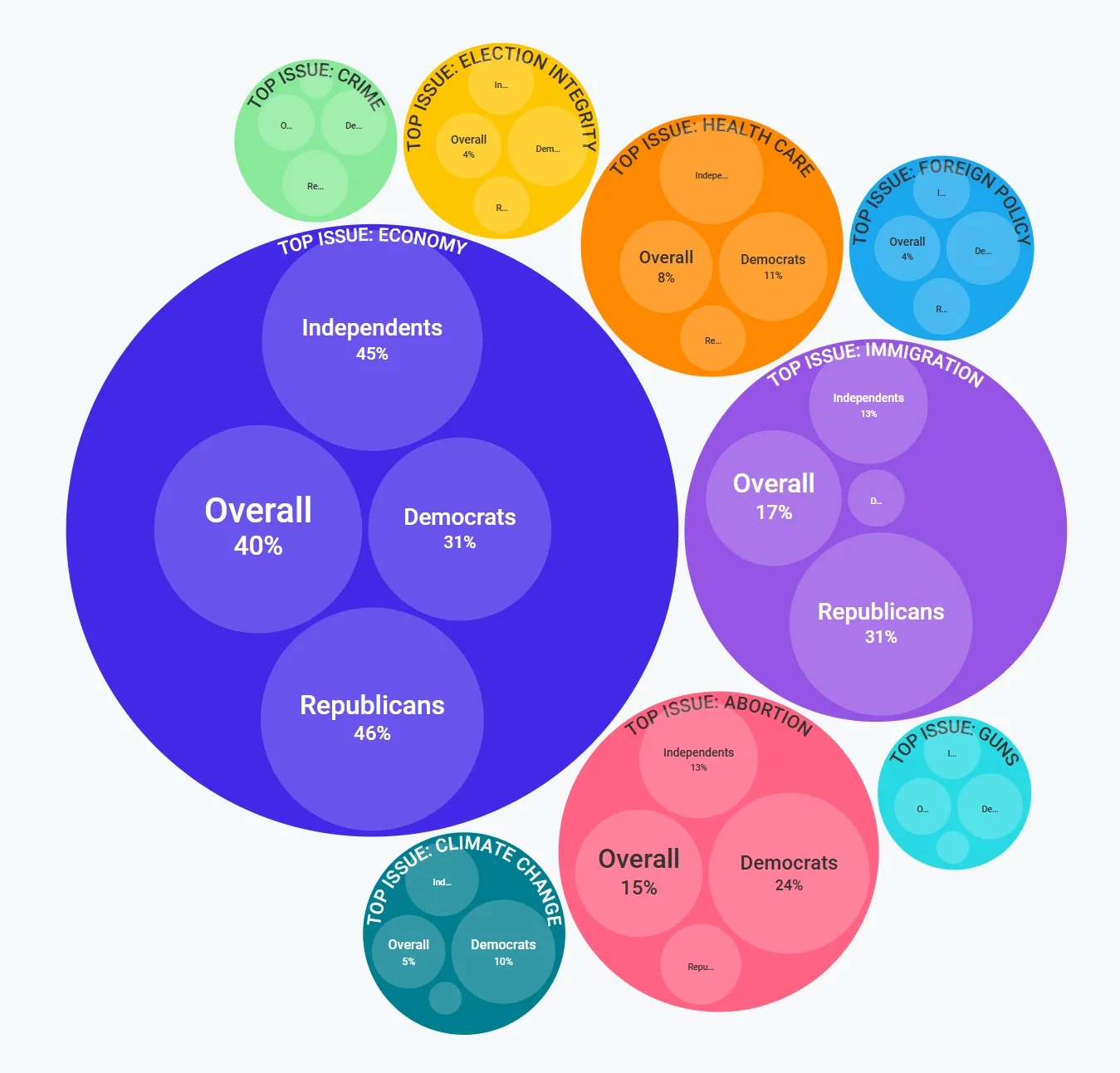
Professionals working on user insight reports can use this type of graph to make user feedback easier to digest and pinpoint which issues matter most to users.
✅ Use it when:
- You’re showing categories and their relative impact
- You need a fresh alternative to pie charts
Example: Sentiment Breakdown in User Feedback
Often we would list down the result of a sentiment analysis in a table, but here’s a more visual way of presenting that data with a circular treemap:
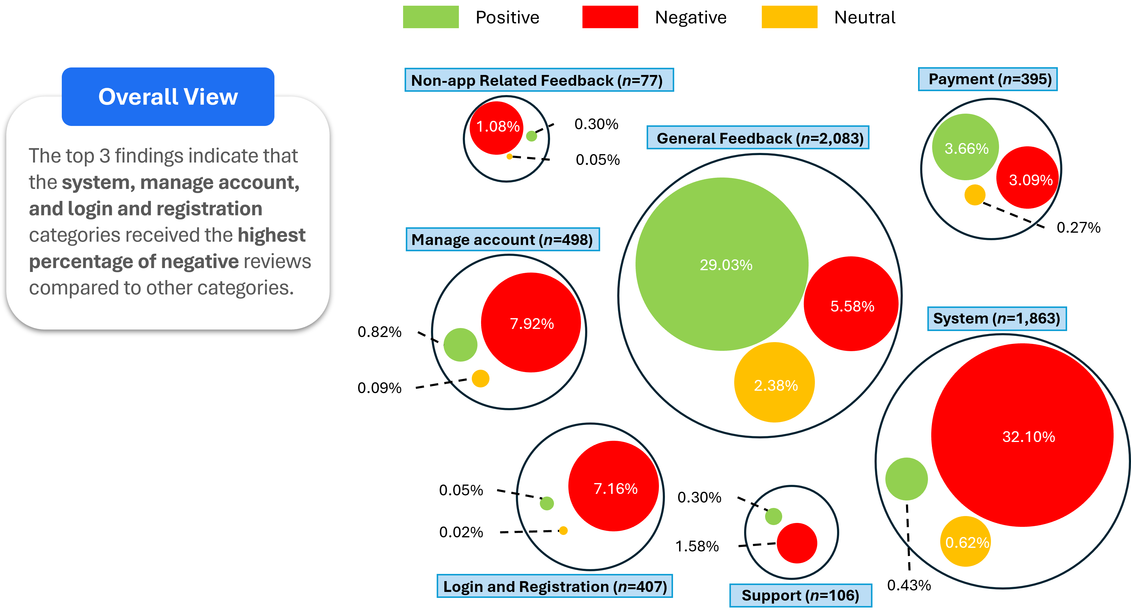
The nested circles help convey both volume and sentiment which helps in prioritizing issues that most impact user satisfaction.
What to show:
- Big circle = feedback category (e.g., "support", "checkout")
- Inner circles = sentiment (e.g., positive, negative, neutral)
- Circle size = number of responses
6. Line Graph + Column Chart: Bring Trends and Context Together
For the final technique, we’re shaking things up by combining two classic chart types: the line graph and the column chart.
Election sites often use line graphs to show how things change over time, perfect for spotting trends, patterns, and shifts in continuous data.
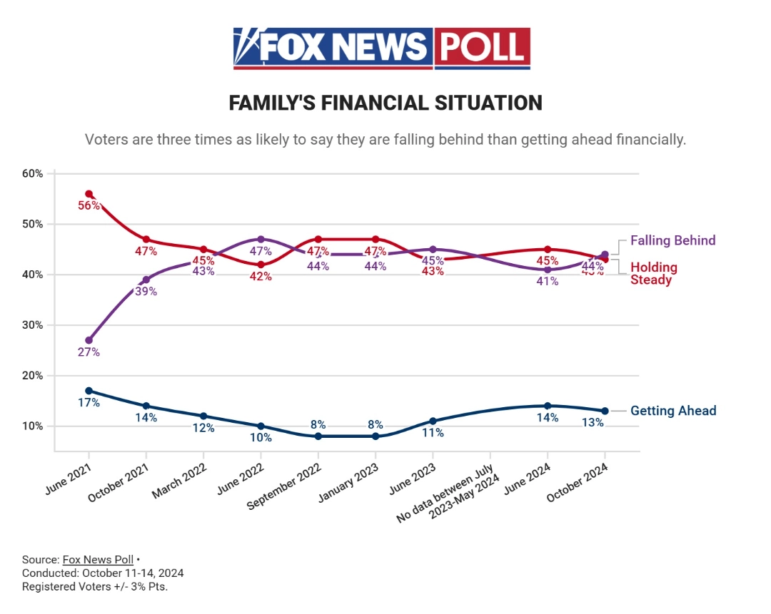
On the other hand, column charts shine when you need to compare data across categories at each point in time, like showing how different voter groups change month to month.
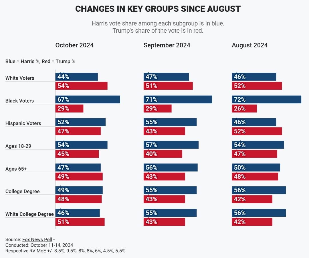
So why put them together? Because each one tells half the story—and combining them is a powerful method for storytelling with data that delivers both overview and detail.
Line graphs give you the big picture: how the numbers are moving overall. But when you want to zoom in and understand what’s driving those changes, column charts step in with the details by category.
Put them side by side, and you’ve got a dynamic duo: the line shows the trend, the columns reveal the “why” behind it. This combo is especially useful for tracking product performance or user behavior over time.
✅ Use it when:
- You're tracking performance over time
- You want both trends and breakdowns
Example 1: Monthly Web Analytics
Instead of using tables to showcase volumes of data or breaking down to individual charts, line graph + column chart can help you tell the story on how users interact with your website.
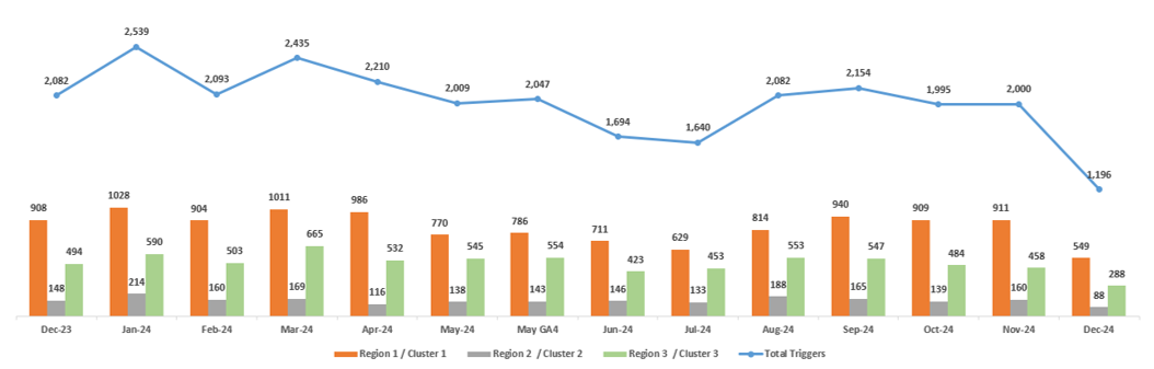
Important Indicators:
- Line graph = total interactions by month
- Column chart = which parts of the page users interacted with, by month
Example 2: Site Performance & Conversion
Another powerful use of the line graph and column chart combo is to uncover relationships across multiple categories at once. It’s a great way to serve different needs in one view: leadership gets the high-level trend at a glance, while your working team can dive into the detailed breakdown for more precise decision-making.
This approach works especially well for performance-based data, where you're looking to identify patterns, or uncover opportunities for optimization.
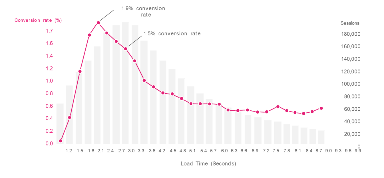
Important Indicators:
- Line graph = shows trend over time (in this case, conversion rate over page load time)
- Column chart = shows changes in categorical data over time (in this case, average session length at each load time)
Conclusion
Election-style data visualization isn’t about flashy graphics—it’s about making meaning obvious. In other words, it’s storytelling with data—turning complex insights into visuals that drive understanding and action. By borrowing these techniques, you can transform dry research findings into stories that stick, spark action, and make your insights impossible to ignore.
So next time you're building a deck, think like a news reporter on election night: what does your audience need to see to care?


