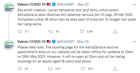
 The vaccine registration was due to open at noon on Wednesday, 26th May and many users were waiting in anticipation, flexing their fingers for the rush ahead, getting as many devices set up to increase their chances, counting down to 12pm to refresh their websites.

Source: Public Health Malaysia
In this Article
 The National COVID-19 Immunisation Programme coordinating minister later acknowledged that the UX of the registration could have been better. Let us dissect the factors that contributed to the UX failures in this incident that lead to much public outcry.
Analyzing The UX Failures of Malaysia’s Vaccine Registration Website
1. Delay Notice Not Published on Website
At the scheduled time open for online registration (12pm), all users were not able to do so. A quick check on social media showed a note from JKJAV at 12:02pm saying that the booking page was still being updated, and that the opening of the booking slot had been delayed to 12:15pm instead. The management of user experience could have been better, where the notice for such delay should be published on the website as this is where users were waiting. We need to consider that not all of our users are tech savvy (especially senior citizens) and they may not have known to check on social media. Here is an example for important announcement that is visible to all website visitors.
Image source: Amazon.com
2. Non-Responsive Buttons
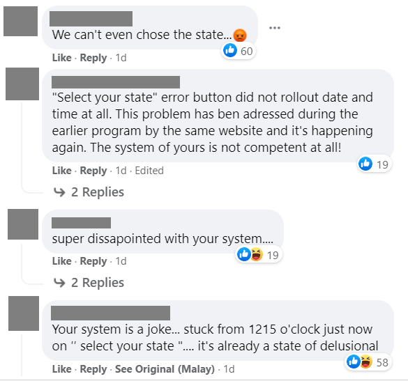
After filling up the first part of the registration form, users came to the section where they had to select their state for their preferred vaccine distribution center and date. None of the buttons worked. Users were clicking on their state and the buttons were just not responding. No error message, no feedback, nothing. Many refreshed the website, had to fill up the form again, trying to click on their state again and again in hopes that something will happen.
Similar issues have also been reported where users clicked on the “Submit” button after filling up the registration form. However, the website did not respond and users were left in the dark as to what they can do next. As a result, this left users clicking on the button furiously in hopes that their appointment slot would get submitted. This could explain the frustration that many users have expressed openly on social media.
It is understandable that the website is receiving very high traffic and the system might not be able to cope. But the failure is not informing the users of the system status, which is a key consideration for good website usability. For example, when a user clicks on the button and if the website is having issues processing the request, it should show an error message to inform the user the type of error and the next steps that user can take.
By looking at the bigger picture of the digital touch points provided by the government, we also see another alternative solution, which is to get users to register on MySejahtera app and let them select if they are willing to take the AZ vaccine. Currently citizens use the MySejahtera app to register for the national vaccine program, therefore the app would already have all the user’s personal details. This could negate the need for users to go to the JKJAV website to manually register separately for the AZ vaccine. There are instances where a better user experience is achieved by reducing the learning curve of users by using what they are already familiar with.
3. Having to Fill Up the Form From Scratch
Due to the non-responsive buttons, many users would also try to reload the website. However, with each refresh of the website, users had to painstakingly fill up every single portion of the registration form again. Due to the urgency of the situation, this repeated form filling caused even more distress to users. Although it’s understandable that the form is requesting for necessary information in order to verify and to allocate an appointment to the right person, it was a pain point that users had to live through repeatedly.
 For many forms online, websites can temporarily save the filled-in fields in case the webpage is refreshed. Users can then come back to the website and pick up where they left off because the previously filled-in fields are automatically re-populated. This shows appreciation of users’ time and the website wanting to help users through the registration process as quickly as possible.
4. Thank You Page without a Reference Number
For some, they finally arrived at a thank you page and hoped that their registration went through because there was no reference information. When we shop online, or have any submission of information online, at the end of the user journey, we tend to receive a confirmation page or thank you page with a relevant reference number. Users are used to such conventions and would expect the same for the JKJAV website. However, in this UX failure, there is no reference number to be found in the thank you page. This has left the users feeling anxious, wondering if they have really gotten an appointment. If users had any issues or wanted to reference their registration in any way later, there is no reference number that they can quote.
Aftermath
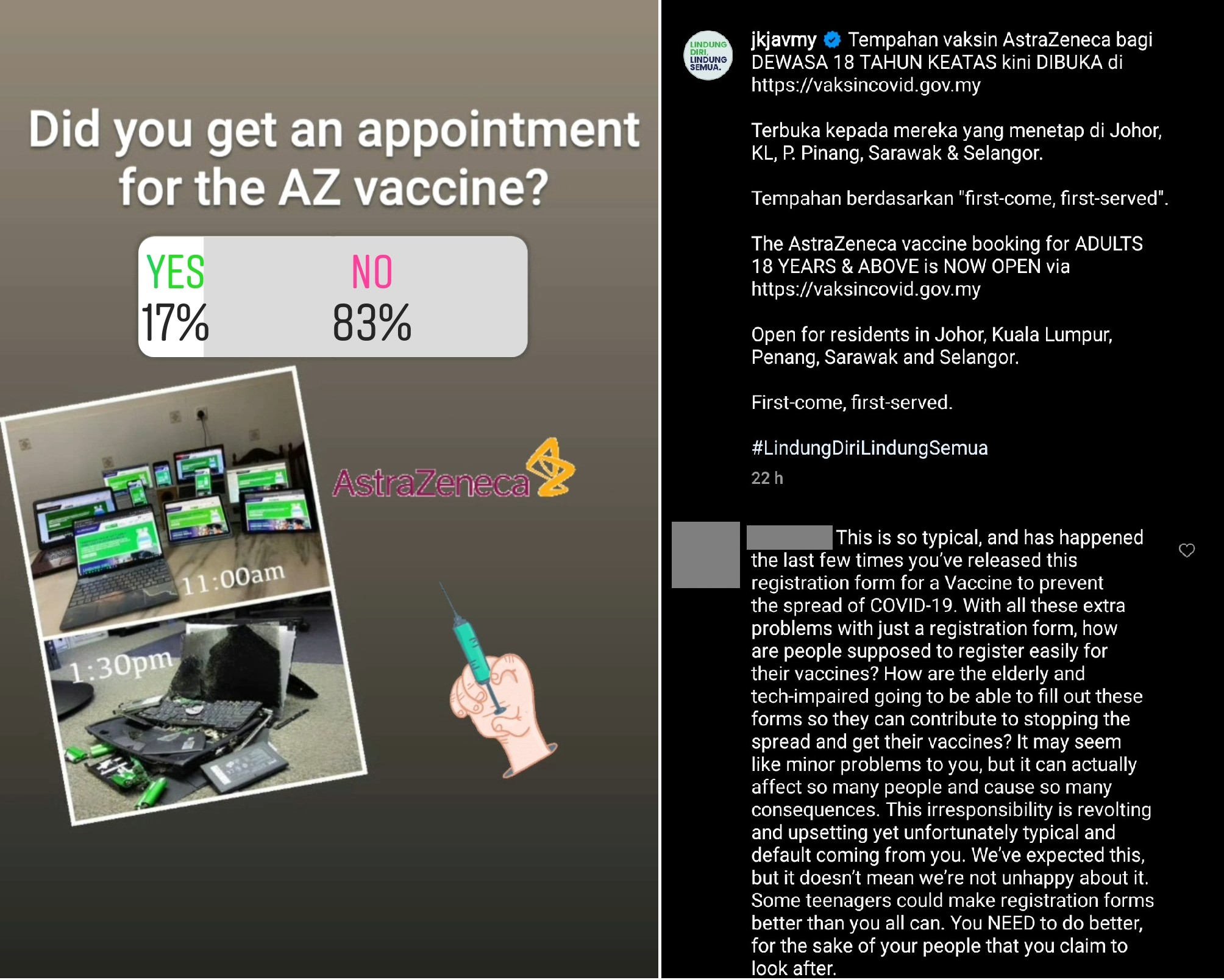
According to Malay Mail, “a total of 959,609 bookings were recorded before registration closed within an hour after it went live about 12.20pm”. Many users who made multiple attempts to submit what should have been an easy registration were left empty handed after an hour of anxiously clicking on non-responsive buttons and filling up the forms repeatedly. The various UX failures of Malaysia’s vaccine registration website led to an uproar on social media, demanding that the government do better by the people.Malaysians took to social media platforms such as Twitter to express their frustration and to share their experiences in registering for the slots Source: Malay MailThis shows that users or consumers today can do a lot more damage to an organisation’s image when they are frustrated with your online experience. Many users shared their feedback and sentiments of this social media poll:
 Many users questioned the poor UX of the website, asking JKJAV how the elderly and those who aren’t tech-savvy will have any chance of filling up the form with so many problems in the registration process.
The consensus is that there are so many Malaysians who are willing to get vaccinated and that JKJAV need to focus their efforts on a faster vaccination rollout. JKJAV has recognized that the “user experience (UX) of the registrations could have been better”.
All in all this level of frustration and blowback from the public could have been reduced if JKJAV had focused more on delivering a working UX for the Malaysian public.
This case study has served to remind us of the importance of UX in this age of digitalization, be it for government or commercial digital services. Focusing on UX is not only going to safeguard the organization’s reputation, but also a must in order to serve users effectively. We ought to invest in the win-win approach rather than the opposite.
