In this Article

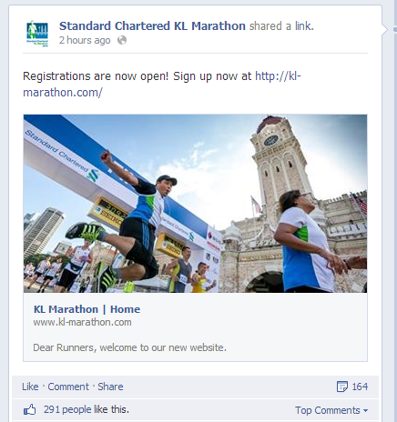
Are you ready for one of the most anticipated marathon events in Malaysia? Standard Chartered KL Marathon announced on their official Facebook page that the registrations are open.
Our team at Netizen Testing were so excited to hear about it and hurried to register for the marathon using the official website. However, something went wrong, what happened? Look at the conversation below:
CY: Hey Guys! The registrations for Standard Charted KL Marathon are now open! Let’s register!
After a while..
CY: Hey, d@mn! I managed to secure a place for myself, then I tried to register for my friend. No more available slots!
MK : What? I’m registering.. it is still available
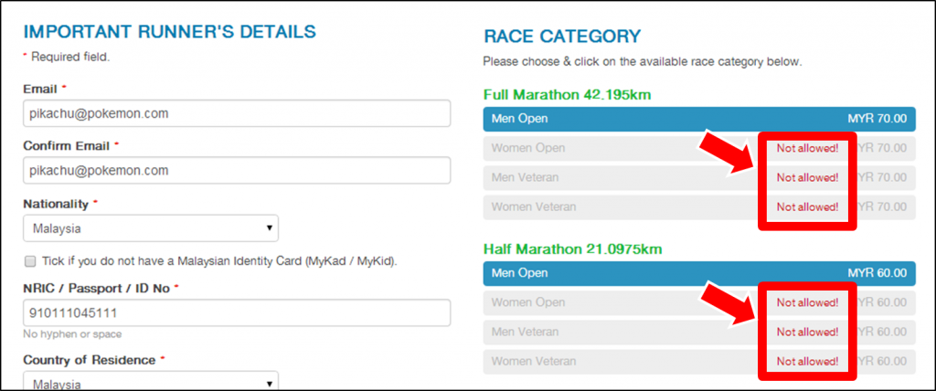
CY : Nope, the status is “not allowed”
SA : Hey!! How did you manage to register? I couldn’t register, all Men slots were “not allowed”
CY : Yes, exactly!
Take a look at the screenshot of the registration page below:

We were trying to register for Half Marathon Session (21km), but we found that all the sections (with same price) under ‘Men Open’ were not allowed. We gave up on the registration but MK insisted that the places were still available.
MK : NO!! You should click on the ‘Blue Bar’ to select!
CY/SA : What the…
At first, we thought it was our very own silly mistake. Then I started receiving Whatsapp messages from my friends.
HEY, THE REGISTRATIONS ARE ALL FULL, SO FAST! OMG! I WANNA RUN!
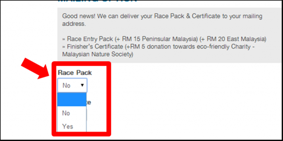
I then told my friends that they can register by clicking the blue coloured tab. Again, I received another question which I could not answer them confidently. “Should I click Yes or No for the Race Pack & Certificate? I want them. So ‘Yes’ right?”.
Other regular Standard Charted KL Marathon runners then confirmed with us that the options for ‘Race Pack’ & ‘Delivery’ are merely for mail delivery services only and the certificates & race pack were already included, no extra fees will be charged.

TIPS for joining this event: You will receive 10% discount if you use Standard Charted Credit Card for payment.
Final Words
We are good with the overall design of the website, the interface and user flow are considerably smooth. The system is ‘smart’ enough to auto-select suitable race categories for you once you inserted your IC number, but not so ‘smart’ for misleading you that no options are available for you.
One or two issues might be critical to cause problems to users and even for the event organizer as they need to reallocate more resources to answer or solve participant enquiries. Also, it wouldn’t be good for the reputation of the organizer.
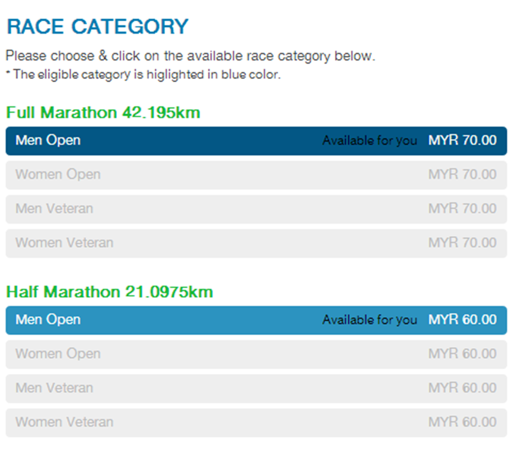
Restructuring the race categories design layout can avoid confusion. A quick tweak may work well by just simply adding a word ‘Available’ in the blue column tab, so that users can easily differentiate between categories that ‘Not Allowed’ (because of their IC input) and ‘Available’ for them. Last thing, we can’t wait to run!
NOTE: CY & MK joined this event every year.
UPDATE (6.15 pm 25 April 2014):
I found that some people were complaining about the issues mentioned above on their Facebook page, so I sent this in with hope of providing some assistance. The Standard Chartered KL Marathon team was very responsive to tweak their website accordingly and acknowledged me on Facebook.

KUDOs to the SCKLM team! However, the updated site (picture below) should use a better colour option for the ‘Available’ words, especially when user hover over it.

