You’ve set up your wallet, linked your card, and granted permissions. Then comes the call or SMS: “There’s a problem with your account.” A few taps later, your money is gone.
In Southeast Asia’s super app landscape, seamlessness can be a double-edged sword; what feels frictionless for users can also lower the barrier for bad actors. As platforms expand services and link more accounts, trust becomes more than branding; it’s architecture, transparency, and user control.
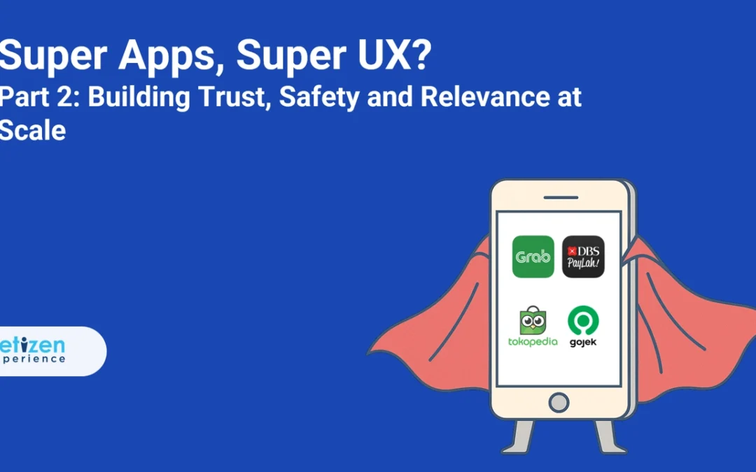
In Part 2, we explore how platforms like Touch ’n Go, Grab, and GoTo handle that responsibility. While features like refund guarantees, safety toggles, and fraud detection hubs exist, the real test is how they perform under pressure—and what platforms don’t always say out loud.
In this Article
1. Touch ’n Go eWallet: Promises and Loopholes
The Trust Pitch and the Hidden Gap
Touch ’n Go eWallet presents itself as one of Malaysia’s safest platforms. It offers biometric login, real-time transaction alerts, and a Money-Back Guarantee. These features, on paper, create the impression of full protection.
Yet scams continue to plague users—especially social engineering scams where fraudsters impersonate TNG agents via phone or WhatsApp. In multiple cases, users were tricked into giving OTPs or clicking malicious links.
Despite the “guarantee,” TNG’s policy only covers unauthorized transactions reported within 60 days—not scams where users were deceived into authorizing a payment themselves. As user complaints and media reports confirm, TNG often rejects refunds in these scenarios.
What TNG Did: Strengthened Warnings
TNG now prominently displays scam alerts in-app and warns that it never contacts users via personal phone numbers. Its website lists current scam types and urges users not to share OTPs. But technical safeguards remain limited—TNG still relies heavily on users recognizing the scam before acting.
Trust in TNG depends on user vigilance. The super app feels safe, but behind the scenes, the protection system has strict fine print. For users, the takeaway is clear: don’t assume a guarantee means automatic refunds—and don’t trust unsolicited calls, no matter how “official” they sound.
2. Grab: Transparency Wins, But Risks Remain
Clearer Payments, Safer Rides but Limited Transparency
Grab has taken visible steps to build user trust. It introduced up-front billing for rides, contextual notifications for offers, and opt-in safety tools like Quiet Ride and AudioProtect (which records rides for dispute resolution). It also limits popups during payment to reduce friction at sensitive moments.
However, despite the transparency in their UX, Grab has faced real privacy and security issues:
In 2020, the Singapore regulator fined Grab SGD 10,000 after a software update exposed personal data from over 21,000 users—names, trip histories, and more.
GrabPay lets users skip OTPs for certain linked-card transactions after device activation—creating risk if a phone is stolen or malware-infected.
What Grab Did: More User Control
To address concerns, Grab expanded controls in its privacy dashboard and implemented biometric verification for sensitive actions. Its safety features are now opt-in (like ride audio recordings), and customer education around scams is more prominent in-app and via emails.
Grab’s approach earns points for visibility and UX clarity, especially with opt-in safety features like Quiet Ride and AudioProtect that give riders more control over their comfort and security.
But these tools work best alongside informed digital habits; users must still take steps to secure their devices and understand how Grab handles stored payment data. The best experience still requires informed consent, not blind trust.
3. GoTo: Integration Comes With Oversight
The Scale Challenge
GoTo is the product of two giants—Gojek and Tokopedia—merging ride-hailing, shopping, payments, and more. Their strategy of “split but linked” apps (shared wallet, loyalty, UI components) keeps UX manageable. But the trust dimension is harder.
Tokopedia’s 2020 breach saw hackers claim personal details from 91 million users—a serious warning about centralizing sensitive data. Though passwords were reportedly hashed, names, emails, and birthdates were leaked and offered for sale on the dark web.
What GoTo Did: Improved Privacy Governance
GoTo updated its privacy policy post-merger and now includes consent withdrawal mechanisms. It also committed to build “world-class security technology” under a dedicated data-protection office. But questions remain:
The Indonesian competition watchdog has reviewed the merger for monopoly concerns.
In 2025, GoTo’s Jakarta office was raided in a corruption probe related to a third-party government contract—raising questions about broader governance.
The Outcome
GoTo’s UX feels connected but clean. However, trust is still catching up to the product experience. As integrations deepen and more data flows through its platform, the company will need to proactively address past security lapses—and maintain strong oversight amid regulatory pressure.
Core Lesson: Trust is Architecture, Policy, and Perception
Security isn’t just about adding a biometric or refund policy—it’s about aligning those tools with user behavior, platform architecture, and real-world attack patterns. When protection fails silently or is misunderstood, users lose more than money—they lose confidence.
Protect: Default to Skepticism
What it means: Don’t rely on UI alone. Question OTPs, refund claims, or calls—even if they “look” official.
For users: Less risk of falling for social engineering.
For teams: Fewer false expectations reduce disputes and improve trust outcomes.
Disclose: Surface the Limits
What it means: Show users when coverage ends—e.g. if a refund won’t apply or what happens in a breach.
For users: Informed decisions, fewer surprises.
For teams: Reduced complaints and more targeted feature fixes.
Harden: Build Beyond the UI
What it means: Protect against edge-case fraud—like token theft, screen overlay malware, or linked-card attacks.
For users: Protection when judgment fails.
For teams: Less reputational fallout after incidents.
Super app trust is built not on claims—but on clarity, consistency, and closure when things go wrong. To deliver it, platforms must treat trust not as a feature, but as a continuous system—supported by code, policy, and user understanding.
Anna is a User Researcher who enjoys asking the right questions and uncovering patterns behind user behavior. For the past 4 years, she’s turned insights into thoughtful design across fintech, insurance, and media. Off the clock? She bakes, observes, and finds joy in the small details that make experiences feel just right.
You open an app in the morning to check your bills. Instead, you find yourself navigating a maze of promos, loans, and shopping tabs.
Welcome to the double‑edged sword of the super app; more convenience, more complexity.
What begins as a convenience promise can quickly turn into a cluttered, high-friction experience if design and architecture are not aligned. In Southeast Asia, platforms like Grab, DBS PayLah!, and GoTo are showing that scale does not have to mean sprawl.
Read on to see how modular app architecture, clearer UX boundaries, and linked services can deliver “more features, less frustration” without overwhelming the user.
Note: Where platforms don’t name “discoverability” explicitly, we infer it from their published goals (faster builds, fewer regressions, cleaner interfaces) as UX‑driven efforts to reduce friction
In this Article
1. Grab: Breaking Down the Digital Monolith
The Monolith Problem
Over time, Grab’s single codebase came to include rides, delivery, payments, insurance, micro‑loans, even groceries. They have come to realize that every release meant rebuilding and retesting hundreds of intertwined features; delaying updates, risking regressions, and measuring in seconds of extra startup time felt painful to users.
What Grab Did: Modular App Architecture
Developer Benefit: The team refactored into over 1,000 independent modules, forming a modular app architecture with core libraries for networking/UI and separate feature libraries (rides, food, wallet, etc.). Now build tools only recompile the modules that changed, cutting build times by as much as 60%.
Grab Tech Blog: Modularised App Structure
Trade‑Off: Splitting the monolith isn’t free. It introduced extra configuration, longer initial migration, and heavier IDE workloads. Grab engineers admit this was “not an easy or small task,” but ultimately worthwhile.
User Benefit: Although every module still ships with the app, behind the scenes this modularity enabled performance optimizations; caching service tiles, lazy‑loading certain assets, and reducing cold‑start latency by around 4 seconds. The result: faster, more predictable launch times and fewer “spinning wheel” moments.
Central Design Tokens
To tame visual inconsistency, Grab’s design team created a central token library—standard colors, typography, spacing, and button styles. Every new feature must draw from this set, preserving a cohesive look as services expand.
Test-and-Learn A/B Culture
Major UX changes now go through continuous testing. Before a wide rollout, Grab pilots tweaks (e.g. relocating an “Order Again” button) with a small cohort, measuring engagement and satisfaction. Only winners make it into production; minimizing the risk of unwelcome surprises.
Grab went from an overloaded super-app to a platform built on modular app architecture that feels light, responsive, and seamless; making life easier for both daily users and the teams who build it.
2. DBS PayLah!: Ecosystem Without the Overload
Feature Sprawl & Technical Debt
Originally a simple P2P wallet, PayLah! became cluttered and slow. UX analyses (independent of DBS) observed that the 2018 PayLah! app was “cluttered with a surplus of underutilized features” and that peer-to-peer transfers still “felt sluggish”. Users noted a confusing home screen and extra confirmation steps. Thus the article is correct that adding too many services risked confusing users.
What DBS Did: API‑First & Microservices
API Platform: DBS launched one of Asia’s largest banking‑API hubs, exposing over 150 endpoints; everything from wallet top‑ups to reward redemptions. Partners plug in via APIs, removing the need to embed mini‑apps directly into PayLah!’s code.
Domain‑Driven Refactoring: Behind the scenes, PayLah! was decomposed into microservices (payments, accounts, promotions), creating a modular app architecture where each component is independently deployable. Release cycles shrank from quarters to weeks, and a single service outage no longer dominoes across the platform.
The Outcome:
PayLah! keeps growing without losing clarity. Users experience a wallet that adapts to their habits, and DBS teams scale the business without scaling “super-app stress.”
3. GoTo: The Power of “Split But Linked”
The Merger Dilemma
After Gojek and Tokopedia united under GoTo, engineers and regulators alike questioned: merge into a single super‑app or keep two? A unified app risked monolithic complexity and ran afoul of Indonesia’s antitrust concerns.
What GoTo Did: Account Linking, Not App Merging
Separate Apps, Shared Wallet: Users link their Gojek and Tokopedia accounts to share GoPay balances and loyalty points without cramming ride‑hailing and shopping flows into one overloaded interface.
Both apps now support high‑contrast, dyslexia‑friendly, and color‑blind modes, built from shared UI components. Gestures and micro‑animations are standardized, so features introduced in one app immediately feel familiar in the other.
The Outcome:
GoTo’s “split but linked” approach means more people are finding what they need, fast: Millions of extra users are riding and shopping each month, and the total value of transactions has jumped by almost a third. By keeping apps focused but connected, GoTo hasn’t just made life easier for its users. The numbers show it.
Core Lesson: Why Modular Architecture Makes Super Apps Work
Think of super apps like LEGO sets: you can build big, but only if every piece is well-designed and fits cleanly with the others. Grab, DBS PayLah!, and GoTo show that success comes not just from doing more, but from building smarter—so both users and company teams win.
Break: Make Features Modular
What it means: Each service lives in its own “block.” Features load only when needed.
For users: The app is quicker, less overwhelming; no extra loading for things you don’t use.
For teams: Fixes or launches happen fast, with far less risk of breaking other features.
Build: Standardize Design and Process
What it means: Every feature or partner uses the same design language and rules.
For users: Even as new options appear, everything looks and feels familiar.
For teams: No time lost reinventing basics; launches and support are smoother.
Connect: Link Value, Not Clutter
What it means: Core app connects to partners and extra features using APIs, so new things appear only when relevant.
For users: You get shortcuts and suggestions that genuinely help, not a flood of unwanted menus.
For teams: Teams can swap partners or improve sections quickly, keeping the core stable.
In practice:
Users enjoy an app that feels lighter, clearer, and more personal, even as features grow.
Teams experiment, fix, and scale with less stress and more success.
The Takeaway:
Build super apps like modular, connected LEGO—everyone gets more power, but no one is stuck with extra weight.
Ready to see how SEA’s super apps build trust into every tap? Stay tuned for Part 2.
Anna is a User Researcher who enjoys asking the right questions and uncovering patterns behind user behavior. For the past 4 years, she’s turned insights into thoughtful design across fintech, insurance, and media. Off the clock? She bakes, observes, and finds joy in the small details that make experiences feel just right.
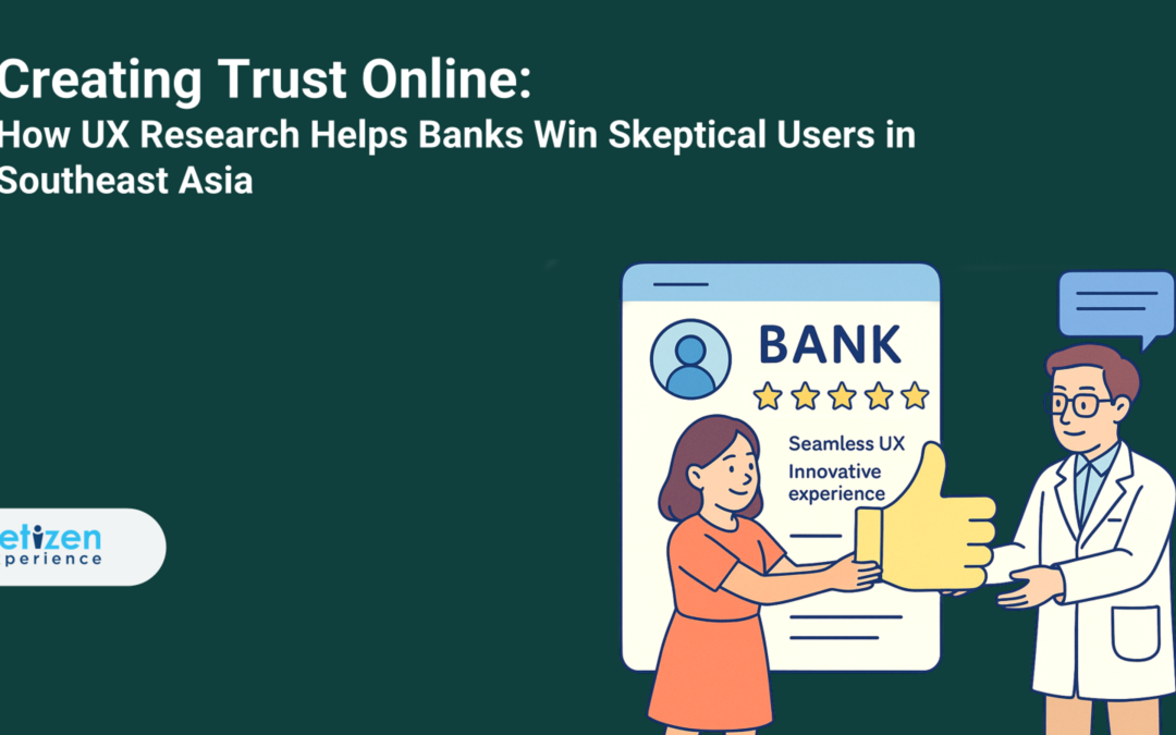
In 2025, digital banking in Southeast Asia is no longer an emerging concept, it’s a rapidly maturing ecosystem. And creating trust online is becoming just as critical as convenience for many fintech companies.
With smartphone penetration soaring and fintech investments reshaping consumer expectations, more people are banking through apps than ever before. But even as the market grows, one thing remains clear: growth does not automatically build trust.
As explored in How UX Research is Reshaping Digital Banking Strategy in 2025, digital banking UX has moved far beyond fixing interfaces as it now informs how entire financial ecosystems operate. And perhaps no theme highlights this shift more than trust.
In many Southeast Asian countries, digital banking is still gaining traction. The biggest UX challenge isn’t just about speed, it’s about building trust. Before users can feel comfortable navigating a banking app, they need to feel secure. Here, UX isn’t just about making apps easy to use, it’s about ensuring first-time users feel protected.
This article explores why trust must become the foundation of digital banking UX in Southeast Asia and how product teams can design for confidence, not just convenience.
In this Article
The Trust Problem: Where Digital Banking Falls Short
To understand why trust is important in digital banking, we need to look at what is getting in the way.
Across Southeast Asia, the issue of trust in digital banking remains a well-documented gap. Over half of online consumers in the region have expressed growing concerns around online security when using digital banking and mobile payment services (GSMA, 2024).
In Malaysia alone, financial scams have led to losses amounting to approximately USD 12.8 billion over the past year, equating to nearly 3% of the country’s GDP (GASA, 2024). When scams are this widespread, it’s no surprise that digital trust is becoming harder to earn and easier to lose.
While security systems are part of the equation, the burden also falls on product and design teams. Gaps in UX—like missing explanations, confusing prompts, or sudden security screens—can create friction that erodes trust even further. These may seem like minor missteps, but in an environment where trust is already fragile, they can break the entire experience.
In Southeast Asia, where fear of scams runs high and digital confidence is still growing, even one moment of hesitation can be the difference between a user staying… or leaving for good. These gaps include:
Security uncertainty: Users hesitate when trust indicators (such as encryption badges or verified logos) are absent or unclear, disrupting efforts toward creating trust online
Poor transparency: Users are wary when they do not know how or why their data is being used.
Brand unfamiliarity: New or digital-only banks struggle to gain credibility in markets where legacy institutions still dominate.
Complex onboarding: Lengthy sign-up flows turn away first-time users, especially those with limited access to formal banking.
The question becomes: how do banks bridge this trust gap without losing users along the way?
To answer that, we must turn to the engine behind every confident user interaction: UX research.
How UX Research Makes a Difference
Understanding why trust is important can’t stop at the theoretical phase. It must be observed, tested, and earned through real user insight.
This is where UX research shines. It identifies friction points, uncovers hidden concerns, and offers tangible ways to build confidence. Whether through usability tests, surveys, or ethnographic studies, research reveals what users are really thinking at each step of their digital journey.
For instance, users often abandon a process when asked for sensitive information without proper context. Research pinpoints these moments of hesitation and allows teams to prototype solutions, whether it is shorter forms, more human copy, or visual trust cues (like padlock icons or face ID illustrations) that reassure rather than alarm. This subsequently contributes to creating trust online.
When teams apply these insights, they not only fix usability but they also build emotional confidence in the product. The goal becomes not just can users use it, but do they feel secure doing so?
To see this approach in action, we can look at how banks in Southeast Asia have implemented UX-informed trust strategies.
Local Examples: What Banks Are Doing Right
Trust is not an abstract goal, it is something that can be embedded into product design. And several banks in Southeast Asia have already taken bold steps in that direction.
Tonik (Philippines) simplified its onboarding by turning KYC into a fast, branchless selfie-and-ID upload process. This approach supported financial inclusion by making digital banking feel accessible and secure, especially for underserved users.
Maybank (Malaysia) responded to increasing scam concerns by implementing cooling-off periods, stronger login security measures and a dedicated fraud hotline—showing that digital trust is also about visible safeguards.
DBS (Singapore) leaned into biometric verification to improve call center trust and user convenience, while also ensuring users could reach support through digital-first channels.
OCBC (Singapore) introduced “Money Lock”, giving users proactive tools to protect their funds from scams. It is a small but powerful way to return a sense of control to the user.
These efforts are not just one-off features, they represent a broader mindset of designing with trust in mind.
Next, we look at how the goal of creating trust online shows up across the full user journey—not just in security features, but in every interaction.
What Trust Looks Like in UX
Trust is not a single feature, it is the emotional foundation that holds the user journey together. In digital banking, users do not consciously evaluate “security” in a form or “confidence” in a flow. They feel safe when the entire experience is cohesive, respectful, and transparent—essential ingredients for creating trust online.
And when trust is missing, it is not loud. It shows up quietly through hesitation, abandonment, and silence.
To design for trust, UX teams need to embed it at every step. Here is how it should show up in the moments that matter most:
In all these moments, trust is not declared, it is earned, quietly, through the consistency and clarity of every interaction. And when UX design is informed by real research, those moments can be anticipated and built with intention.
Final Thought: Trust Is Measurable
Banks that treat trust as a design objective rather than a PR promise are seeing real impact.
Completion rates, customer satisfaction scores, and NPS scores can all reflect trust. More importantly, they help teams identify which changes matter most to real people. UX research provides the lens to evaluate these metrics and the language to advocate for better solutions in creating trust online.
In Southeast Asia, where digital finance continues to evolve rapidly, trust remains one of the most valuable (and vulnerable) currencies. It is not won through slogans, but through design that listens.
And that begins with research; one that goes beyond usability and into long-term strategy.
For more insights on how UX research is transforming the digital banking landscape in 2025, feel free to revisit our earlier article on the topic.
Anna is a User Researcher who enjoys asking the right questions and uncovering patterns behind user behavior. For the past 4 years, she’s turned insights into thoughtful design across fintech, insurance, and media. Off the clock? She bakes, observes, and finds joy in the small details that make experiences feel just right.
Imagine this: You urgently need to transfer money, but the banking app crashes mid-transaction. You restart it, but now you’re unsure—did the payment go through? Will you try again?
For a moment, you feel a surge of panic.
But take a deep breath and let’s zoom out for a moment.
This isn’t just your frustration—it’s happening to millions of banking customers worldwide. In an era where people expect banking to be as seamless as ordering food online, a single bad experience can push customers away for good. This is why UX in banking is no longer just about making things look good—it’s about survival.
In Europe and North America, banks are racing to integrate AI-driven hyper-personalization, anticipating users’ needs before they even arise. Meanwhile, in Southeast Asia, banks are fighting a different battle—building trust among millions of new digital users transitioning from cash-based economies.
But how did UX evolve from usability testing to a strategic pillar in banking? And more importantly—what’s next?
To understand this shift, let’s first explore how UX research is shaping banking strategies in different parts of the world.
In this Article
How UX Research Shapes Banking Strategy in Southeast Asia vs. Global Markets
Global Banks: AI Knows You Better Than You Do
The modern banking customer no longer waits for problems to happen—they expect their bank to predict and prevent issues before they even occur.
That’s why global banks are shifting towards AI-driven hyper-personalization, using real-time data to craft intelligent, proactive user experiences:
Bank of America’s Erica AI assistant doesn’t just remind users to pay their bills—it predicts when they might forget and nudges them in advance.
JPMorgan Chaseuses data to spot patterns in your spending, helping customers optimize their finances without them lifting a finger.
Emirates NBD (ENBD) provides automated financial coaching through AI, making wealth management accessible to everyday users.
For these banks, UX isn’t just about usability—it’s about staying ahead of customers’ financial needs.
But while AI and personalization dominate global banking UX, over in Southeast Asia, the challenges are different.
Here, UX is about earning trust.
Southeast Asia: The Battle for Trust
For decades, banks have competed on speed and convenience. But in 2025, the real challenge is trust—especially in Southeast Asia, where digital banking is still gaining traction.
The biggest UX challenge isn’t just about making banking faster—it’s making it feel safe and accessible. According to GSMA’s 2024 survey, over 50% of Southeast Asian consumers worry about online security, and 25% have experienced financial fraud.
Here, UX isn’t just about usability—it’s about ensuring first-time users don’t feel overwhelmed or exposed. So how has UX evolved from usability to a strategic driver of banking success? And how do SEA banks compare to their global counterparts? Let’s dive in.
Tonik Bank (Philippines) makes opening an account as easy as downloading an app—no paperwork, no long wait times.
AEON Bank (Malaysia) focused on “trust-first” design, ensuring security measures didn’t make users feel like they were being locked out of their own money.
With these different priorities, UX research is now driving the very strategies banks use to compete.
Now that we’ve seen how UX shapes different banking markets, let’s explore how it actively prevents financial stress for customers.
UX Research as the Driving Force Behind Banking Innovation
Preventing Financial Stress
You check your balance and realize you’ve overspent. Sound familiar?
It’s a scenario banks are increasingly working to prevent, using UX research to create proactive interventions before customers even realize they need help.
Monzo (UK) doesn’t just warn users about a low balance—it predicts if they’re about to overdraft and sends an alert in advance.
Santander Bank (Argentina) revamped its digital platform based on user research, leading to a 20,000+ increase in digital transactions in just one month.
By identifying pain points before they happen, UX research is shifting banking from reactive problem-solving to proactive customer care.
However, proactive banking requires real-time insights, so how do banks test and improve their UX at such a fast pace?
The answer lies in AI-powered UX testing.
AI-Powered UX Testing
Some banking apps seem to get better overnight. That’s because banks are now using AI to analyze millions of user interactions in real time, automatically detecting friction points and adjusting designs on the fly.
Revolutcontinuously tweaks its interface based on real-world user behavior, ensuring a seamless experience.
DBS Bank (Singapore) uses data-driven UX research to make sure digital banking feels as intuitive as visiting a physical branch.
This shift means UX research isn’t just about designing great experiences—it’s about constantly optimizing them.
But while AI makes banking smoother, it also raises another challenge: How do you balance security with simplicity?
Security vs. Simplicity
Security is non-negotiable in banking, but if security measures feel too frustrating, customers will switch banks.
By making security invisible yet effective, these banks prove that UX doesn’t have to come at the cost of customer confidence.
Clearly, UX’s role in banking is now going beyond just design—it’s shaping entire business strategies.
From UX Design to UX Strategy: A Shift in Banking Mindset
UX researchers are no longer just supporting product teams—they’re helping banks make high-level strategic decisions.
Commonwealth Bank of Australia created “Hey CommBank,” an AI-powered chatbot that cuts call wait times in half.
OCBC Bank embeds UX research into compliance strategies, ensuring that customers can navigate regulations without feeling overwhelmed.
With UX professionals influencing everything from customer service automation to regulatory design, banking is entering a new era where UX is the foundation of strategy.
What’s Next?
Looking ahead, UX will continue to shape how people interact with their banks. Some of the biggest trends to watch include:
AI-Driven Hyper-Personalization: Your banking app might soon know what you need before you do. From predicting expenses to detecting fraud in real time, AI is reshaping digital banking. Curious how? We broke it down in our articleThe Future of AI in UX: Trends in 2025—check it out!
Embedded Finance: Imagine accessing banking services directly through WhatsApp or TikTok.
Regulatory UX: Making compliance effortless for users.
Behavior-Driven Banking: Shaping user habits through smarter design.
Banks that fail to invest in UX research will fall behind—not because their tech is outdated, but because their customers will simply go elsewhere.
Conclusion
Think back to that moment of frustration—when your banking app crashed, or when you couldn’t figure out where your money went. Those small moments define how we feel about our banks.
The most successful banks aren’t the ones with the lowest fees or the most advanced AI—they’re the ones that make their users feel secure, understood, and in control.
In the race for digital banking dominance, UX isn’t an afterthought—it’s the winning strategy.
Anna is a User Researcher who enjoys asking the right questions and uncovering patterns behind user behavior. For the past 4 years, she’s turned insights into thoughtful design across fintech, insurance, and media. Off the clock? She bakes, observes, and finds joy in the small details that make experiences feel just right.