Most online services today have become highly interactive and are delivered via mobile devices. This means that user interface(UI) and user experience (UX) have an ever-increasing role to play in today’s technical world.
While UX traditionally focuses on the experience that users have with a product and service, UI focuses on the ease of interaction with a product’s interface.
What is UI/UX design?
UI/UX design revolves around a set of activities that seek to deliver a productive, usable, and visually satisfactory interactive tool.
These activities involve concepts and workflows that aim to produce an experience that is enjoyable and empathetic while remaining aligned with an organisation’s business goals.
UI/UX design activities typically encompass user research, product design, usability studies, information architecture, content strategy, user interface (UI) design, visual design, prototyping, and more user testing.
So, while UI designers decide how the user interface will aesthetically look, UX designers ultimately determine how the user interface will operate.
For more information, read this comprehensive guide on “User Interface.”
10 innovative user interface design examples
Drink Half Past
This innovative beverage company exploits a unique and dynamic visual colour palette on their website design to show a playful side of the brand.
Image Credit:www.drinkhalfpast.com/
It maintains a consistent colour match across every block of content for corresponding flavours.
This unique colour implementation strategy matches the flavour of each drink while reflecting the ingredients inside. In a way, this visually probes website visitors to experience the uniqueness of the product, even before making a purchase.
Pinterest
Pinterest’s icon UI delivers a waterfall effect to provide users with a seamless experience. In practice, each Pinterest card is given a subtle shade whenever it interacts with the mouse.
This can be aesthetically pleasing to users whilst giving the perception of “clickability”.
Image Credit: www.pinterest.com
Headspace
Headspace provides accessibility options that are inclusive for all users. Users can flexibly choose colours, navigation options, sizing, and even readability preferences on the platform.
Furthermore, users can also exploit capabilities like text magnifiers, voice communication, and a virtual keyboard to access medication features.
Overall, this array of amazing accessibility and usability flexibility enables users to adapt the system to their preferences so they can comfortably use it with freedom and control. It results in a very enjoyable user experience, and in turn, repeat visits.
Pitch
Pitch is a collaborative mobile and web app for building and managing professional presentations. Hence, its website UI presentation has to somehow reflect its ethos.
Its website intuitively walks users through what their journey would be like if they actually used the application. With a clean and cohesive flow that avoids clutter, it does a great job of highlighting the primary product features of its offering.
Image Credit: www.pitch.com
Squarespace
Squarespace employs card carousels to display the templates within their application. This allows users to quickly scan through several options at once. Overall, its UI deploys a clean, straightforward design with minimal copy and a centrally aligned navigation.
Image Credit: www.squarespace.com
It also keeps a consistent feel with the rest of the app, which enables users to learn it faster. For example, it provides a constant indication of the number of templates available, so users know where they are as they progress.
Dropbox
Dropbox employs responsive colours to great effect rather than employing a single symbolical colour. This colour dynamism helps keep users continually engaged as they navigate the Dropbox website.
Image Credit: www.dropbox.com
Semplice Labs
Semplice Labs offers a beautiful but functional UI that features fluid animations and smooth transitions that are desirable to users. This company boasts a reputable WordPress portfolio created by designer Tobias Van Schneider, who is known for his work with Spotify, BMW, and Google.
Image Credit: www.semplice.com
Cognito
Cognito’s brilliant UI shines best after loading with unique illustrations that come to life to display sophisticated motions. This dynamism illustrates the brand’s offering at a glance whilst keeping users intrigued.
Image Credit: www.cognitohq.com/
Tumblr
Tumblr’s UI design also enables users to customise their palettes and views in a manner that works for them.
For example, it provides various options to change page width and the colour palette with options like ‘canary’, ‘vampire’, or ‘ghost’.
As a result, the palette choice can support better readability, satisfy users’ aesthetic preferences, and enhance the speed of navigation.
Image Credit: www.tumblr.com/
Spotify
This music streaming powerhouse’s website exploits colour gradients to convey emotions or highlight a specific feature of their offering. This allows its mobile application to be more engaging and fun to use over extended periods.
Image Credit:www.careerfoundry.com/
While these UI design examples provide a wealth of inspiration, translating them into functional and user-centered interfaces requires a strategic approach. Here’s where partnering with a UI/UX design agency can prove beneficial. Their team of skilled designers and UI/UX specialists can take these design concepts and transform them into user experiences that not only look appealing but also function flawlessly. Agencies can ensure consistency across all design elements, conduct usability testing to identify areas for improvement, and ultimately deliver a polished user interface that aligns with your business goals.
Conclusion
An aesthetically pleasing design cannot really save a UI that’s confusing to navigate.
However, a well-thought-out user experience can be overshadowed by bad visual interface design that makes navigating an application unpleasant.
That being said, both UI and UX design processes need to be executed in tandem and perfectly aligned with user expectations to create a cohesive user experience. And when these elements align in perfect symmetry, the results can only be eye-catching!
While this article explores inspiring UI examples from various companies, understanding the usability heuristics covered in Top 10 Usability Heuristics for User Interface Design will ensure those interfaces are not only beautiful but also user-friendly.
Due to the proliferation of mobile devices, information available to humans keeps growing on a daily basis. The more data we have, the harder it is to sift through to find what you need.
Fortunately, a well-thought-out information architecture (IA) can help users find their way while ignoring what isn’t relevant to them.
After all, who would like to utilise an application that constitutes unorganised content that makes navigation difficult?
If users easily get lost or feel aggravated, they may not give your application a second chance.
Product owners, product managers, UX researchers and UX designers, therefore, have the responsibility of constructing content and navigation systems in a manner that accommodates users’ perceptions. This is the fundamental premise of information architecture with regard to user-centred design.
The information architecture of an eCommerce website. Credit: tutsplus
What is information architecture?
Information architecture is a scientific discipline that fundamentally focuses on data organisation within digital products. For instance, whenever web designers create apps, they lay out each screen so users can easily find the exact information needed.
The primary idea behind IA is to create a flow that lets users seamlessly navigate between application screens without much effort. This means that information architects’ work revolves around organising content, describing it clearly and providing ways for users to access it.
As a software discipline, information architecture plays a critical role in defining the user experience of a website or mobile app. The design is usually dictated by the target users’ needs and the organisation’s business goals.
For instance, the information architecture of a blog website and an e-commerce shopping site will differ considerably. This means that a UX architect designing the online shopping site will design the IA of the site with the principal motive of making it easy for visitors to find what they want while still showcasing the business offerings.
The information architecture of a bike-sharing app. Credit: practical.guide
When to do information architecture design / appropriate timing
Information architecture design is typically performed at the beginning of a project to fully understand the depth of the information to be worked with.
This usually involves figuring out how to portray the top-level aggregated nodes which users will first encounter (for example, top or left navigation contents), or even what efficiencies need to be provided for search, faceting, short-cuts, etc.
It is also suitable timing when there are a lot of new categories of content/services being added to a company’s offering.
For example, a company that used to sell internet subscriptions has now expanded to provide smart home products, then its website information architecture ought to be reexamined to see if it still supports visitors to find information easily.
Principles of information architecture
As mentioned above, an intuitive, well-designed, and user-friendly information architecture ensures that visitors spend less time and effort searching for the information they need.
The discipline of IA was founded by Richard Saul Wurman, an American architect and graphic designer. He conceptualised and popularised the discipline as a means of organising content for users to easily find everything they need without much effort.
As a starting point, ‘information architects’ consider the specifics of their target audience’s needs and impose user satisfaction as a priority.
Furthermore, the information structure also depends on the type of product or offers that the companies have. For instance, a retail website and a tech blog will possess two completely different structures to accomplish specific objectives.
Generally, the key components of information architecture are:
Organisation schemes and structures: These dictate how one categorises and structures information.
Navigation systems: These focus on how users browse or move through information.
Search systems: These dictate how users look for information.
Labelling systems: These dictate how information is presented.
To design all these systems of information, one needs to understand the inter-dependent nature of the content, users, and context.
Context: This encompasses business goals, politics, culture, technology, resources, and constraints.
Content: This revolves around content objectives, volume, existing structure, document and data types, governance and ownership.
Users: This focuses on audience, tasks, information-seeking behaviour, needs and experiences.
To contextualise the information ecology, let’s dig deeper into some basic principles of information architecture.
The Objects Principle
It is imperative to perceive all content as an organic whole, with its own strengths, and weaknesses.
The initial stage of developing an information strategy involves organising all the categories of content objects. This is done while simultaneously determining the types of interactions that users need to have with the content objects.
The core idea is to present the content to users in the most efficient manner.
The Main Entrance Principle
This principle dictates that despite a site’s home page being the main entrance to the website, it shouldn’t be the only landing page on the website.
The Growth Principle
Most existing websites understand the importance of updating their content periodically. However, as the complexity and magnitude of the content increase over time, it becomes more vital to employ a flexible approach to content management.
This means that the complete structure of a site and its search tools should be flexibly scalable. This helps the website grow sustainably, regardless of the different types of content that spring up in the future.
The Principle of Gradual Disclosure of Information
This principle recognises that most users can perceive and process only a minimal amount of information at a time.
The best design approach is to always display only as much content as is necessary for visitors to know what to expect next.
This can be achieved by either incrementally revealing more information on the same page, or displaying it on another page. Nonetheless, the user should be able to assess the data on a page to subconsciously predict what information might appear on the next page.
The Multiple Classification Principle
Different internet users can employ the same site in different ways, and may even use disparate methods of searching for the same information.
For example, some might rely on search, while others may prefer to extensively browse through a site.
As such, it is important to adapt the website’s content to various user behaviours, needs, tasks, and scenarios.
The Focused Navigation Principle
It is important not to mix dissimilar categories of information within an individual navigation structure. The UX designer’s task is to provide all users with the elements necessary for effective navigation.
For instance, in a menu containing products that the business sells, try not to mix support services that the business offers into the same menu.
The Examples Principle
Whenever possible, ensure to provide visual examples of content types to improve the user experience. This can help users navigate the site faster, even without fully understanding what a label for a category exactly means. Therefore, the effective use of images in the menu could be very helpful to signal to users what they should expect the content to be.
Generally speaking, once a UI/UX designer learns to employ these principles, it becomes relatively easy to solve the most complex information challenges and build user-friendly websites.
What do information architects do?
Many organisations do not have information architect as a standalone role, it is usually done by someone in the UX design team or outsourced to a UI/UX design agency.
However, if an organisation is able to have a dedicated resource to have an information architect, their main job would be to design actionable and useful content structures and navigation systems from sophisticated sets of information.
This happens before the UX designers and developers add any functionality to the website or app.
Most of the work of information architects revolves around identifying common features in content, linking documents to other documents on the same topic, and forming groups of similar information objects.
This work typically involves the generation of sitemaps and navigation systems that UI/UX designers can then subsequently incorporate into the mock-ups of their webpage designs.
Whenever information architects collaborate with UI/UX designers, the result is a high-quality website that effectively communicates and facilitates interactions.
An information architect seeks to address the challenge of cognitive overload. They do this by adding sufficient structures, labels and browsing aids to sites and software applications to improve usability.
Cognitive psychology revolves around how the human mind works, encompassing mental activities that occur in the brain and the different elements that influence human perception.
Information architects rely a lot on cognitive psychology in order to organise information within products.
Generally, the more content an application has, the more important the role of an information architect is in the UX design process.
Here is a summary of the everyday activities that the average information architect engages in:
Card sorting and tree testing to understand users’ mental models.
Usability testing to determine whether the structure they have created works for their users.
Creation of hierarchy and navigation by creating simple, low-fidelity prototypes to demonstrate the hierarchy of information and navigation.
Visiting users in real-world environments to examine how they interact with a product.
Classifying and grouping items using categories, sections, or metadata tags.
Identifying the relationships between information.
Performing content audits for insight into how useful, accurate, and effective the content is.
Mind mapping to organise information connected to a single topic and structures in a systematic and meaningful way.
Information architecture vs UX
If you have reached this far down the article, you are probably asking yourself if IA design is the same as UX design.
Despite being closely connected, they aren’t the same.
User experience revolves around the way a user thinks and feels when using a system, or service. Principally, UX focuses on usability, utility, and the satisfaction of using a system— more than only the content’s structure.
However, it’s practically impossible to create a great user experience without a solid information architecture. This is why every competent UX designer should learn the skills to be a relatively good information architect.
Remember, the information architect’s main job is to create an experience that enables users to focus on their tasks.
Information architecture pertains to the blueprint of the design structure necessary to generate wireframes and sitemaps of a website. UX designers use these wireframes and sitemaps to plan the navigation of a system.
This consequently enables UX designers to build a pleasant interaction model, so that users feel comfortable when using a product. Thus, influencing users’ behaviours and actions like emotion and psychology.
Why is information architecture important in UX?
Content is the main reason why most users visit websites. While it is important to produce content that users find valuable, it is equally important to ensure that the content is easy to find.
Time is a precious resource, and people expect to find solutions to their problems with the least effort.
Unfortunately, when finding information becomes challenging and complicated, there’s a high risk that people will just abandon it. And whenever visitors abandon an application or a website, it’s more challenging to bring them back.
This is where information architecture comes into play to frame the skeleton of any design project. As we have seen, functionality, interaction, visual elements and navigation are typically built with IA principles.
Overall, the information architecture is not visible to end-users but is the backbone of any app design.
How to create the information architecture for websites?
There are four key steps necessary to develop IA for any website or app, namely:
Group, prioritise and label the content using card-sorting techniques.
Define the navigation and create a site map.
Determine the usefulness of pieces of content to ensure that the content that users see is exactly relevant to the page they are on.
Test early and often using quantitative and qualitative techniques like:
Tree testing: to determine if key information can be easily found in the information architecture of the website.
Closed card sorting: to determine the strength of category names.
Click testing: to show how users use the available UI components.
Information architecture examples
Simple tree structure
In this example, the developers built on top of a basic site mapping and then added in both child pages and actions.
Furthermore, the addition of number values helps to denote the priority of pages in the information hierarchy instead of leaning on colours.
This information architecture for a Canadian tax law firm laid the foundation for its website.
The user flows convey the actions their users could take while navigating through the site, tied into the functionality goals desired for the intended audience.
Image Credit: www.topdraw.com/
UI/UX Design Services
Key Highlights
Provides UX design services for businesses & organizations
Uses a human-centered design approach to create digital products that meet users’ need
Conduct research to understand users’ needs
Create wireframes & prototypes to test and refine a design
All things considered, information architecture is a critical part of UX design for all types of apps and websites.
It is actually more important for websites that constitute many pages and extensive content.
Creating an IA should be a collaborative and iterative process that involves product managers, UX researchers, UX designers and information architects.
The process should also evolve organically, with as much of the structure defined up-front as possible. While many companies do not yet see the true value of information architecture, others realise that it is an effective tool to guarantee reduced usability or navigation problems.
In turn, well-thought information architecture can help save an organisation both time and money, which they otherwise would have spent on fixing future usability issues.
Even if an application has multiple important features, or delivers a revolutionary way to solve humanity’s biggest problems, it means little if its interface repels users and is a nightmare to operate.
A user-friendly has a strong effect on user engagement and retention. And is therefore essential for the commercial success of any organisation.
However, creating a great UI design is a non-trivial task as it involves careful consideration of elements like background, position, size, form, colour, fonts, etc.
User interface design process
The UI design process revolves around creating products that provide meaningful and relevant experiences for users.
It involves research and analysis of all user-related information, consideration of content hierarchy, navigation design, and functionality of the visual elements.
The core principles when undertaking the UI design process are:
Design with problem-solving in mind.
The design begins with pen and paper, not software tools.
Always fight for the user.
Design with research, such as insights from user interviews and usability tests.
Listen more and be eager to be proven wrong, just as you’re to be proven right.
Typically, the results of a good user interface design process are:
Increased efficiency
Improved productivity
Reduced errors
Reduced training and reinforced learning
Components of UI design
Typography: This involves consideration of font type, typeface choices, and font sizes that can be utilised.
Colours: This considers colour choices that can be employed, including primary, secondary, and tertiary colours.
Interaction & Behaviour: This principle covers actions and user interactions with a component (such as hover, scroll, click, etc.)
Error & System Status: This guide entails information if an error occurs and displays the status of an action.
Buttons: This considers the shape, colour, text, radius, size, and button behaviour.
Icons: This considers the icon type and size.
Input & Form: This serves as a guide for the shape and size of the input field.
Spacing: This guides the manipulation of the distance between components and white space.
Feedback can either be visual, audio or through the sense of touch. Every action should have some form of feedback to indicate whether an action was successful or not.
In essence, feedback can you help to answer issues related to users like:
Status: What’s going on? Is it still going on?
Location: Where did the issue occur?
Future status: What is next?
Outcomes & Results: What really happened?
2. Get started with a black and white design and add on to it
It is advisable to avoid beginning user interface design with visual details like the colour scheme. Most wireframes start with varying tones of grey as colours and details are distracting.
Actually, most UI designers start with the basic bones and layout of screens in black and white.
This allows them to focus only on the efficiency of the space, prioritising elements like the visual hierarchy of key components. Over time, they build on this grey base and introduce more details.
3. Utilise and maintain standards
Design standards are usually in place for a reason as humans only have a limited amount of memory for tasks.
For example, existing standards suggest not to employ a dollar icon to login, or not putting the main menu on the footer of a website.
Users are conditioned to expect specific visual elements in certain areas. On the other hand, heuristics can be exploited as they are based on patterns and research, and can improve a user’s experience.
4. Keep the interface consistent
Consistency fosters familiarity, and familiar interfaces tend to naturally be more usable.
Additionally, consistent design usually reduces friction for the user as it offers predictability. And predictable designs are always easier to understand without instruction.
5. Keep it simple & clear
Simple interfaces always offer a classic and timeless feel, and never go out of style. So, with modern techniques, you can still aspire for an elegant and simple design.
Take Slack as an example. The app keeps the content and designs simple for giving a smooth onboarding experience to users. The layout makes it simple to understand and there is a prominent “call to action” button for guiding the user to the next step.
The layout avoids clutter, provides easy to navigate tabs and is laid out in a simplified design which is easy to understand for beginners.
6. Reduce cognitive load
This concept revolves around not making users ‘over-think’. There are a few different ways and principles you can utilise to reduce cognitive load, namely:
Employ the 3-click rule where it shouldn’t take more than 3 clicks to find any information
Avoid chunk actions and information, for example, breaking up phone numbers in a 3-3-4 manner, rather than using a 10-digit sequence results in fewer errors.
Minimise recall in favour of recognition by using common images and icons in context to help users easily identify functionality.
However, this is only a guideline. As long as the users are able to confidently know what or where to click for their next step, it is still ok to have more than 3 clicks.
7. Minimise actions and steps per screen
Ensure to streamline the tasks and number of actions required of a user so they can be performed in as few steps as possible. Each screen should maintain one primary focus.
8. Flexibility
Ensure to build your UI to function optimally across multiple platforms.
Credit: Macworld
Of course, it may need to be tweaked occasionally depending on the form factor of a device, and its operating system (for instance, Android and iOS). However, it should remain flexible enough to work on any platform.
10. Use real-world metaphors in your UI
Despite the fact that most users are now extremely familiarised with digital products, it’s still a smart idea to use real-world metaphors. Take for instance the “delete” or “edit” icons on most apps. Most sites/apps use the trash bin for depicting the delete or recycle bin. Similarly, a pen is used to show the edit sign.
Since these are metaphors that are easily understood by most users, it does not leave them anxious and searching for simple tabs on an interface.
Most designers strongly feel that these metaphors improve the general usability of a product since they’re so simple to understand, even at first glance.
Conclusion
In summary, in today’s evolving digital world, UI sits up there with speed and content as the crux of any website or app.
Unfortunately, even the smallest change in UI Design can have a considerable impact on the user experience. So, a company’s UI design speaks to clients and should be taken seriously if the business wants to succeed.
The goal of effective UI design is to produce a user interface that is self-explanatory, efficient, and enjoyable (user-friendly).
And while UI design guidelines provide a strong foundation, effectively implementing them throughout the design process requires expertise and experience. If lack of time and resources are a big issue, a UI/UX design agency can be a valuable asset in this area. Their team of specialists can ensure consistent application of these guidelines across all touchpoints, resulting in a cohesive and user-friendly interface. Agencies can also conduct usability testing to identify any areas where the guidelines might not be working as intended, allowing for refinement and optimization.
In addition to the aforementioned principles, remember to follow industry standards and conventions within your design elements. Make sure that you provide multilingual support that matches your operational location. Finally, endeavour for uniformity.
The article is a part of our comprehensive series on “User interface.”
An interface is any medium that facilitates interaction. For example, a language is a communication interface between two people.
A translator is an interface for an individual to interact with another who doesn’t speak the same language. Similarly, an API is an interface for computer software to interact with another software program.
Typically, when users find interaction with an interface challenging, their cognitive load is high. One way to keep the cognitive load to a minimum in software nowadays is by leveraging natural user interface concepts.
Natural User Interface Definition
A natural user interface (NUI) is a system for human-computer interaction that a user operates via intuitive actions related to natural, everyday human behaviour leveraging modalities like touch, gestures or voice.
Natural user interface design relies on a user being able to perform relatively natural gestures to control a computer application or manipulate the on-screen content.
How does NUI work?
NUI design focuses on traditional human abilities, like vision, touch, speech, handwriting, motion, cognition, creation, and exploration to replicate real-world environments. This helps to optimise interactions between physical and digital objects.
This means that NUIs leverage on natural human skills to minimise cognitive load and human distraction.
The main NUI principles are:
Performance aesthetics- The joy of doing/using an interface.
Direct manipulation- Direct interaction with informative objects.
Contextual environments- Interfaces locating themselves in space and time.
Super real- How humans perceive interfaces as super real.
Social Interaction- Interfaces enabling users to engage with other users.
Spatial relationships- Objects being intelligent and having auras.
Scaffolding- Indications of how an interaction will unfold.
Seamlessness- Achieving minimal barriers between the users and the information.
Advantages of Natural User Interface (NUI)
The primary benefit of a NUI is improved user experience. Humans are naturally attracted to things that are naturally associated with them.
Hence, in most cases, people will likely opt for a device that deploys a touch-screen interface than the traditional computer keyboard and mouse.
A touch-screen interface as an application of NUI is more interactive, intuitive, and lively, making it more enjoyable and convenient to operate with.
So, user interaction with NUIs feels more fun, easy and natural since the user can employ a broader range of basic skills in contrast to more traditional GUI interaction—which mainly happens via a mouse and a keyboard.
Applications of NUI
Speech Recognition
Speech recognition as an application of NUIs helps drivers to keep their eyes on the wheel during navigation.
Therefore, promoting safer driving experiences as drivers can make a phone call, set their GPS location or even change radio channels using verbal commands.
Brain-machine Interface
Brain-machine interfaces possess the ability to read neural signals and make use of them.
They generally work by exploiting different software programs that translate the signals into programmatic action.
These interfaces have multiple applications in the health sector as they allow paralysed patients to operate their wheelchairs.
Touch Screen
Touch screen interfaces allow users to interact with a machine or device with the touch of a finger.
Essentially, users do not have to use buttons or a mouse to hover over a GUI.
Currently, this is the most common and a more seamless humanistic way to interact with machines and devices.
Touch screen
Gesture recognition
Gesture tracking involves tracking user motions and then leveraging them to send instructions to a system or device.
This NUI is mostly employed in Nintendo Wii and PlayStations as their controllers have accelerometers and gyroscopes to sense the rotation, acceleration, and tilting. And thus, facilitate gesture recognition.
Gesture recognition, Credit: ITcra
Gaze Tracking
Gaze tracking is a NUI application that follows the movements and motions of one’s eyes, particularly the eyeball.
Generally, with this NUI application, users can control a system or device through eye movements as exemplified by companies like Lenovo’s laptop device that operates functions through an eye gaze.
NUI vs GUI
Unlike graphical user interface (GUI) interfaces that are enabled by indirect manipulation via a keyboard and mouse, NUIs enable users to interact directly with information objects.
For instance, touch screens and gestural interaction capabilities enable users to feel like they’re physically touching and manipulating objects with their fingertips. Rather than ‘what you see is what you get’, successful NUI interfaces impose the principle of ‘what you do is what you get’.
Unlike GUIs, where multiple options and commands are presented at once and depicted with subtle hierarchy and visual emphasis, an effective NUI constitutes fewer options with interaction scaffolding.
Information objects in a NUI behave in a manner that users intuitively expect.
Natural user interfaces are dynamic and can adapt themselves in space and time. For example, elements like touch screen, speech recognition, gesture recognition, gaze tracking etc make natural user interfaces more intuitive.
With GUI, it is naturally expected for the users to understand and adapt to technology. However, NUI lets the technology adapt to a user according to the actions and requirements performed at a particular time.
On the other hand, GUIs present a user with the same set of options, regardless of the context. Conversely, NUIs are responsive to the environment and suggest what the next interaction should be.
NUI objects are intelligent, and require less cognitive investment, unlike GUIs that are highly visual and usually require a great deal of cognitive focus to utilise.
Example of NUI in the form of voice assistants such as Amazon’s Alexa, Apple’s Siri, and Google Home, credits: nytimes.com
All things considered, in NUIs, the interaction is direct and consistent with ‘natural’ human behaviour.
As such, the user can exploit a broader range of basic skills in contrast to more traditional graphical user interface interaction that mainly happens via a mouse and a keyboard.
An effective NUI design should imitate the user’s interaction with the real-world by facilitating a direct correlation between user action and NUI reaction.
An experienced provider of user experience consulting services can help ensure that an NUI design effectively imitates the user’s real-world interactions. They can work closely with businesses to identify the user’s needs and preferences, conduct user research to gather valuable feedback, and develop user-centered design strategies that optimize the user experience.
The article is a part of our comprehensive series on “User interface.”
Typically, humans extract information about the world using their different senses like vision. As visual creatures, humans learn to interact and communicate with varying objects from birth.
With the advent of computers, people were forced to think abstractly and deal with a larger number of commands they would not easily remember when performing different tasks, especially if some of them are performed very infrequently.
Fortunately, computers progressively implemented unique graphical user interfaces (GUIs) to help improve visual operational efficiency of humans interacting with computers.
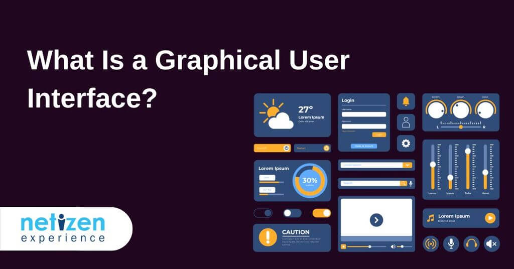
So, what is a graphical user interface?
A GUI (graphical user interface) is a system of interactive visual components
through which users interact with electronic devices via visual indicators and representations.
GUIs were initially introduced in reaction to the steep learning curve of command-line interfaces (CLIs) that required commands to be typed on a computer keyboard.
A GUI helps translate information and represent actions that a user can take. The actions in a GUI are typically performed through direct manipulation of the graphical elements.
Beyond computers, GUIs are utilised in multiple handheld mobile devices like MP3 players, gaming devices, smartphones and even smaller household, office and industrial controls.
How does the Graphical User Interface work?
As hinted at earlier, a GUI operates by the manipulation of graphical objects. A GUI primarily does this by exploiting a pointer that serves as a navigation instrument to interact with disparate visually appealing graphical icons.
Abstraction is a key concept that is used in GUI operating systems. Users can employ a pointer to click on the icon that initiates a series of actions.
Typically, an app or functionality will get started, then the user has to provide input or tasks to generate the intended action from the machine.
The GUI basically translates user language, which can consists of simple one-line commands, single click and double clicks into a machine language or assembly language.
The machine comprehends the machine language and then responds to the task initiated, which is then translated into the user’s language and communicated to the user through the GUI.
Furthermore, the appearance of the operating system or application software can be redesigned at will as graphical user interfaces are independent of application functions.
Apps usually implement their own unique GUI display elements in addition to GUI elements already present in the existing operating system.
The importance of abstraction in a graphical user interface
Abstraction is a key concept that is used in GUI operating systems. This process allows humans to interact with a device’s underlying code by separating us from the technical details and presenting a simplified interface to the user.
To put it into simpler terms, imagine driving a car. You don’t need to know the specific details of how exactly your car’s engine and steering column work.
Instead, these complex functions are abstracted away into the car’s user interface: the pedals and the steering wheel. All the driver has to know is that pushing the pedal down moves the car forward, while turning the steering wheel moves it left or right.
The same applies to GUIs: Folder icons are not real folders on your computer screen; they are merely abstractions of the underlying computer software code. These abstractions enable the average user to easily utilise computer technology without having to learn and understand the complexities behind them.
Character interface vs Graphical user interface
Command-line interface
Commonly known as a command-line user interface (CLI) or non-graphical user interface, a character user interface (CUI) employs text commands, managed by a command-line interpreter to communicate with a computer program.
Software developers and system administrators exploit command-line interfaces to configure machines, manage files, and access program functions that are otherwise unavailable on a graphical user interface.
Character user interfaces essentially support automation and scripting. They also tend to provide greater granular control and a higher level of functionality than GUIs.
While the command-line interface was the principal method of operating computers throughout the 1980s, most modern electronic devices currently utilise intuitive graphical user interfaces.
So, the average user will rarely (if ever) have a reason to access a command-line interface. Here are some most popular graphical user interfaces known to users globally:
Microsoft Windows 11 Graphical User InterfaceApple OS Graphical User Interface
Differences between GUI and CLI
Here are some of the main differences between a graphical user interface and command-line user interface:
A GUI enables users to interact with the operating system or application. On the other hand, a CLI allows the user to perform tasks by issuing commands in successive lines of text or command lines.
The CLI requires memorizing the commands, making it difficult for newcomers, while the GUI is more user-friendly.
The CLI is ideal for dealing with difficult tasks, as these tasks may be handled by writing a few commands. By contrast, a GUI requires some steps to function.
A CLI only requires the keyboard and the system during interactions, while a GUI has additional resources to engage with the user.
The interface in a CLI is consistent all the time, while the interface in a GUI changes as the software is updated.
Advantages of graphical user interface
GUIs offer many advantages over text-based interfaces. These include:
Clarity: Each and every response from the computer can be visually communicated through GUI. This ensures that issues can be identified more quickly and easily compared to text-based formats.
Simple to use: GUIs offer simplicity, as someone with no technical computer knowledge can use the computer and perform basic functions.
Provides shortcuts: The GUI enables users to use shortcut keys to minimise their actions, saving time and improving productivity.
Allows multitasking: GUI allows users to work and view two or more programs at the same time. For example, you can watch a streaming lecture while searching a browser for more information.
Visual appeal: GUIs are visually appealing and can make anyone get involved in working with the machine.
Easier searching: Search functions are streamlined as GUIs provide a visual representation of files present and provide details about them.
User-friendliness: There isn’t a steep learning curve as GUIs provide a wide scope for users to explore computer functions and discoverability.
Accessibility: GUIs are more accessible to users with disabilities, impairments, and limitations.
Features of graphical user interface
To make a graphical user interface as user-friendly as possible, there are unique elements and objects a user can employ to interact with software. For example:
Microsft Windows 11 Application UI
Button – This is a graphical representation of a button that performs an action in a program when pressed.
Toolbar – This is made up of a row of buttons, typically near the top of an application window, that control software functions.
Dialog box – This type of window displays extra information and asks a user for their input.
Ribbon – This serves as a replacement for the File menu and toolbar and groups program activities together.
Icon – These are small graphical representations of a program, feature, or file.
Menu – These are a list of commands or choices offered to the user through the menu bar.
Menu bar – This is a thin, horizontal bar containing the labels of menus.
Tab – This is a clickable area at the top of a window that shows another page or area.
Window – Rectangular section of a computer’s display that shows the program currently being used.
Informational elements
Here are some examples of GUI informational elements:
Message box – It is a small window with information, such as a policy or disclaimer, requiring that you take action before proceeding.
Notifications – It is a message box used to indicate emergency warnings, error messages or task completion.
Pop-up windows — A pop-up, or modal, window requires you to interact with it before you can return to the system.
Progress bar – It shows where you are in a series of steps in a process e.g., your pizza order’s status in the order, cook and delivery process. These are typically not clickable.
Tooltips – When you hover over an item, a tooltip offers more information. For example, you might receive a definition and usage examples when hovering over a word or phrase.
Interaction elements of a GUI
Apart from structural elements, a GUI also features interaction elements, such as:
Cursors – A cursor indicates where the system will accept input next. One example is a mouse pointer.
Selections – A selection refers to a list of items to which a user will apply an operation. For example, a user can select a portion of text for cut, copy and paste operations.
Adjustment handles – A handle indicates a drag-and-drop operation. When a user places the pointer on the handle to initiate the drag process, its shape changes to an icon representing the drag function.
Graphical user interface (GUI) examples
Microsoft Windows
Microsoft programs like Word, Excel, and Outlook.
Software programs like Apple Music or Steam
Apple’s macOS
Chrome OS
Linux variants like Ubuntu
Internet browsers, like Internet Explorer, Chrome, and Firefox.
Conclusion
A GUI is more user-friendly than a text-based command-line interface, like MS-DOS.
Unlike a command-line operating system, a GUI operating system is easier to learn because commands do not need to be memorised.
The bottom line is that users don’t need to know any programming languages when using a GUI. So, because of their ease of use and modern appearance, GUI operating systems currently dominate today’s market.
Generally, GUIs are a crucial element of the communication of humans with the modern world. As such, an intuitive and usable GUI is key to success for any product that requires constant user interaction.
By working with a user experience consultant to design an intuitive and easy-to-use GUI, businesses can increase user satisfaction and engagement, ultimately improving outcomes for their products or services.


