AI in UX Research: What It’s Like Using Gemini In A User Interview Study

AI in UX Research: What It’s Like Using Gemini In A User Interview Study

Are you a UX researcher or designer curious about using AI in your research workflow, but not sure where to begin, or wondering how others are really using it?

Well, here’s a candid, behind-the-scenes look at how we’re using AI in UX projects in the form of a research diary!

We’re sharing what worked, what didn’t, where the tools fell short, and how we worked around the gaps. Think of it as a human-first view of AI in UX research, full of honest reflections, practical tips, and the creative ways we’ve made these tools work for us.

Whether you’re just starting to explore AI or already experimenting with tools like ChatGPT, Gemini, or Perplexity, this research diary is meant to help you make smarter, faster, and more impactful research decisions — without replacing the human touch.


Why You Should Read This Article

This article is perfect for:

  • UX professionals and researchers who want to level up their workflow with AI.
  • Designers and product strategists interested in real examples of how AI fits into the research process.
  • Anyone new to AI tools, but eager to unlock their potential in a user-centric, practical way.

If you’re tired of vague overviews and want something practical, nuanced, and experience-based — you’re in the right place. This article is a field-tested, hands-on breakdown of how to actually use AI in your research. And we’re sharing exactly how we do it.


What You’ll Gain From Reading This Article

By accessing the full content, you’ll get:

  • A phase-by-phase look at how we used AI tools across a UX research project, from planning to analysis.
  • Prompt examples and tips to help you get better results (and avoid AI dead ends).
  • Real talk on AI’s limitations and how to work alongside it, not blindly trust it.

Ready to Dive In?

Access the full article and:

✅ Learn how to use AI in a way that’s smart, grounded, and collaborative.
✅ Explore tested workflows, prompt templates, and workarounds for common pitfalls.
✅ Get inspired to experiment — and make AI your research sidekick, not your replacement.

👇 Fill out the form below to unlock the full article and discover a more human way to work with AI in UX research.


    Not Convinced Yet?

    Here’s a sneak peek into how you can use AI in UX Research

    In this research diary, we don’t just explore how to use AI, we take you behind the scenes into how it actually performs in a UX research project. This is a hands-on, human-centered look at where AI shines, where it struggles, and how to bridge those gaps with your own expertise.

    Here’s a peek at how we used AI in creating a research plan, often the most time-consuming step:

    Phase 1: Project Planning – Laying the Groundwork with Gemini

    Let’s start with Phase 1 – project planning. My first interaction with Gemini involved creating a research plan. I provided it with the specifics of the project: my role, the objectives, the target participants (internal colleagues in this case), and the expected deliverables. I also uploaded a sample of a past user persona document as a reference point.


    Efficiency Boost: Initial Output Generation

    As you can already guess, Gemini is capable of almost immediately generating initial project outlines and plans, accelerating the beginning stages. This turnaround was undeniably faster than your usual manual process. All I had to do was transfer the output to a new file for documentation purposes. 

    If there is anything to take note of, it is essential for the UX researcher to be clear about research objectives and needs for effective AI utilization, which we will talk about next.

    We also covered how AI can keep up with real-world Malaysian conversations where different languages are often found in one sentence. We explored Google Meet’s live transcription feature and later used Gemini to summarize these transcription. We saw first hand how AI handles messy, multilingual input — and the results were unexpected.

    AI-Powered Contextual Understanding in Post-Interview Analysis

    An additional pleasant discovery was AI’s ability to understand Malaysian’s habit of mixing multiple languages within a single sentence. As a company based in Malaysia, which is a multicultural and multilingual country where “bahasa campur” (mixed language) is a common way of speaking, we’re used to blending words from Malay, English, and sometimes other languages in everyday conversations. Curious to see how well Google Meet’s transcription could handle this, I intentionally asked a colleague to mix Malay words into their interview responses.


    Surprisingly, while Google Meet’s transcription struggled and transcribed some Malay words into gibberish, rendering kampung (village) as “kong kong”, and pisang goreng (banana fritters) as “goring pis”, Gemini was able to infer the intended meaning in its summary.


    For instance, it correctly picked up that my participant was referring to rural areas, despite the error in the transcript being written as “kong kong”. This discovery was indeed a nice surprise, demonstrating Gemini’s contextual understanding of mixed-language communication, a reality deeply embedded in the Malaysian experience.

    AI in UX Research: Google Meet's transcription feature picking up "kampung" as "kong kong"

    “Kong Kong” to kampung: Even with transcription errors, Gemini gets the context.

    These are just two highlights into the research diary!

    The full article walks you through every major phase of a UX Research project, complete with tools used, prompts, limitations and strategies to get the most out of AI without losing your own critical thinking.

    👉 Ready to see the full breakdown? Drop your details here and unlock the complete article.


    💡 Not quite ready to dive into the full research diary just yet?

    You can still explore the big-picture ideas in a lighter, high-level overview. It covers key limitations of using AI in UX research and how to work around them — phase by phase. Read it here.


    UI Elements: All You Need To Know

    UI Elements: All You Need To Know

    Since user-centric designs are now a core component of modern digital products, it makes sense to ask many more questions about user experience in design.

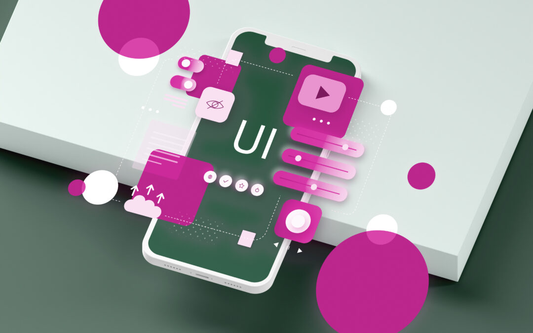
    One component of user experience (UX) design that is often probed about is UI elements. As the fundamental building blocks of user interfaces, UI elements arguably underpin everything about user experience.

    Without thoughtfully designed UI elements, UIs would lack cohesion, functionality, and intuitiveness. This would make it exceedingly challenging for them to navigate and interact with applications effectively.

    So, this post aims to go into great detail about UI design elements and their nuances. It also seeks to explain some practical use cases of different UI elements.

    What are UI elements?

    In simple terms, UI elements are the fundamental building blocks that constitute any user interface. These elements range from small components like buttons, icons, and text fields —to larger elements like image blocks and navigation menus.

    In practice, UI elements serve various purposes. For example, guiding user interactions, presenting information, and enhancing the visual appeal of an interface. They tend to provide a sense of familiarity for users, offering a clear path to achieve specific goals or actions.

    UI Elements

    The importance of UI elements in creating user interfaces

    Without a carefully designed set of UI elements, the user experience would be disjointed.

    In fact, the overall structure of the product would become fragmented, making it challenging for users to accomplish their goals.

    A disjointed UI typically results in disconcertment, confusion, and a lack of engagement as users become lost in a maze of inconsistent and confusing interactions. In stark contrast, a well-crafted set of UI elements creates a cohesive and intuitive experience. This allows users to focus on their intended tasks rather than navigating a disorganised interface.

    Overall, intuitive and responsive interfaces guide users through their tasks effortlessly, enabling them to accomplish their goals efficiently. That being said, the implementation of UI elements plays a mission-critical role in shaping the overall user experience.

    Basic UI elements

    UI elements are the primary means through which users engage with and navigate an interface. UI components have multiple uses and can be applied to many different kinds of projects.

    1. Buttons

    Buttons are arguably the most fundamental UI elements. They serve as the primary means for users to initiate actions and trigger specific functionalities within an interface.

    They are commonly deployed for actions like submitting forms and navigating to different pages. The different types of buttons include:

    • Primary buttons: These are the most prominent and frequently utilised buttons. They are often leveraged for the main call-to-action (CTA) on a page.
    • Secondary buttons: These buttons are usually deployed for secondary actions or alternative choices.
    • Icon buttons: These buttons feature an icon instead of text. They are often used for actions like opening a menu or closing a modal.

    2. Icons

    Icons are indispensable in visual communication within user interfaces. They serve as compact and recognisable symbols that relay information or functionality.

    Additionally, they can enhance the aesthetics of a UI whilst also improving usability by providing visual cues and shortcuts.

    Some commonly used icons include:

    • Navigation icons such as home, search, menu, and back.
    • Action icons like add, edit, delete, share.
    • Status icons like success, error, warning, and loading.

    3. Text Fields

    Text fields are input controls that allow users to enter and edit text within a UI. In practice, they are essential for collecting user data in search bars and forms. For example, names, email addresses, or comments.

    The main types of text fields are:

    • Single-line text fields: These fields are designed for short, single-line inputs like names or email addresses.
    • Multi-line text fields: Also called text areas, these fields allow users to enter longer, multi-line inputs like comments or descriptions.

    Navigational UI elements

    4. Menus

    Menus are critical navigational UI elements that allow users to access different sections and features of an application or website. They come in different forms, for example:

    • Dropdown menus: These menus expand to reveal a list of options whenever a user interacts with a menu button or link. They are typically deployed to organise and provide access to a hierarchical structure of content and features.
    • Hamburger menus: The hamburger menu is a compact icon (three horizontal lines). Whenever clicked, it reveals a full-screen or sidebar menu. It’s conventionally used where screen real estate is limited.

    For effective menu design, consider the following tricks:

    • Keep the menu responsive and adaptable to different screen sizes and devices.
    • Keep the menu structure simple, with a clear hierarchy of options.
    • Always leverage consistent terminology and labelling.
    • Ensure that the most frequently used options are easily accessible.
    • Provide visual cues, like highlighting the current page or section, to help users orient themselves.

    5. Tabs

    Tabs allow users to navigate between different sections or views of content. In practice, they help organise UI information into manageable and accessible sections— especially when one has a substantial amount of content that needs to be presented in a structured way. This reduces cognitive overload on users.

    Tabs come in two specific forms:

    • Horizontal tabs: These are the most common tab form and are typically placed at the top of the content area.
    • Vertical tabs: These are less common but can be useful when one has a large number of tabs— or when the content sections require more vertical space.

    6. Breadcrumbs

    These navigational UI elements display the user’s current location within the application or website’s hierarchy. They provide a visual trail that allows users to understand their position and easily navigate back to higher-level pages or sections.

    Breadcrumbs provide a sense of context and orientation within the overall information architecture in different ways, for example:

    • On an e-commerce website, breadcrumbs might show the path from the homepage to the current product page. For example, “Home > Category > Subcategory > Product”.
    • Breadcrumbs can help users navigate through the site’s hierarchy, such as “About > Team > Leadership”.

    Informational UI elements

    7. Tooltips

    Tooltips provide supplementary context or details when a user hovers over, or interacts with a specific element on the interface. They are expressly designed to enhance user understanding—for example, descriptions, explanations, or instructions—without cluttering the main interface.

    They are particularly useful for conveying information about complex features, technical terms, or even user actions. By keeping the main interface clean and uncluttered, tooltips help users focus on the primary tasks. This consequently balances the need for information with the desire to maintain a visually aesthetic and unobtrusive design.

    8. Notifications

    Notifications are informational UI elements that alert users to important events, updates, or system messages. They can take various forms, for example:

    • Toast notifications: These are small, temporary notifications that appear at the top, bottom, or side of the screen. They are often deployed for non-critical updates or confirmations.
    • Alerts: These are modal notifications that interrupt the user’s workflow and require immediate attention. For example, error messages or critical system alerts.

    Generally, notifications can be utilised to provide timely updates, acknowledge user actions—or even draw attention to important in-app information. Thereby, appreciably enhancing the overall user experience.

    9. Progress bars

    Progress bars are informational UI elements that visually indicate the status of an ongoing process. For instance, a file upload, form submission, or data loading.

    They provide users with a clear understanding of the current state of a task. Thereby, helping to manage their expectations and reduce anxiety during lengthy UI operations.

    They can also be used to provide feedback during form submissions. Thus, giving users a visual cue that their input is being processed.

    Input UI elements

    10. Checkboxes

    Checkboxes are input UI elements that allow users to make multiple selections from a set of options. This makes them suitable for scenarios where multiple choices are required.

    They are usually deployed in forms, settings, or preference menus where users need to select one or more items.

    11. Radio buttons

    Radio buttons are input UI elements that allow users to make a single selection from a set of mutually exclusive options. Like checkboxes, they are also often leveraged in forms, settings, or preference menus— where users need to choose one option from a list.

    Radio buttons are best for scenarios where users need to choose one option from a list, such as selecting a payment method, a preferred shipping option, or a gender. They are also useful in settings or preference menus where users need to choose a single configuration or preference.

    Differences between Checkboxes and Radio Buttons

    • Checkboxes allow for multiple selections, while radio buttons are used for single-choice selection from a set of mutually exclusive options.
    • Radio buttons are typically leveraged when users can only choose one option from a list, such as selecting a payment method or a preferred language.

    12. Sliders

    Sliders allow users to adjust a value within a specific range. These UI input elements are commonly utilised for brightness adjustment settings and volume control functions— or any scenario where users need to select a value from a continuous scale. As such, they are particularly useful in media players, image editors, or device settings.

    Generally, they provide a visual representation of an available range of a specific function, making it easy for users to understand the minimum and maximum values. In practice, users can make adjustments by dragging the slider handle or clicking on the desired position along the slider.

    Containers and layout UI elements

    13. Cards

    Cards are UI elements that group related information or functionality into a contained, visually distinct unit. They are usually employed to present content in a structured and organised manner.

    They allow designers to cohesively present related pieces of information, such as product details, user profiles, or news articles. This structured grouping consequently helps users quickly scan and digest the content. Thus, improving the overall user experience.

    Cards are widely used in e-commerce, social media, and content-heavy websites to organise various types of information. For example, products, articles, or user profiles.

    14. Modals

    Modals are UI elements that display content in an overlay on top of the current interface. They are designed to temporarily interrupt the user’s workflow to draw their attention to a specific task or information.

    Conventionally, modals are utilised to present important information, confirm user actions—or even facilitate specific tasks that require the user’s immediate focus.

    To effectively leverage modals, consider:

    • Using them judiciously to avoid disrupting the user’s flow and causing frustration. They should only be deployed for critical or time-sensitive tasks.
    • Ensuring that they’re easy to close, provide clear instructions, and don’t block access to essential functionality.

    15. Grids

    Grids are layout UI elements that structure content into rows and columns. Grids can be used to establish a clear visual hierarchy, with disparate grid sizes or layouts used to emphasise or de-emphasise certain content.

    For the most part, grids allow designers to arrange content, like images, text, or other UI elements— in a structured and predictable manner. This often results in a coherent presentation of information, making it easier for users to ingest the content.

    Suffice it to say that the improved readability and ‘scanability’ that grids deliver, guides users’ attention and augment their understanding of presented information.

    Interactive UI elements

    16. Accordions

    Accordions are interactive UI elements that allow users to expand and collapse content sections, thereby, revealing or hiding additional information as needed. They are especially useful for organising and presenting substantial amounts of content in a compact and manageable way.

    They constitute a series of expandable and collapsible panels, each containing a title or header and the associated content. Users can click on the header to expand the corresponding panel and view the content, and then collapse it again when they’re done.

    This approach appreciably reduces cognitive load and makes it easier for users to find and access the specific information they need.

    17. Carousels

    Carousels display rotating sets of images, content, or interactive elements— typically in a horizontal or vertical layout. They are usually deployed for showcasing featured content, product images, or promotional banners.

    In practice, carousels allow users to view multiple pieces of content or images in a limited space, without taking up too much screen real estate.

    As such, they can effectively draw user attention to key content and provide a dynamic, visually engaging experience. However, carousels can also sometimes be problematic if not designed and implemented properly. They may distract users, cause information overload, or make it difficult for users to interact with specific content.

    18. Dropdowns

    Dropdowns are interactive UI elements that allow users to reveal and select from a list of hidden options. They are commonly deployed to provide access to additional content or functionality within a compact space.

    With the ability to expand hidden content without cluttering the main interface, they typically come in two forms, namely:

    • Simple dropdowns: These typically contain a short list of options, providing the user with a focused set of choices.
    • Mega dropdowns: These dropdowns contain a more extensive and complex set of options, often organised into categories or subcategories. They are utilised when there is a substantial amount of content that needs to be accessible.

    Advanced UI elements

    19. Graphs and charts

    Graphs and charts are advanced UI elements that transform numerical or categorical data into intuitive visual formats. For example, line graphs, bar charts, area charts, pie charts, or scatter plots. Each of these is suited for different types of data and analysis.

    They principally seek to enable users to quickly understand and interpret complex information. For example, they help users identify patterns, trends, and relationships within the data. Thereby, making it easier to comprehend and draw insights.

    To design readable and effective graphs and charts, always utilise the following:

    • Clear labels
    • Appropriate scales
    • Consistent colour schemes
    • Minimise clutter to ensure the data is easily interpreted.

    20. Maps

    Maps are advanced UI elements that provide interactive geographical representations. In essence, they allow users to explore and interact with location-based information.

    They typically incorporate various interactive features. For instance, zooming, panning, and overlaying additional information like markers, routes, or heat maps.

    Maps are commonly used in applications like ride-sharing, navigation, real estate, and travel planning. In such applications, geographical context is mission-critical to the user’s experience.

    21. Virtual assistants

    Virtual assistants are advanced UI elements that leverage artificial intelligence (AI) to provide interactive, conversational support to users within an application or website.

    Virtual assistants, like chatbots or voice-based assistants, exploit natural language processing (NLP) to understand user queries and provide relevant assistance.

    They provide this assistance in a more natural, conversational manner, rather than relying solely on traditional UI elements.

    Best practices for designing UI elements

    From clicking on buttons to sign up for an account to seamlessly transitioning between pages, UI elements underpin the user experience. Here are some proven principles to follow when designing UI elements:

    • Keep the UI simple and uncluttered, removing any unnecessary elements.
    • Always maintain consistency in the visual design, layout, and functionality of UI elements across the entire interface.
    • Ensure the UI is accessible to all users, including those with disabilities, by considering factors like font readability, and keyboard navigation.
    • Design UI elements that can adapt and scale to heterogenous screen sizes and devices, providing an optimal experience across platforms

    Conclusion

    UI elements are the most integral part of product design, serving as the core components that shape the entire user experience. For UI designers, having a deep understanding of the above elements and how users engage with them is mission-critical to creating successful digital products.

    Reach out to us at Netizen eXperience. With a strong grasp of UI elements, our designers and developers develop interfaces that are not only aesthetically pleasing but also highly responsive, and tailored to the specific preferences of one’s target audience.

    Interaction Design: The Ultimate Guide to IxD

    Interaction Design: The Ultimate Guide to IxD

    Every time we pick up our smartphones, tap on an app, or interact with a website, we’re experiencing interaction design (IxD) in action.

    As an integral part of user experience design, IxD focuses on creating seamless, intuitive connections between users and digital products.

    When done well, it allows us to accomplish tasks effortlessly, fostering a positive relationship with the technology we rely on daily. In fact, good interaction design can make technology intuitive and enjoyable. On the other hand, inadequate design can lead to user frustration and abandonment.

    Suffice it to say that interaction design is a key differentiator in today’s competitive digital landscape. That being said, understanding the nuances of IxD is mission-critical to create user-focused experiences.

    What is interaction design?

    IxD is the systematic practice of designing the interactions between users and digital services or products. It focuses on creating seamless, intuitive connections that enable users to accomplish their goals effectively and efficiently.

    It encompasses various disciplines such as psychology, human-computer interaction, information architecture, and user research. At its core, interaction design aims to shape the user experience by carefully considering how people will interact with a product or system.

    In fact, its primary objective is to curate products that are not only aesthetically appealing but also highly usable and engaging. To this end, it leverages user behaviours, motivations, limitations, and contexts to design interactions that feel natural, responsive, and delightful.

    By carefully crafting the way users navigate, input data, receive feedback, and perform tasks, interaction designers strive to create experiences that are both functional and emotionally satisfying.

    Interaction Design

    Interaction design vs. UX design

    While interaction design and user experience (UX) design are closely related, they are disparate disciplines with different scopes.

    UX design takes a holistic approach, encompassing the entire user journey from initial awareness to post-usage evaluation. It considers various aspects such as branding, information architecture, usability, and overall product strategy.

    IxD, on the other hand, focuses specifically on the moments when users directly interact with a product or service. It is concerned with designing the interfaces, controls, gestures, and feedback mechanisms that facilitate these interactions.

    While UX design considers the broader context and overall experience, interaction design zooms in on the granular details of how users engage with the product. It is important to note, however, that IxD is an indispensable component of the overall UX design process.

    Successful user experiences rely heavily on well-designed interactions that are intuitive, efficient, and enjoyable. So, interaction designers work closely with UX designers, contributing their expertise in crafting engaging and delightful interactions that support the broader user experience goals.

    What is the purpose of interaction design?

    The core purpose of IxD is to facilitate effective and satisfying interactions between users and digital products.

    It focuses on creating interfaces that are easy to use, responsive, and enjoyable—whilst considering user behaviour and emotional responses to craft a dialogue that is both functional and enjoyable.

    The five dimensions of interaction design

    The five dimensions of IxD provide a comprehensive framework for understanding and designing effective user interactions.

    These dimensions encompass the various aspects that an interaction designer must consider when crafting seamless experiences. Let’s explore each in detail:

    • 1D:  Words: Words, or text, play a crucial role in interaction design. They convey information to users and guide them through the interface.

    Button labels, instructions, and other textual elements should be simple, clear, and easy to understand. In practice, the goal is to communicate the right amount of information without overwhelming the user.

    • 2D: Visual Representations: This dimension encompasses graphical elements such as images, typography, and icons. These visual representations aid users in understanding and interacting with the product or service.

    They often supplement the words used, providing additional context and enhancing the overall user experience. However, it’s essential to strike a balance and use visual representations judiciously to avoid cluttering the interface.

    • 3D: Physical Objects or Space: The physical medium through which users interact with a product or service is a critical consideration in interaction design.

    This dimension encompasses the hardware devices, such as laptops, smartphones, and tablets. It also includes the physical environment in which an interaction takes place. The design of these physical objects and spaces can significantly impact the user’s experience and overall interaction.

    • 4D: Time: Time is a dynamic dimension that involves media that changes over time, such as animations, videos, and sounds. These elements provide visual and auditory feedback to users, enhancing the overall experience.

    Additionally, this dimension considers the duration of the user’s interaction with the product or service. Designers must ensure that users can track their progress, pause, and resume their interactions seamlessly.

    • 5D: Behaviour: The behaviour dimension encompasses the mechanisms through which users perform actions and interact with the product or service. It defines how the previous four dimensions come together to enable specific interactions.

    This dimension also considers the reactions and emotional responses of users, as well as the feedback provided by the product or service in response to user actions.

    Interaction design principles

    Several core principles guide the practice of IxD. These principles help designers create interfaces that are intuitive, efficient, and enjoyable for users.

    Visibility

    Visibility refers to making important elements visible and easily accessible to users. Users should not have to search for essential functions; they should be readily apparent and accessible.

    Feedback

    Feedback provides users with information about what action has been performed and what has been achieved. This can include visual, auditory, or haptic responses that inform users that their actions have been recognised and processed.

    Constraints

    Constraints limit the actions that can possibly be performed in a given context, guiding users towards the correct interactions. By restricting certain actions, constraints can

    help prevent errors and make the user interface more intuitive.

    Mapping

    Mapping involves the relationship between controls and their effects. Effective mapping ensures that users can predict the outcomes of their actions— making the interaction more intuitive. For example, a volume control should increase or decrease sound in a way that aligns with users’ expectations.

    Consistency

    Consistency means ensuring that similar elements behave in similar ways. Consistent design helps users learn and predict how to interact with a product. This principle applies to visual styles, interaction patterns, and behaviours across the interface.

    Affordance

    Affordance alludes to the properties of an object that suggest how it can be used. For instance, a button on a touchscreen should look pressable. Affordance helps users understand how to interact with the product intuitively.

    Cognition

    Cognition in IxD denotes the mental processes involved in understanding and interacting with the interface. Designers must consider how users perceive, think, and understand the elements and actions within an interface.

    Interaction design process

    Creating effective interaction design involves a structured process with several key activities. Here is an overview of the process:

    1. User research

    User research involves understanding the needs, behaviours, and motivations of users through various methods such as interviews, surveys, and observations. This research helps designers gain insights into what users need and expect from the product.

    2. User requirement analysis

    Based on user research, designers identify and document the requirements that the product must meet. This step involves translating user needs into specific design criteria and functional requirements.

    3. Ideation and conceptualisation

    In this phase, designers generate ideas and concepts for the product. This involves brainstorming sessions, sketching, and creating low-fidelity prototypes to explore different interaction possibilities and solutions.

    4. Interactive design and prototyping

    Designers create detailed interactive prototypes that simulate the final product. These prototypes allow product designers to iteratively test and refine interactions, ensuring they are intuitive and effective. Tools like wireframes, mockups, and interactive prototypes are used extensively in this phase.

    5. Evaluation and testing

    Evaluation and testing involve gathering feedback on the prototypes from users and stakeholders. Usability testing helps pinpoint any issues or areas for improvement. Designers iterate on the prototypes based on this feedback until the interactions are optimised.

    The interaction design checklist

    When designing interactions, it’s essential to consider various factors to ensure the design is effective. Here’s a quick checklist of questions to guide the process:

    • Are the primary actions visible and easily accessible?
    • Does the design provide immediate and clear feedback for user actions?
    • Are constraints in place to prevent user errors?
    • Is the mapping between controls and their effects intuitive?
    • Is the design consistent across the interface?
    • Do elements afford their intended use?
    • Is the cognitive load minimised for users?
    • Have the user needs and requirements been thoroughly researched and understood?
    • Are interactive elements tested with real users for feedback?

    Best practices for getting started with interaction design

    Starting with IxD can be daunting, but following best practices can guide you towards creating effective interactions. Here are some key practices to consider:

    • Understand your users deeply through research.
    • Define clear interaction goals and objectives.
    • Prioritise simplicity and clarity in your designs.
    • Ensure consistency across all interactive elements.
    • Provide immediate and comprehensible feedback on user actions.
    • Use prototypes to test and iterate on your designs.
    • Collaborate with cross-functional teams to tap into diverse perspectives.
    • Keep abreast with the latest design trends and technologies.
    • Invest in usability testing to refine and optimise interactions.
    • Consider accessibility and inclusivity in your designs.

    Conclusion

    In a highly competitive global market, seamless and intuitive interaction design can differentiate any brand. It can also foster customer loyalty and positive word-of-mouth.

    As digital interactions become increasingly central to customer relationships, investing in high-quality IxD is no longer a luxury but a fundamental necessity for success.

    So, partnering with a competent interaction design agency can significantly enhance the quality and effectiveness of your product’s interactions.

    Good IxD practices not only improve user satisfaction but also appreciably contribute to the success and competitiveness of your business.  Therefore, invest in interaction design to create impactful digital experiences.

    5 Stages of Design Thinking Process You Need to Know

    5 Stages of Design Thinking Process You Need to Know

    Staying ahead of the curve means continually innovating and adapting. Entrepreneurs and mobile app developers often face the challenge of creating solutions that not only solve real problems— but also deliver exceptional user experiences.

    This is where design thinking comes into play.

    This user-centred approach helps in creating innovative solutions that tackle complex problems by deeply understanding the user’s needs and problems.

    This article seeks to unpack the five stages that underpin design thinking processes. It also illustrates how design thinking is particularly well-suited for tackling sophisticated ill-defined problems that require the exploration of multiple possible solutions. So, let’s get started, shall we?

    What is design thinking?

    Design thinking is a human-centred, iterative approach to problem-solving that focuses on understanding users, challenging assumptions— and consequently redefining problems to identify alternative strategies and solutions.

    At its core, design thinking is about placing the user at the centre of the product design process. It encourages us to step into our users’ shoes, understand their pain points, and create solutions that truly address their needs.

    Design thinking encourages an iterative, experimental process of prototyping and iterative testing, rather than a linear approach aimed at a single final design. It also involves cross-functional collaboration, bringing together disparate perspectives. This is in stark contrast to the more siloed, discipline-specific nature of traditional design.

    Additionally, design thinking frames problems to be solved, rather than jumping straight to solutions. It embraces ambiguity, acknowledging that complex problems may not have a single obvious answer.

    This structured approach has been adopted by leading companies worldwide —from tech giants to startups— to drive innovation and curate products that resonate with their target audience.

    Design Thinking Process

    Why is design thinking important?

    Design thinking is crucial because it prioritises the user at every stage of the development process. It’s a methodology that combines empathy, creativity, and rationality to address user needs and drive business success.

    Here are some fundamental reasons why design thinking is important:

    1. User-centric approach: Design thinking aids in the development of goods and services that consumers genuinely desire and find enjoyable to use by concentrating on user demands and experiences.
    2. Innovation driver: The structured process encourages creative problem-solving and thinking outside the box. Thus, leading to innovative solutions.
    3. Risk reduction: Design thinking helps identify and address potential issues before significant resources are invested by testing ideas early and often.
    4. Improved ROI: Products and services developed through design thinking are more likely to succeed in the market, leading to better returns on investment.
    5. Cross-functional collaboration: Design thinking breaks down silos and encourages collaboration across different departments and disciplines.

    In mobile app development, for example, design thinking can be the difference between an app that users love and one that gets lost in the sea of millions of apps available. It helps ensure that your app not only looks good but also provides real value to your users.

    Five stages of design thinking

    The design thinking process is usually depicted as a cyclical or iterative model, where the disparate stages inform and feed back into each other. These stages denote a user-centered, collaborative, and experimental approach to problem-solving.

    Each stage plays a critical role in the development of a successful product, allowing designers to:

    • Deeply understand the problem.
    • Generate innovative solutions.
    • Frequently refine their designs based on user feedback.

    Let’s dive into each stage in detail.

    Stage 1: Empathise

    Empathy is the cornerstone of design thinking. In this stage, the goal is to understand the user’s needs, experiences, and emotions deeply, as this is crucial for creating solutions that genuinely address user problems.

    Methods for building empathy include:

    1. User interviews: Conducting in-depth conversations with potential users to understand their perspectives, needs, and pain points.
    2. Observations: Watching users interact with existing solutions or navigate their daily routines can reveal insights that users themselves might not articulate.
    3. Empathy maps: A visual tool that helps categorise user insights into what the user says, thinks, does, and feels.

    Consider this example of development of a health app aimed at improving patient adherence to medication schedules. The design team may conduct extensive user interviews and observations in clinics and ultimately discover that patients often forget to take their medication due to busy schedules and a lack of reminders.

    By empathising with the patients, the team can identify the core problem to develop a solution tailored to their needs.

    Stage 2: Define

    In this stage, we synthesise the insights gathered during the empathise stage to clearly articulate the problem we’re trying to solve.

    This stage is crucial because it sets the direction for the rest of the design process. A well-defined problem statement acts as a north star, guiding all subsequent decisions and ideas.

    The key here is to frame the problem in a user-centric way. Instead of focusing on business goals like “increase app downloads by 50%,” we frame the problem from the user’s perspective. For example, “young professionals need a way to easily plan and shop for healthy meals because they struggle to balance their busy schedules with their desire to eat well.”

    Tools used in this stage include:

    1. Personas: Fictional characters curated to represent different user types that might use your app.
    2. User stories: Brief, straightforward descriptions of a feature told from the viewpoint of the person who desires the new capability.
    3. Problem statements: Concise descriptions of the issue you’re trying to solve, focusing on the user’s needs and insights.

    A well-defined problem statement provides a focused direction for ideation and ensures that the team remains aligned on the main objective.

    For example, if the problem statement for the health app is “Patients need a way to remember to take their medication on time,” it provides a clear target for generating ideas in the next stage.

    Stage 3: Ideate

    In this stage, the aim is to generate a wide range of creative solutions. This stage encourages divergent thinking, where the focus is on exploring as many ideas as possible without immediate judgment or evaluation.

    Ideation techniques often include:

    1. Brainstorming: A group activity where participants generate ideas freely, building on each other’s suggestions without criticism.
    2. Mind mapping: A visual tool that helps explore connections between different ideas and concepts.
    3. SCAMPER: A technique that prompts idea generation by asking questions about Substituting, Combining, Adapting, Modifying, Putting to another use, Eliminating, and Reversing aspects of the problem or existing solutions.

    During a brainstorming session for the health app, the team may generate numerous ideas, such as reminder notifications, medication tracking features, and integration with wearable devices.

    By encouraging diverse perspectives and leveraging the SCAMPER technique, the team can develop innovative solutions that address the core problem identified in the ‘define’ stage.

    Stage 4: Prototype

    Prototyping involves creating tangible representations of ideas to explore potential solutions. This stage allows teams to test and refine their ideas before investing significant resources in development.

    Methods for prototyping include:

    1. Rapid prototyping: Quick and low-fidelity prototypes to explore different solutions.
    2. Sketching: More detailed visual representations of the app’s interface created using design software.
    3. Digital mockups: Click-through models of the app that simulate user interactions.

    Continuing with the same example for the health app, the team may create several prototypes, ranging from simple paper sketches to interactive digital mockups. These prototypes can be tested with users to gather feedback on usability and functionality. Through iterative prototyping, the team can refine the app’s features, ensuring that the final product meet the users’ needs effectively.

    Stage 5: Test

    Testing is the stage where users evaluate prototypes. The goal is to gather feedback and identify any issues or areas for improvement, as user feedback is invaluable for refining solutions and ensuring they meet the intended goals.

    Testing methods can include:

    1. Usability testing: Examining users as they interact with the prototype and complete specific tasks.
    2. A/B testing: Comparing and contrasting two versions of a design to see which performs better with users.
    3. User feedback sessions: Structured interviews where users provide feedback on their experience with the prototype.

    The health app prototypes, for example, can be tested with a group of patients. Usability testing may reveal that users find the reminder notifications helpful but struggle with the medication tracking feature. Based on this feedback, the team may make adjustments to improve the tracking feature’s usability, ensuring that the final product is user-friendly and effective.

    Conclusion

    The five stages of design thinking— Empathise, Define, Ideate, Prototype, and Test— provide a powerful framework for creating innovative, user-centred solutions.

    Remember, design thinking isn’t a linear process, and you may find yourself moving back and forth between stages as you gain new insights and refine your ideas. The key is to remain flexible, keep the user at the centre of your process, and be willing to iterate based on what you learn.

    So, as you embark on your next mobile app development project, embrace the design thinking process. It might make you reevaluate your beliefs and step outside of your comfort zone, but the outcomes— in terms of user satisfaction, business success, and innovation— are well worth the effort.

    Consult our experienced designers at Netizen eXperience and get complete assistance in navigating the design thinking process to create a real impact on both your company and your users.

    How To Choose The Best UI/UX Design Company?

    How To Choose The Best UI/UX Design Company?

    As more forward-thinking enterprises shift towards leveraging mobile and web platforms, the demand for intuitive, engaging, and user-friendly designs will only surge.

    Entrepreneurs, business owners, and decision-makers must, therefore, understand the critical role that UI/UX design plays in the success of their digital products.

    By the same token, the selection of a UI/UX design company to execute a company’s vision cannot be overlooked significantly. This is because UI/UX now plays an indispensable role in improving conversion rates, driving customer satisfaction, loyalty and, ultimately, business growth.

    What is UI/UX design?

    UI/UX design broadly encompasses the methodical processes involved in creating digital products that deliver meaningful and relevant experiences to users.

    In practice, UI (User Interface) design principally focuses on the look and feel of a product, including layout, visual design, and interactive elements.

    In contrast, UX (User Experience) design emphasises the overall experience of using a product, ensuring it is efficient, enjoyable, and fulfilling.

    UX/UI Design

    Why is UI/UX design so important for businesses?

    UI/UX design is critical to businesses because it considerably influences how users perceive and interact with their products. A well-designed interface leads to increased user satisfaction, higher engagement rates, and improved brand loyalty.

    Here are some key reasons why:

    • First impressions matter: A well-crafted, visually appealing and intuitive design can capture users’ attention and create a positive first impression.
    • Enhanced user experience: Good UX design ensures users can seamlessly navigate and interact with a product. This leads to higher satisfaction and retention rates.
    • Increased conversion rates: Effective UI/UX design can guide users through a seamless journey, improving conversion rates and achieving business goals.
    • Brand credibility: A professional and polished design enhances a brand’s credibility and trustworthiness.
    • Competitive advantage: Companies that prioritise UI/UX design can noticeably distinguish themselves from competitors and gain a competitive edge.

    What is the role of a UI/UX design company?

    A UI/UX design company plays a pivotal role in transforming a business’s vision into a functional and aesthetically pleasing digital product. It accomplishes this iteratively through a series of methodical activities, such as:

    • Conducting user research: This revolves around understanding the target audience’s needs, preferences, and pain points through various research methods.
    • Creating wireframes and prototypes: This activity centres around developing visual representations of the product’s structure and layout to guide the design process.
    • Respondent recruitment: This involves recruiting participants for qualitative & quantitative studies for usability tests, online surveys, and interviews.
    • Designing user interfaces: Crafting visually appealing and intuitive interfaces that align with the brand’s identity and user expectations.
    • Ensuring usability: This activity revolves around iteratively testing the product with real users to pinpoint and fix usability issues. Its ultimate goal is to ensure a smooth and enjoyable user experience.
    • Collaborating with stakeholders: Working closely with clients, developers, and other relevant stakeholders to ensure the design meets business goals and technical requirements.
    • Providing ongoing support: Offering continuous support and updates to keep the product relevant and up-to-date with the latest design trends and user feedback.

    What are the benefits of partnering with a UI/UX design company?

    Partnering with a reputable UI/UX design company can bring numerous benefits to a business. Here are some key advantages:

    • Expertise and experience: Access to a team of skilled designers with extensive experience in various industries.
    • Access to specialised tools and resources: Utilising advanced design tools and methodologies to create high-quality designs.
    • Saves time: Streamlining the design process allows businesses to focus on other core activities.
    • Efficient project management: Ensuring projects are completed on time and within budget.
    • Delivers customer satisfaction: Creating designs that meet user needs and expectations leads to higher satisfaction rates.
    • Provides objective feedback: Offering unbiased feedback and suggestions to improve the design.
    • Offers ongoing support: Providing continuous support and updates to maintain the product’s relevance and usability.

    How to choose the best UI/UX design agency for your business?

    Selecting the best UI/UX design company is a climacteric decision that can significantly impact your business’s success. Here is a comprehensive checklist to help you make an informed choice:

    • Examine the company’s portfolio: Reviewing a company’s portfolio is one of the most telling steps in the selection process. A portfolio showcases the agency’s design style, creativity, and expertise across different projects. Therefore, always pay attention to the diversity of projects delivered, the quality of the design, and their relevance to your needs.
    • Understanding of the design tasks: A good UI/UX design agency should have a deep understanding of your specific design needs. They should be able to articulate your vision by clearly understanding your business goals and how the design will support them.

    They should also provide insightful solutions to potential design challenges, and ensure that the design strategy aligns with your overall business objectives.

    • Expertise and diverse design thinking: Seek out an established agency that brings a wealth of expertise and diverse design thinking to the table. Their team should have experience across various domains and be able to provide innovative and practical solutions.

    Diverse design thinking means they can offer fresh and unique ideas, ensuring your product stands out, and they are technically proficient, as this ensures they can execute complex design tasks effectively.

    • User research skills: A competent agency should excel in conducting thorough research using various methods like interviews, surveys, usability testing, and analytics to gather comprehensive user insights.

    They should be able to translate these findings into the design process, ensuring that the product is user-centred. Demonstrating a deep understanding and empathy for the end users’ needs, behaviours, and pain points is crucial for creating a product that users love.

    • Effective communication and collaboration: Clear communication and seamless collaboration are essential for a successful partnership. Evaluate the agency’s communication style to ensure they communicate clearly, promptly, and effectively throughout the project.

    So, check to see if they use modern collaboration tools and platforms to facilitate smooth interactions. Their ability to engage with all relevant stakeholders, including your internal team, to gather input and feedback is crucial for the project’s success.

    • Attention to detail: The agency should prioritise quality in every aspect of the design, ensuring consistency across different platforms and devices.

    Rigorous testing to iteratively pinpoint and rectify any design flaws before the final delivery is also essential. This commitment to detail should not be overlooked, as it ensures that the final product is polished and functions well.

    • Proven track record and client testimonials: Investigate for a trail of successfully completed projects and affirmative client testimonials. These provide valuable insights into an agency’s reliability and performance.

    Detailed case studies highlight the agency’s problem-solving abilities and project outcomes. Client feedback and reviews give you a sense of their reputation and client satisfaction levels. Industry awards or recognitions further attest to their excellence in design.

    • Project management approach: Effective project management is critical, ensuring that projects are concluded on time and within budget. So, evaluate the agency’s project planning capabilities, including its ability to develop comprehensive project plans with timelines, milestones, and deliverables.

    Additionally, carefully assess how they allocate resources and manage workloads to meet deadlines. Their strategies for spotting and mitigating potential risks throughout the project lifecycle are also important to ensure smooth project execution.

    • Diverse business awareness: A UI/UX design agency with diverse business awareness can better tailor designs to meet specific industry requirements. So, ensure the agency has a nuanced understanding of your industry’s unique challenges and opportunities.

    Their business acumen should allow them to align design strategies with your business goals and market trends. Additionally, their awareness of cultural and regional nuances that may impact design decisions is vital to curate products that align with a global audience.

    Mistakes to avoid when selecting the best UI/UX design company

    A misstep in choosing the right UI/UX design company can lead to subpar designs, wasted resources, and missed business opportunities.

    To ensure you make the best choice for your business, it’s essential to be aware of common mistakes and how to avoid them.

    • Considering cost over quality: While budget constraints are a valid concern, selecting a UI/UX design company based solely on the lowest bid can be detrimental. Lower costs often translate to less experienced designers, reduced attention to detail, and a lack of advanced tools or methodologies.

    The result can be a design that fails to meet user expectations or align with your business goals. Instead, concentrate on the agency’s value proposition, which includes their experience, track record, and level of quality in their work.

    • Neglecting confidentiality rights: When you share your business ideas, strategies, and user data with a UI/UX design company, you need assurance that this information will be protected.

    Failing to establish clear confidentiality agreements can lead to unauthorised use or sharing of your proprietary information. So, before engaging with an agency, ensure they have robust confidentiality policies and are willing to sign non-disclosure agreements (NDAs).

    • Ignoring the perks of design documentation: Design documentation is an essential aspect of any UI/UX project, yet it is often overlooked. Comprehensive documentation includes detailed descriptions of design decisions, user flows, wireframes, prototypes, and usability test results. Unfortunately, ignoring such documentation can lead to confusion, miscommunication, and difficulties in future updates or redesigns.

    Good documentation ensures continuity and consistency in the design process, making it easier for your team or another agency to understand and work with the design in the future.

    • Focusing solely on aesthetics: While visual appeal is a significant component of UI design, focusing exclusively on aesthetics without considering functionality and user experience can be a major pitfall.

    A design that looks good but is difficult to navigate or doesn’t meet user needs can harm your business more than it helps. Remember, a good UI/UX design balances aesthetics with usability.

    UX/UI Design

    Summary

    When selecting a UI/UX design company, consider their portfolio, expertise, user research skills, communication, attention to detail, track record, project management approach, and business awareness.

    Additionally, avoid common mistakes such as prioritising cost over quality, neglecting confidentiality, and overlooking the importance of design documentation.

    A well-designed UI/UX can enhance user satisfaction, improve brand credibility, and drive business growth.

    And soliciting the services of an established UX/UI design company like NetizenExperience is the most seamless way to achieve that! We leverage our state-of-the-art UX tools to ensure that clients’ digital products meet the needs and expectations of their target audience.